January 26th, 2010

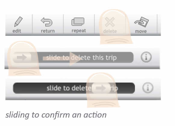
Vincent, a friend of mine, has been tinkering with some new ways of portraying simple touch screen interactions on his Get Around application. He uses a big overlaid thumb with a set transparency to indicate the touch. For indicating a dragging action, the thumb also contains an arrow with a direction. Just thought to share this as I found it interesting. To refresh quickly, Elaine has also approached the same problem previously in a slightly different way.
Credits: Vincent Steurs
Tags: activity, draggable, gestures, wireframe
Posted in Samples | 7 Comments »
January 22nd, 2010
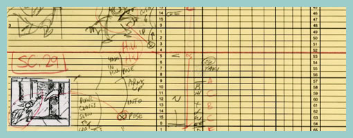
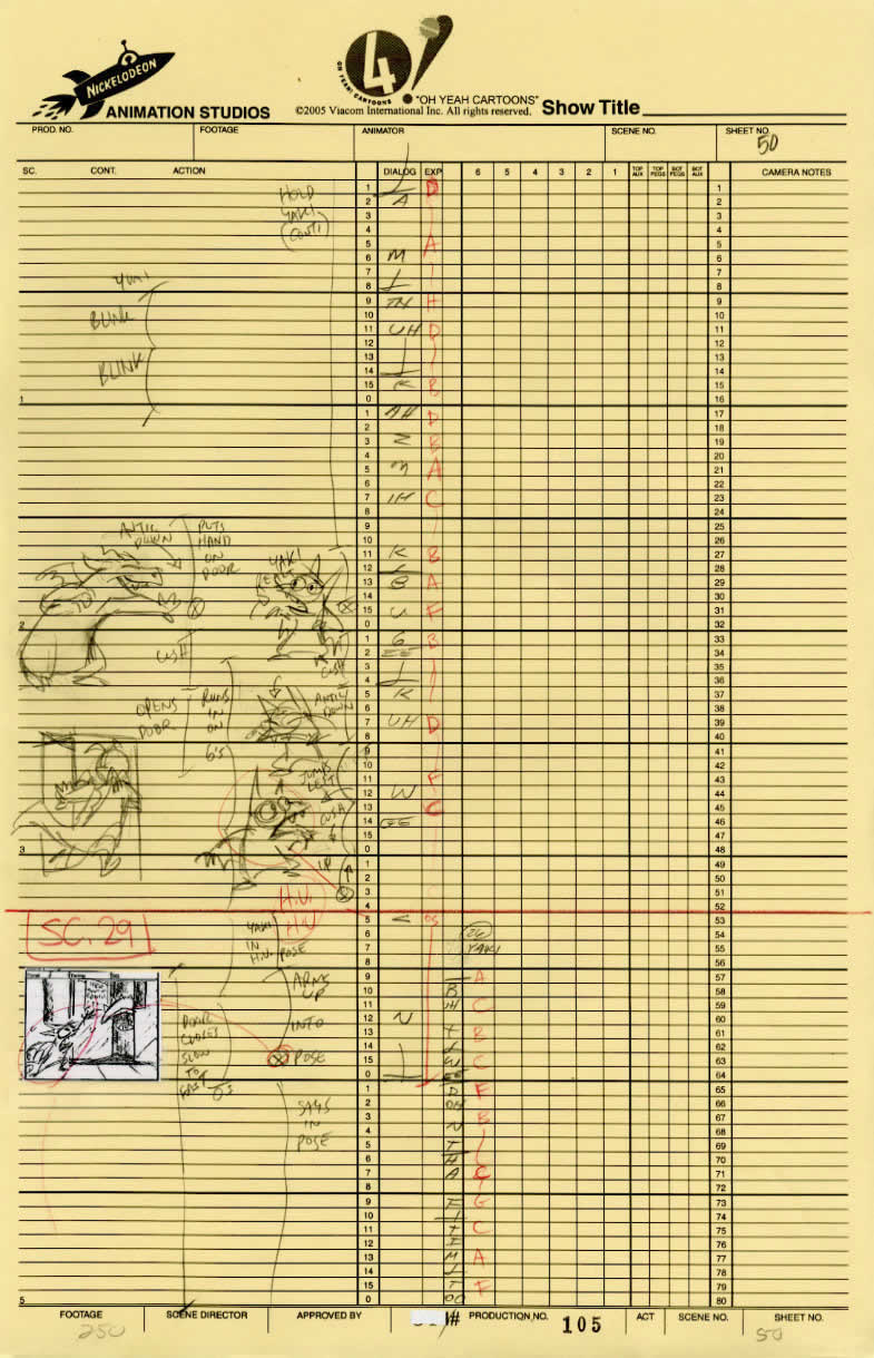
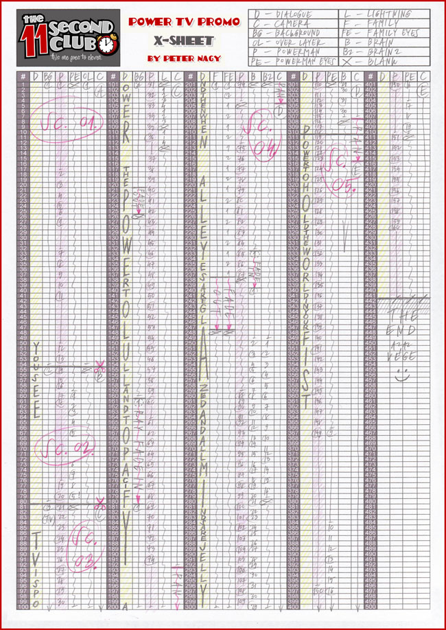
Traditional animators have been relying on sketching techniques of their own which I thought might be inspirational. Animators represent time with exposure sheets (aka. dope sheets) through which a large number of information can be conveyed to others. An x-sheet is pretty much a frame by frame representation of time to which notes can be layered on top. Some of these notes typically include information about: dialogue, camera angles, lighting, background and audio. Since timings of around 30 frames per second are standard, each xsheet is just a snapshot of a few seconds. Nevertheless, animators still find them useful as a communication artifact.
Here is what the people at Michael Sporn Animation studios have to say about these deliverables:
You see, when you get used to reading X-sheets, you see them as time. You don’t see the lines, you see seconds and footage, instantaneously. As an animator, you get an overview immediately of the scene; as a director you read the track, how the animator has constructed the scene, and what camera moves are indicated and why.
Here are a couple extra x-sheet samples.
Of course x-sheets work for a passive medium such as film and it’s questionable of how useful they might be for interactive web applications. Nevertheless, I still wonder if some of these ideas can be useful to our field. What other information can experience or interaction designers “layer” on top of the existing deliverables that we are typically accustomed to? Perhaps it would be interesting to combine a user flow representation with a learning curve or effort representation? What ever happened to representing sound in a UI sketch? What about a wireframe referencing an x-sheet sketch for the times when we do use animation? Hey, and what about a user flow with one axis dedicated to representing time consistently? Just thinking out loud.
Credits: Jun Falkenstein
Tags: activity, annotation, sketch
Posted in Inspirations | 4 Comments »
January 19th, 2010
I’m planning to update the little sketching project I started a while ago and I was curious if perhaps some people might want to contribute any ideas. I’m already planning to take in Nathanael’s feedback but am also open if perhaps others made use of this, and would like to share their thoughts. Ideas in the form of text or sketched samples, all are good. Let me know (email listed in the right hand column) :)
Cheers,
Jakub
Posted in Announcements | 6 Comments »
January 19th, 2010
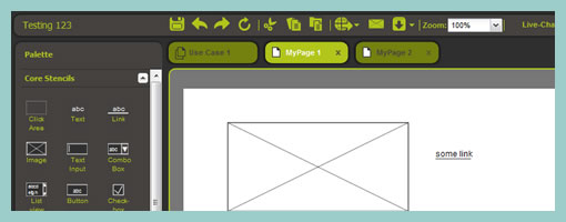
Pidoco, is an online prototyping tool tool which supports a wide range of design activities. Users of this software can for example insert common wireframe elements onto multiple pages. If you drag and drop the freehand box, you can also sketch out line drawings more flexibly (although this still feels a bit jagged). Pidoco also supports a collaborative environment where multiple designers can work together on the same prototype, and allows you to keep track of a version history. On the same note, Pidoco documents can also be reviewed by others and annotated with notes. One interesting way of handling reusable elements is with the global layers feature. The visibility of layers basically can be toggled across any page which allows more flexibility. Of course, like any other similar tool, Pidoco also allows to export the work into interactive prototypes that can be bound with links.
One area where Pidoco truly differentiates itself from the rest of the competition is with the ability to run remote usability tests with the prototypes it generates. Designers can send out a link and invite users to participate in a usability test which the software also records and stores for future reference. I wasn’t able try this feature out, but it definitely looks pretty useful. Nice job!
Sign up for the 30 day free trial.
Posted in Tools | 2 Comments »
January 16th, 2010
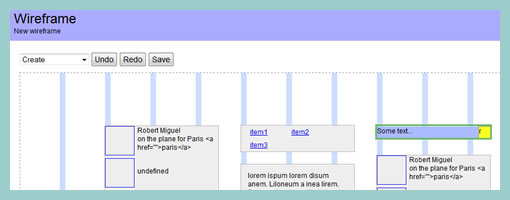
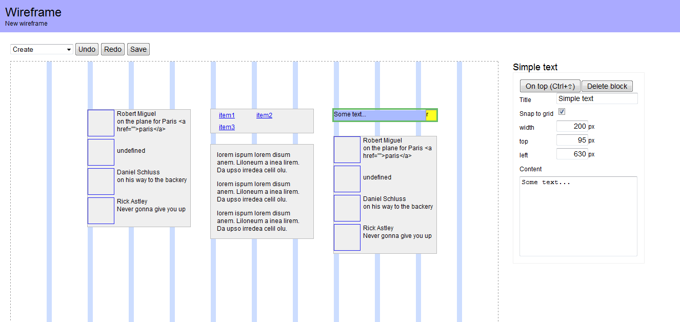
Batiste Bieler has just recently released an wireframing tool with both the python source and a demo available publicly. The tool, as its tagline implies, is quite simple and looks like it is just the beginning of a project. For now, users can start of by creating a wireframe by first specifying a grid on which to work on. Further, components can be inserted into the page from a pull down menu. I believe that in the next release Batiste will be opening up an administrative panel to allow users to create new components. Of course all components are dragable, resizable and editable. Excited to see some grassroots projects happening.
Check out the demo.
Credits: Batiste Bieler
Tags: opensource
Posted in Tools | 2 Comments »
January 12th, 2010
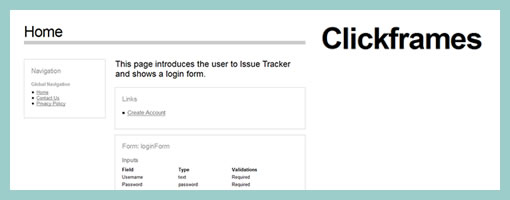
Clickframes is an open source software requirements tool which takes an XML notation as a source and generates a clickable document. First the requirements are written in the form of an appspec, are then fed into an interpreting tool (such as the hosted CLIPr), which in turn generates interactive documentation. Now don’t get me wrong, the generated documentation looks nothing like traditional wireframes. Clickframes are requirement abstractions which do not contain any structural information about various UI elements’ position or size (typical wireframe meat). Clickframes do however indicate the input elements which reside on each page as well as the paths of actions and the resulting outcomes that users can take. I find this interesting as this tool takes a stronger stand on the element of time as represented through such interactions. Hence, this tool visualizes cause and effect of user interactions explicitly, as opposed to having to be discovered.
Another definite Clickframe analogy which comes to mind is that of an interactive and auto-generated page description diagram. What both page description diagrams and clickframes in my opinion lack is the concreteness of elements in a given space which have been traded off for abstraction. For this, I assume there would be designers who start of projects by sketching and designers who begin by writing requirements. Perhaps Clickframes also resonate with what Ryan Singer of 37signals was speaking of when he mentioned that before the pen is laid to paper, a UI model should exist.
Credits: Jonathan Abbett & William Crawford of Beacon16
Tags: opensource
Posted in Tools | 4 Comments »
January 7th, 2010
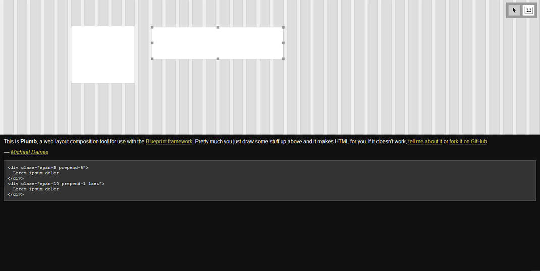
Plumb is an open source tool (GitHub source) for drawing out placeholders on top of the Blueprint framework. You can simply draw out the boxes and it will automatically create the HTML for you. So what’s in it for me you ask? I noticed in the past that there is a community of HTML prototypers out there who like to do their interactive wireframes with grid systems in their most native form. With that, I thought this tool might be interesting to some. Enjoy.
Oh, and if you haven’t noticed already, I have a thing for open source software. Hence a separate opensource tag just appeared in the right navigation bar to separate out these types of projects. Cheers!
Credits: Michael Daines
Tags: opensource
Posted in Tools | 3 Comments »
January 5th, 2010
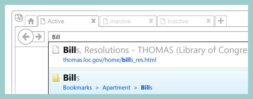
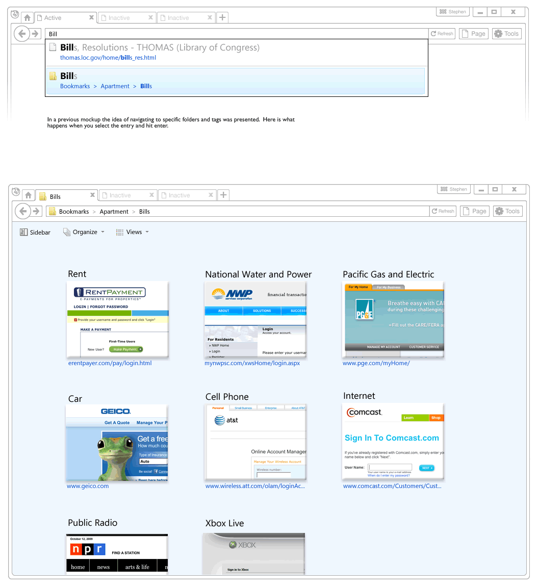
Recently, a visual mockup technique by Alex Faaborg on the Mozilla blog caught my attention. As Alex has been thinking about the merits of searching and browsing through bookmarks and history for the next Firefox version, it seemed like in a way he merged the traditional wireframe with a detailed mockup. While parts of the interface schematics are faded outlines devoid of any colour, other parts are represented in full colour and contain rich depth. Interesting? This effect enables the designer to emphasize the more important parts of an interface and focuses the viewer’s attention on what matters most. These wireframe-mockup hybrids perhaps reaffirm the importance of designing UI parts in the right fidelity and at the same time remind us that it is ok to leave stuff out.
Credits: Alex Faaborg
Tags: colour, emphasis, priority
Posted in Samples | 2 Comments »
December 30th, 2009
I just kicked off a new inspirations category intended for samples and techniques from outside the boundaries of the UI/UX/IA profession. I’m looking forward to seek out some inspiration from within other fields in the new year (please continue to send in samples or ideas). For now, here is a first post in this category.
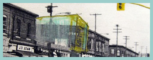
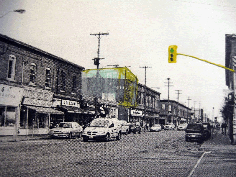
I’ve noticed that my sister who is in her third year of studying architecture does quite a bit of sketching and model prototyping herself. Looking through her work, one thing which caught my attention was the use of a form of sketching which overlays the envisioned building (or neighbourhood) on top of an existing environment. For me, this seems like a superb and smooth way of transitioning from the present into the future. The present in this case is a black and white photograph of the neighbourhood and acts like a clear reference point. The future state of the intended design clearly stands out by means of a coloured pencil sketch on top of the photograph. Occasionally, I’ve also seen her make use of overlaid tracing paper.
To me this seems really interesting and I wonder if the same approach can be used in UI design. When redesigning existing UIs, why not take screenshots of the current present state, import into Illustrator and sketch the future state on top. Eager to try this one day.
Credits: Dominika Linowska
Tags: colour, sketch
Posted in Inspirations | 3 Comments »
December 29th, 2009
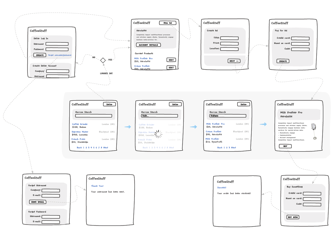
Andreas just sent in a sample of a wireflow done in Omnigraffle (here are a few more) which I thought was an interesting show. It contains a sketchy style, conditionals, and groups a set of pages together with a grey background area. Most recently, this way of working is also my personal preferred approach to communicating UI concepts. Not only does a deliverable like this convey activity more clearly, but it also provides a sense of scope in one snapshot. One problem with these wireflows which I’ve seen in the past is when the design proceeds further and more detail is required. Often in this situation I fall back and develop wireframes. This however duplicates the documentation which is undesirable from a maintenance perspective. Come to think of it, perhaps there is a way to reference occasional detailed wires, on demand, from within a wireflow diagram. Anyhow, here is what Andreas has to say:
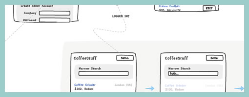
I’ve got a combination wireframe/sitemap that I thought I’d share with you. Adequately called a WireMap. It’s a tool I started using in an attempt to get an overview of small to mid-sized web projects. (The limit is self-imposed. I like printing my work on paper and hanging it around the office. And there’s only so much information you can fit on Tabloid or A3).
Using the wiremap has been a boon both in talking to the internal team as well as taking to clients. In either case it helps the audience grasp the scope and complexity of the project. I’ve found it very helpful in the formative stage, but I see no reason why it couldn’t also be used later on in the development cycle as well.
My approach to this is the combination of wireframe sketching (for which I use Konigi’s Sketch stencil for OmniGraffle) in combination with J.J.Garrett’s IA templates (another OmniGraffle stencil). The result is very much a WireMap in that sense of the word—a site-wide visualization with some page detail (enough to provide an idea of the page’s purpose) as well as some rudimentary logic.
I’ve attached an example showing a WireMap of a mock website called CoffeeStuff. I’ve tried to keep it simple but could easily elaborate more if you think it worthwhile. Didn’t want to overwhelm the reader, but I’m keen to hear your thoughts as well. The map is by no means bulletproof, but I think it does a good job of introducing the general concept.
Credits: Andreas Holmer
Tags: activity, sketch, user flow, wireframe
Posted in Samples | 6 Comments »


