December 12th, 2011

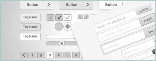
Hannah just started the Fireworks Wireframing Kit resource site. It’s still hot of the press, but the blog is gearing up to be a collection of freely submitted PNG files submitted by the public to help with wireframing. So far there are a few grey scale files already with such components as: modal windows, login boxes, and buttons of various shapes and sizes. Right now you have to download each component individually, as you see fit. Hopefully it’s useful and please feel free to submit something if you have stuff to share.
Credits: Hannah Milan
Tags: wireframe
Posted in Templates | Comments Off on Fireworks Wireframing Kit
December 5th, 2011

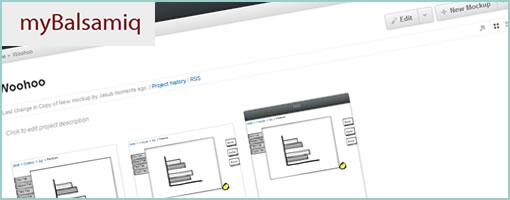
myBalsamiq has just launched last month and took the web based version of Balsamiq Mockups and extended it with a bunch of collaboration features. The sketchy wireframes can now be uploaded online and organized into projects which can then also be given one of the following four access settings: private, website, blog and wiki. The default setting, “private”, is the most restricted and makes projects only visible to the specified members you share your work with. Whereas “wiki” on the other end of the spectrum is the most open and allows anonymous users to comment on, and edit the work. This degree of collaboration offers quite the flexibility for a variety of projects.
More so, myBalsamiq also comes with the ability to version your work by means of a revision history, as well as allows for email based discussion groups for each project. The web version of balsamiq resembles the desktop version so closely that it’s hard to tell the difference. Overall, I think this move marks a natural direction for the already awesome and popular tool.
Have a look.
Posted in Tools | 1 Comment »
November 23rd, 2011

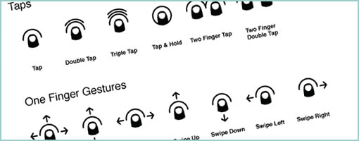
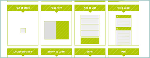
PJ recently took another stab at making gesture icons more comprehensible and released Cue under Creative Commons. It’s a proposed system for representing gestures more clearly that makes use of thumb like icons. He explains his motivation for the project in a blog post as well. The icons come in PNG (4 sizes), SVG, Omnigraffle and InDesign formats. Awesome. It’s always great to see explorations in visual language. Thanks PJ!
Here is how he puts it:
These gesture icons act as roadsigns to an app for interaction way-finding. As expected, there has been a significant collection of gesture icon sets that have been made available to fill this need. The current crop of icons succeed in clarity, but they lack the iconic qualities necessary to act as a standard representation of gestures. My goal is to help create a foundational set of icons that are flexible, clear and distilled to a point where they could become a standard visual system to build from – ultimately to be used within apps for when explicit communication is needed.
Credits: PJ Onori
Tags: gestures, opensource
Posted in Samples, Templates | 1 Comment »
November 11th, 2011

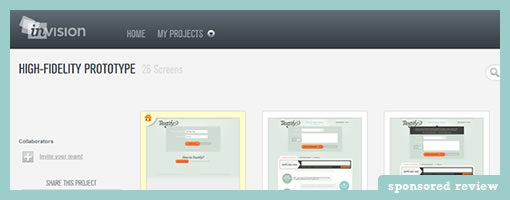
Here comes InVision, a simple click-through prototype building app. The tool itself is pretty light (in a good way) in that you do not design the actual pages in InVision. Instead, the idea is to design your screens in your other weapons of choice (Fireworks, Illustrator, Balsamiq, Photoshop etc.) and then upload them into InVision. Once you upload your GIFs, PNGs, or JPGs, the tool then allows you to create hotspots and link pages together. When creating these hotspots, you also are provided with a very useful ability to save them into templates for easier reusability.
InVision also comes with a few standard collaboration features. You can easily share a full prototype or individual pages through easily accessible links, which then can be commented on by the viewers. You can also invite additional designers if you need multiple people to work on the prototype.
One thing which becomes immediately apparent when using this is that a good amount of effort has also been put into designing the sleek interface. All the little tiny details in terms of interactions and visual design have been fine tuned. As an example, the upload process is quite smooth as files are drag and dropped from your desktop to the web app. Overall, a simple yet clearly focused little application!
Give it a try.
Posted in Tools | Comments Off on InVision Prototyping Tool
November 9th, 2011

Happy World Usability Day from the guys over at Optimal Workshop! An awesome bundle of online usability tools is up for grabs on World Usability Day up until this Thursday, November 10! This year a bunch of User Experience (UX) organizations have put together a basket of complementary training and tools for the World Usability Day Bundle. The bundle is only available for 48 hours and includes an incredible package of UX tools at more than 70% off the usual price.
This year’s World Usability Day Bundle is priced at $1,370 (pretty much the same as last year) and includes more than $5,000 worth of subscriptions. The individual components of the bundle are:
- Usability Professionals’ Association: 4 video seminars and a live webinar.
- OptimalSort: Remote card sorting.
- Treejack: Test and validate your IA.
- Loop11: Test the user-experience of any website.
- OpenHallway: Record a/v screencasts of user testing sessions.
- SnapEngage: Live chat with your site visitors and customers.
- ConceptShare: Markup visual designs collaboratively
- HotGloo: Rapid collaborative wireframing.

Tags: offer
Posted in Announcements | Comments Off on Special Offer: World Usability Day Bundle
November 7th, 2011

Johannes Tonollo’s thesis project explores a number of interesting user interface transitions, and how they can be used to create meaning by complementing static UIs. They have been segmented into six categories: Orientation, Spatial Extension, Awaking Controls, Highlight, Feedback and Feedforward. The site has a large number of examples or patterns for each category that are pure inspiration. Interesting stuff! Traditionally, UI designers have been reinforcing meaning by relying on gestalt principles using proximity, alignment, positioning and contrasts. Johannes shows that these could be extended with transitions and the element of time. With CSS animations getting more and more powerful, these transitions don’t seem so far fetched any longer. Thanks Michael (@konigi) for finding this!
Credits: Johannes Tonollo
Posted in Inspirations | Comments Off on Meaningful Transitions
November 3rd, 2011

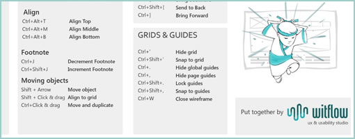
The guys over at WitFlow recently put together an Axure Cheat Sheet (PDF). It comes loaded with a bunch of potentially useful little shortcuts for the Axure masters out there (or shall I say, Axure FU Masters to be). Thanks for compiling & sharing this. :)
Credits: @WitFlow
Posted in Templates | 2 Comments »
October 28th, 2011

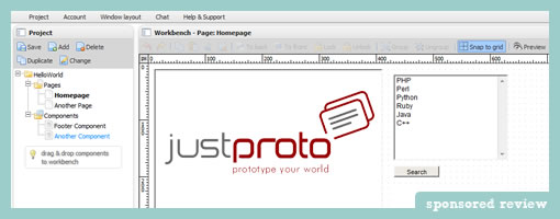
JustProto has made some improvements over the last little while as they moved on to version 2.0 of their web based prototyping app. This time around they included a bunch of collaboration features. This means that the tool now allows multiple designers to work on one prototype simultaneously in real time. More so, designers can also create a quick preview links of the prototype that can be shared with the team. What’s interesting and unique though is that the shared prototype also updates instantaneously as users continue to work on it – potentially handy for quick feedback. Furthermore, real time chat as well as comments in the form of tags, sticky notes and pins have also been included.
Additionally, the latest version also now includes a prepackaged range of useful famfam icons as well as an extended set of elements. Another improvement is that now users can create their own custom reusable components – a pretty standard and useful feature.
Along with their new site redesign, the team has also exposed a number of public prototypes examples to give people a better sense of what is possible with their software.
The Giveaway. Yup, you heard it. These guys are giving away 3 One Year Plus Licenses. What do you need to do? Sign up for an account and leave a comment here on this blog of what you think is useful or would do to improve the tool. The JustProto team is eager to hear out some feedback. Myself along with the JustProto team will try to select the three commentators within 7 days.
Update Congrats to Ben, Michael, and Antonio! They have been selected for the giveaway. :)
Posted in Tools | 7 Comments »
October 13th, 2011

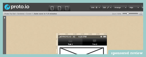
Proto.io is a new UI prototyping tool specifically tailored for mobile and tablet applications. The web based environment allows you to start off by creating a project for either the iPad or the iPhone. After creating a few screens, you typically would expect to be able to link a few pages together with interactivity – and proto.io does just that. It comes prepackaged with actions that are custom to hand held devices. So for example, you can simulate such interactivty as: clicks, taps, tap and holds, as well as swipes. Additionally, transitions such as slides, pops, fades and flips are also supported to make the prototype resemble the real experience more closely. Pretty cool.
Proto.io also comes with other more standard prototyping features. Users can create reusable templates and components into which a bunch of prepackaged and editable elements can be dragged onto. Just to give you a taste, have a look at the Picker Component demo which is fully customizable. Another interesting draggable component includes the HTML Code box that allows users to write custom HTML. The tool also has a useful snappy grid as well as some align to features for those who wish to work at a pixel perfect level. Once the prototype is ready you can of course publish and preview your prototype which works inside a browser as well as real devices.
The team is apparently also working on supporting Android devices in the near future. Rock on. :)
Try it out.
Credits: Alexis Piperides
Posted in Tools | Comments Off on Proto.io – Mobile App Prototyping
September 30th, 2011

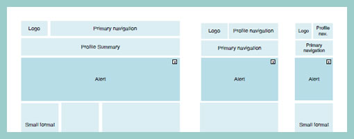
As we design for more devices, considerations for more responsive layouts which scale gracefully across varying screen sizes could be gaining in importance. Warren here has shared one such quick wireframe that tries to accommodate just this. It basically shows 3 wires side by side each other with some placeholders as well as how they would all vary across a few predefined screen widths. It’s a pretty straightforward, yet clear way of conveying more flexible layout concepts.
That same week, as I was asking around for a few additional “responsive layout” samples, Martin also pointed me to Media Queries – which is an awesome gallery and collection of layouts that scale beautifully on various screens (it’s actually also a CSS extension recommendation). Have a look.
Credits: Warren Anthony
Tags: responsive, wireframe
Posted in Samples | 1 Comment »
