Posts Tagged ‘colour’

Hatched Colour Overlays

Tuesday, June 30th, 2009


Uwe has recently published his wireframe sketches in which he uses a number of interesting techniques. One of these techniques is the use of rapidly generated hatched colour overlays on top of his sketches. Coloured lines are basically drawn over desired interface sections in a diagonal manner. This fast application of colour has at least two benefits. First attention can be drawn to coloured elements as they stand out more. Secondly, associations between coloured elements spread out over numerous screens can be made more easily when sharing sketches with others.

Credits: Uwe Thimel for kuehlhaus AG

Wireframe Moodboards

Thursday, June 11th, 2009


A wireframe alongside a moodboard might stir some controversy for traditional information architects. Fonts, colours, styles have been considered a thing of the later phases of a design process, elevating the flow of activity in importance. Perhaps Chris’ work which combines stylistic exploration with the exploration of interactivity, challenges this traditional waterfall view. Similar thoughts have been surfacing and emerging in earlier posts and samples, as visible here and here. Perhaps this interplay between user experience and emotion is an important one. Perhaps it’s only natural if interaction designers or information architects work in parallel with visual designers opening up more room for dialogue.

TIP: To see the full image you can drag around with the mouse while in the full size mode of the popup.

Chris writes:

I’ll do my Wireframes in illustrator after I have met with the client and they have filled out my website questionnaire (another blog post for that) – after we have hashed out the sitemap on Writemaps (another great product) I will create this over all scheme that includes Fonts, Colors, Inspiration, textures or patterns and takes care of the Wireframing side making sure what will live on each page. For this example I have done a very simple layout – just a homepage template and interior page template. If this was a large site I may have done out 8 template Wireframes in illustrator.

Credits: Chris Gillis & David Perel

Structure Juxtaposed Wireframe

Monday, April 13th, 2009


While designing the uxtestkitchen.com site, Dawn has come up with a navigation scheme which displays the site structure along with the current location at the very top of the interface. As we’d expect, these ideas have been naturally placed into the wireframe. What I find interesting however is the juxtaposition between the site structure and the wireframe at a more general level. I mean, this type of view could just as well be used even if the interface did not contain such a navigation. After all, seeing the site structure along side the wireframe in itself provides a richer picture. Similarly to showing needs alongside wireframes, perhaps seeing structure or user flows more closely could enrich the context.

A second thing I find interesting here, is the use of colour to suggest the current location of the user. Here, yellow has been used to hint at the currently selected item. This brings back thoughts about colouring clickables in wireframes. Just as actionable elements in a wireframe could have a reserved colour, perhaps a second standardized colour could be reserved to suggest selected items.

Credits: Dawn Bovasso

Coloured Paper Templates

Wednesday, April 8th, 2009


Here is an interesting twist on the wireframe by means of using a different coloured background. When Steve has been drawing up templates of existing content for an intranet site, coloured paper has been used to denote the various templates types. In this case the colour suggests the differences in technologies used. However background colour could be just as well used to denote other things such as: user types, page states, stages in a flow, etc. It seems like an interesting approach, as typically the wireframe usually rests on a white background.

Credits: Steve Baty

Coloured Interface Sketches

Friday, March 27th, 2009


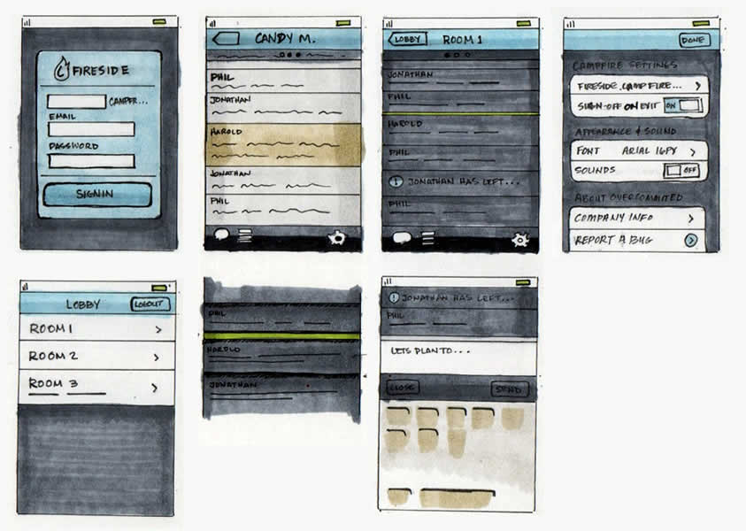
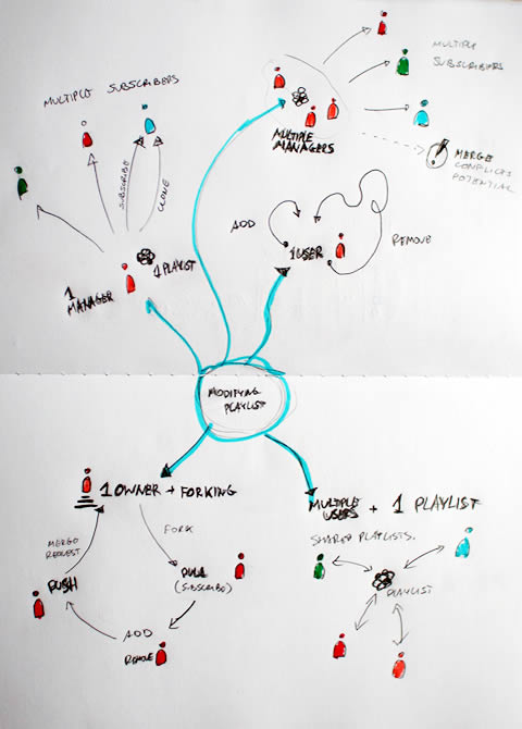
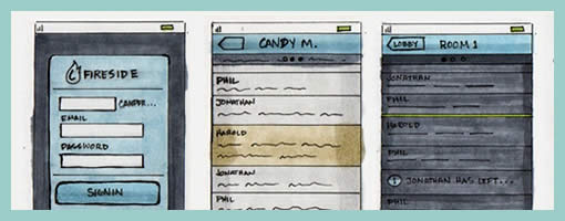
I think the technique of using colour combined with interface sketching has a great deal of strength. In this sample from Harold, amongst other things one can really see some awesome explorations emerge. The colours in this work really help to gain a richer understanding of the various interface elements across the screens. It also makes association easier and thus similarities and differences begin to stand out more so than in simple grey scale terms.

Traditionally, the general consensus around the use of colour in early interface design work was to avoid it. Early conceptual design, at least in wireframing, has typically focused more on things such as basic interface structure, flow, functionality and more general interaction. Seeing detailed colour on a computer screen too early was (is) perceived by many as detrimental from these more important issues. Myself included, I have resorted to the use of colour in wireframes for purely functional reasons. Could this constrained view be breaking down? According to agile approaches, it is completely valid and even desirable to “spike” forward with explorations. This sample does just that perfectly well in the context of colour exploration. Perhaps a coloured fill using the paint bucket on a computer is too rigid and too perfect for early design phases. However, such renderings as seen above still resonate with open and inviting incompletion which makes them more than suitable for conceptualization.

Here is another link of the evolution from sketch to final visual, along with an explanation.

For those thinking of spending some money, Harold has mentioned that he used Copic Markers, which are quite expensive but refillable. Amazon carries quite a few different sets amongst which include a greyscale set and a coloured one as well (they have other ones too). Jennifer has also stated here that she uses Prismacolor ones which are a bit cheaper and available in color or greyscale. I personally might just pickup and try a few colours first from a local art store, as well as compare Copics to Prismacolors.

Credits: Harold Emsheimer

Sketching Alternative and Social Activities

Friday, February 20th, 2009


Recently as I was thinking about an assignment of designing a new playlist system at work, a number of ideas collided all into one and resulted in this design sample. The desire was to explore alternatives, quickly, of high level activities, which would have to support interactions between a number of actors or people. So I jumped back into pencil, paper and marker mode. As simple or obvious as it may seem, what I think might of worked well worth noting is the use of colours to denote different (or same) people. Another thing that perhaps worked out was the use of one activity as a starting point in the center and then branching out toward alternatives.

I think this little sample was influenced by other’s work as well worthy of noting. First of all, here at TU Delft we were exposed to quite a bit of mind mapping exercises which in a way resemble the interface sketches of Jonas Löwgren. Then again, this sample also shares the high level characteristics of a user journey submitted by Steve Johnson. Finally, as I’ve written in my personal blog I’ve also began questioning the sterility of one path user flows wondering about how to explore the diversity of activities.

The sample isn’t perfect, and as is argued in Pencils before Pixels, the lower the fidelity of the sketch the harder it is to use it to communicate with others. However when I showed the sketch to others, and supported the sample verbally, it enriched the conversations.

Credits: Jakub Linowski

Sitemap References

Sunday, February 15th, 2009


In a way, sitemaps can be thought of as a unifying table of contents of an information architecture project. They provide a way to zoom out and view the whole organization from a bird’s eye point of view. As interesting as things look from the clouds, one can fly around only for so long, and information architects often also allow to come back down to the wireframe or page level. This zooming back in is often done through some form of referencing. Here in this sample I began referencing at least three things: wireframes, content inventories, and additional sitemap pages. Wireframes are referenced with a red “W#” stamp, content inventories with a “C#” stamp, and additional pages with upper corner blocks. Some time ago in the past I also referenced user scenarios at this level. The list of references could possibly be expanded to accommodate other item as well.

Credits: Jakub Linowski

Annotation Droplets

Friday, January 30th, 2009


This little design documentation pattern has been with us for a long time and yet it’s still worthy of mentioning. The idea of annotating wireframes using droplets or circles with one pointy edge is a nice visual technique. The coloured circle is what grabs the attention quite well, combined with the pointed edge that allows to reference a very specific area. Will Evans allowed me to post this sample and he also has an interesting write up on his wireframing process. Finally there is also a Konigi Omnigraffle Stencil which uses these droplets as well. I’d also be very much interested to see what others are doing in terms of annotation. If you have interesting visuals, please send those samples over! :)

Credits: Will Evans

Colouring Clickables in Wireframes

Sunday, January 25th, 2009


Sometime ago I felt a need to represent in wireframes everything that could be clickable or actionable. This came largely from people asking me where one could click on inside a wireframe during presentations. When I just presented black and white screens it was not always easy for them to distinguish standard content areas from clickables and people would ask for confirmation. For this reason I began using one colour, usually red, to denote any interface areas, buttons, or text links that could be acted upon. In this regard, I found that this justified and consistent use of colour worked out pretty well.

Credits: Jakub Linowski

Isolated & Referenced Elements

Monday, January 12th, 2009


This is an interesting sketching technique provided to me by Jonas Löwgren, which separates individual interface elements from the page. Here, individual elements are taken out from the page view and then referenced back to a mini version of the page which contains a structural representation. More so, the page structure only lives in one area (the centre). Nearby each sketched element there is also some faded hinting of what is around the element. Taken together, this increases the speed in which the sketches can be generated, as there is less need to redraw full pages with all other elements.

Secondly, this technique also has the strength to emphasize particular elements as they speak back at us with a louder voice. The isolation of various items, freed from the page view makes them stand out more. There are also other submitted samples (here and here), which also made use of this technique in a wireframe context.

Credits: Jonas Löwgren