Posts Tagged ‘prototype’

Framer – Modern Prototyping

Wednesday, January 30th, 2013

Framer
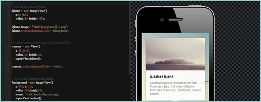
Framer (github) is a modern prototyping tool. More concretely, it’s a lightweight Javacript based framework for creating and prototyping complex interactions (with animations) on various mobile devices. I haven’t tried it on a mobile device yet, but in Chrome at least (doesn’t work in the Firefox browser), the transition and animations do look pretty smooth as the author claims to rely on the GPU directly. So if performance matters to you and you’re up for some transition prototyping fun, why not give this opensource tool a try.

In Koen’s own words:

Many people already prototype in the browser. It’s simple and quick. But while html/js/css/jquery gets a lot done it has some downsides:

  • It can get pretty complicated mixing all the different technologies
  • It can be hard to get the pixel perfect control you want
  • It’s not always performant, especially on mobile
  • It’s pretty far from how it will be actually implemented if you prototype for native

Framer tries to solve some of these problems by providing a very lightweight framework modeled after larger application frameworks. The basic idea is that you only need a few simple building blocks like images, animation and events to build and test complex interactions.

Credits: Koen Bok

jKit – jQuery based UI Toolkit

Monday, January 14th, 2013

jKit
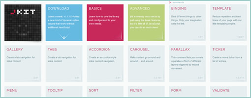
jKit is a new toolkit for jQuery, built by Fredi Bach from Switzerland, that I think has much to offer for those with HTML prototyping needs (the way prototyping is ought to be done I believe). :) The toolkit contains quite a few widgets, interactions and behaviors that help to enhance the UI while at the same time lowering the programming barrier to entry. Some of the many things that the toolkit allows for includes: a carousel, tooltips, form validation, zooming interactions on images, list cycling for styling, auto scrolling, etc, etc, etc. Anyhow, there is a lot more to it so have a look at the awesome examples and see if you it fits your needs for the next prototype you decide to build. Thanks Fredi for releasing it under an MIT license! Rock on!

In Fredi’s own words:

jKit was born in the summer of 2012. After developing almost two dozen jQuery plugins over the past years, some for myself and some for client projects at the company I work (deep AG), it was time to create something bigger and better, especially as we needed a frontend library at our company that was easy to use for our publishers and had the features we needed. But only after implementing the first few features, I started to see the real potential for this toolkit. With only about 1k per command, the plugin could add quite a lot of useful features without getting to big in size. It would meen for us that we could add this toolkit together with jQuery onto all our new client projects and easily have all the features we needed in 95% of all cases, with the benefit, that the API was easy to use and consistent. And now we’re here, with a really feature rich UI toolkit that meets our needs and gets better almost every day, mainly because we actually use it and hopefully because of the input you can give is for perfecting it more and more. I really hope you like jKit as much as I do, because at the end of the day we can all benefit from the knowledge and experiences of each others, getting this baby somewhere not even I imagine right now.

Credits: Fredi Bach (Twitter)

InVision Sync (for Mac)

Wednesday, December 5th, 2012


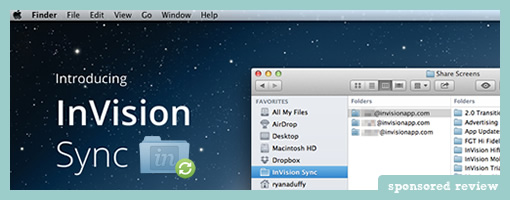
InVision Sync is out (for Mac) and they have removed another hurdle from their online protyping tool – that of having to manually upload screens through the browser. It’s a simple yet powerful improvement which streamlines their prototyping workflow. Designers can now simply set local InVision project folders and then save and manage screens directly to them. InVision Sync will do all the burdensome work of then syncing and uploading the screens to the server so that hotspots can be assigned (hotspots still remain after an existing file has been changed). And yes, if you have a team of designers working on the same project, InVision Sync will upload and download screens accordingly both ways in order to keep things, well, in sync. Way smoother!

InVision Sync runs in the background on the MAC system toolbar and surfaces a few additional quick options to end users. One of these is the ability to quickly grab URL links of projects that can be shared with others. Another feature directly accessible from the toolbar is the ability to see recent comments. Finally, when working with a team, Sync provides system notifications on all files which have been changed. Definitely a move forward in many ways that improves the online prototyping experience.

Ryan Duffy, one of the designers on the project, also released a great Vimeo screencast which explains the full process. Pretty slick!

Ready to try it out? Grab the DMG file.

Proto.io V3 – Changes mobile prototyping as we know it

Monday, October 1st, 2012

Proto.io
Proto.io last Thursday just released the next version (V3) of their interactive mobile app prototyping tool. The new version promises to push prototyping to the next level with an even wider range of devices. With custom devices, users can now prototype for pretty much any device with a screen, from SmartTVs to refrigerators. Adding to that, it becomes the first mobile prototyping tool to support full feature animations of UI items within a prototype screen. Its V3 release also includes keyboard events and web fonts, among other improvements.

V3 features in detail from their press release:

Custom device prototyping

Created specifically for mobile, Proto.io identified the growing problem of prototyping for the many different devices and screen resolutions of available mobile devices. Without wanting to restrict users to predetermined mobile devices and factoring in the ever evolving mobile scene, Proto.io took things a step further. It created a prototyping first by giving users the liberty to determine their screen size dimensions and then apply their own skin for the device they are prototyping for, to create a real user experience for the viewer. With this update, prototyping is not restricted to just mobile anymore. It opens up prototyping apps for any device. That includes Smart TVs, PSP and other gaming devices, refrigerator interfaces, airplanes, cars, alarm clocks, medical equipment and pretty much anything with a screen interface. See a custom ‘gaming device’ demo here.

Full feature animations

Since its launch, Proto.io included between screens animations like slide, pop, fade, flip, turn and flow. It now comes to add full feature animations, allowing for simple animations of UI items in the prototype’s screens. That means that users can interact with any item on the screen and make it animate, really bringing prototypes to life. The animations types include move, scale, resize, rotate and fade. Users can set a duration, easing effect and start delay for each animation, and set commands like loop iterations and repeat animation steps. Check out the interactive demos!

Keyboard events and web fonts

Going by the principle that not all devices are created equal, Proto.io wanted to enhance the user’s experience when prototyping for not-only-touchscreen and non-touchscreen devices. For example, a gaming device is accompanied with several hard buttons for navigation and gameplay. Proto.io users can assign keyboard events and map each of these buttons’ functionality. So when a user hits the right arrow key (→) on their keyboard, the corresponding hard button will respond with the action preset by the user. Keyboard events is a useful tool to complement a touch screen interface design that a user would want when prototyping for car radios, remote controlled Smart TVs, handheld gaming devices, etc.

Web fonts are also supported in V3. That includes using any of the 1000+ available fonts, freeing up prototypers to using more suitable fonts for their prototypes. The main benefit of using web fonts is that they show exactly the same in almost any device or browser.

Have a look at more demos and give it a try!

Credits: Alexis Piperides
EightShapes / Blocks

Friday, September 14th, 2012

EightShapes / Blocks
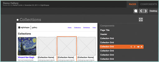
Blocks (github) is a HTML prototyping tool brought to you by EightShapes – the company that’s all about modular components. The JavaScript toolkit allows designers (code literate ones that is) to tag pages or the components within, for purposes of presentation and reuse. Such tagged HTML page prototypes then become listed in a table of contents so to say, along with all of the unique components on the side. Blocks is a presentation layer tool that sits on top of the prototype and can be turned on or off. The other core benefit or idea behind this is that instead of duplicating HTML over and over again, the toolkit instead also allows to reference HTML code and reuse it across multiple pages. Being pure JavaScript, it also looks pretty simple to implement.

One thing which I don’t see and think would still be nice to have is a way to tell stories across these listed pages and components. Right now, all of these assets are very much fragmented and require the designer to do the magic of tying it all together into a flow or narrative. I wonder how the toolkit would feel if there was a layer of visible use cases, scenarios or non-linear flows that could be attached over on top.

Nathan also shares an interesting article which compares HTML prototyping to other tools like Axure. I’d have to agree with Nathan on this one that working with HTML (and JavaScript) for prototyping has the definite benefit of being closer to the medium as opposed to abstracting it. Even if writing JavaScript functions is too much for a designer (although it can be learned), that also opens up a perfect opportunity to collaborate on the prototype with a developer. For me personally, prototyping is less about setting up clicks between all of the screens, as is more about being able to get to the right richness of interaction, data, or visual representation for a narrower set of screens. With HTML and JavaScript there is simply more potential to get to the highest level of detail possible in order to feel out a risky part of the product. That’s not to say, that more often than not, just the “clicks” are adequate and so many other “abstracting tools” work for a lot of people. Thoughts?

Either way grab and fork it from github. There is also a good video where Nathan describes the approach.

In his own words:

EightShapes Blocks is a toolkit for user experience designers to modularize, communicate, and deliver annotated HTML prototypes.

Credits: Nathan Curtis

Interface Origami

Monday, April 16th, 2012

Interface Origami
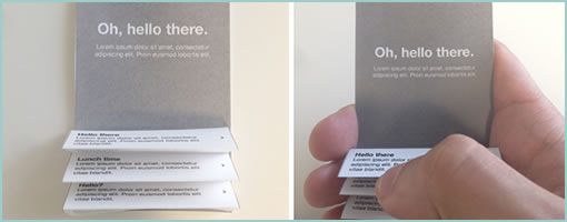
Juan has been recently playing with paper in order to explore some possibly new interactions. This person is trying to pinch, tear, flip, curl, fold, and peel UI’s in new ways just for kicks without the limitations of pixels. In a way this kind of stuff resembles paper prototyping a bit but probably focuses more on discovering new gestures. Either way, it’s an awesome way to think outside the box in my opinion, as tactile play breads creativity. Thanks for sharing!

In Juan’s own words:

In a previous post, I mentioned a way of thinking about interactions and interface within a framework of depth and space. The ideas were centered around the digital space, but as a designer I find it’s important to remove myself from that space and explore solutions that can originate in physical space.

One of the easiest ways to do this is to break out scissors and paper. With paper you can remove the constraints of working in pixels to fold, tear, flip, curl and manipulate the medium to discover solutions that may have otherwise been missed.

To illustrate this, I created a few examples based on some familiar apps and others based on former concepts I’ve played around with in the past.

Credits: Juan Sanchez

Foundation

Tuesday, April 10th, 2012


Foundation looks like an interesting open framework for building HTML, CSS and Javascript prototypes. It offers a quicker way to build prototypes as it comes loaded with code for grids, buttons, alerts, forms and error states, sliders (Orbit), and modals (Reveal). The project also feels like it has some github momentum. The makers of Foundation have also shown a few examples of their prototypes.

Have a look and see if it’s for yourself.

Credits: ZURB

Sketchify

Tuesday, June 7th, 2011


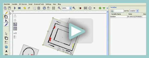
Sketchify is an open source toolkit for simulating simple drawings with a wide range of inputs in real time. As an example, it allows you to quickly create a functional prototype of a moving car along with the mouse acting as a controller for its direction. Other inputs which Sketchify may apparently hook up to include: motion sensing (with a webcam), speech recognition, face recognition, Wii Remote, web services, Phidgets, and Arduino. All of these of cource can then be tied back to move, hide, and affect various interface elements. Here are a couple additional youtube videos which demonstrate more examples of what is possible with this tool.

From the Sketchify website, in Željko’s own words:

Sketchify (also known as AMICO Sketchpad) is a toolset for sketching of novel classes of user interfaces, originally developed by Željko Obrenović at the Concept Lab of the Eindhoven Technical University. Sketchify extends the concept of paper and pencil sketching to a more generic concept of rapid manipulation of interaction material. Interactive material is any piece of software/hardware that represents or simulates a part of user interactive experiences, such as inputs from sensors, output of audio tools, interaction with Web services, or simple drawings. Through manipulation of interactive materials, designers create “interactive sketches”, which in rough terms illustrate interaction scenario or interaction techniques. Our tool gives a designer freedom to combine elements of traditional freehand sketching and with numerous extensions, such as end-user programming (spreadsheets and scripts), and links to existing software functionality.

Credits: Željko Obrenović

SketchWizard

Thursday, October 21st, 2010


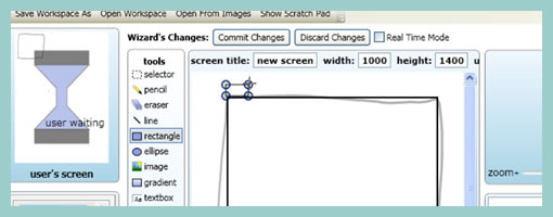
A rather interesting experimental wizard of oz sketching tool has been developed a few years ago by a group at the University of Washington. The setup requires two separate monitors with the user on one and the designer on another. The person evaluating the prototype can then use a standard computer or a pen based input to perform actions on one monitor. While the screen pauses on the user’s monitor, the designer (acting as the wizard) then spontaneously draws up or selects what the user will see as a consequence, and so on.

Today’s popular prototyping tools for the most part rely on a similar approach to handling interactivity, which might be a bit stale. There is a large focus on trying to predict all possible interactions in advance and prerecording event handlers (such as onclicks and mouseovers) ahead of time. I find SketchWizard on the other hand provides a more spontaneous way of playing out interactions with a prototype. While it alleviates the need to have everything thought out before hand, the one catch might be that the user has to occasionally wait a few seconds longer before a new screen comes into view (as the designer is preparing it quietly on the other end). Perhaps it would be interesting to see more prototyping tools take on this approach as well.

There are binary releases and videos available right there on the project page.

Credits: Richard C. Davis, T. Scott Saponas, James A. Landay

iPad Template for Keynote Prototyping

Tuesday, July 20th, 2010


Amir Khella just described his experience of building an interactive prototyping for an iPad application using Apple’s Keynote. Along with a thorough post, he release a template available for download (requires blog subscription). The post also comes with a video screen cast showing the final result and interactions. Here is an interesting quote around what he has to say on prototyping:

Remember that a prototype doesn’t need to be perfect. It just needs to convey your idea better than your words do. Don’t over-engineer it, and don’t prematurely optimize it. Just put together something that users can see and play with. You will get many more insights than spending hours in focus groups, market research and surveys.

Credits: Amir Khella