Posts Tagged ‘referencing’

State Annotations

Tuesday, August 18th, 2009


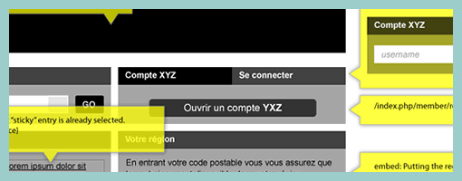
Here is a cool idea by Benoît which combines annotations with interface visuals into one coherent whole. Typically annotation bubbles were reserved for textual information, yet this sample extends it to contain more elaborate visual elements. More so, some of these annotations visible here also contain multiple variations of an interface suggesting some sort of multiple state representation.

Credits: Benoît Meunier

Object-Oriented Wireframes

Tuesday, April 28th, 2009


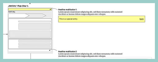
Rich Internet Application wireframes continue to pose a challenge to information architects who try to tame their complexity. Often all it takes is a few multi-state items on a single page and the number of all possible page variations skyrockets. Nick has introduced an object-oriented approach to wireframing which aims to ease the representation of such conditional multi-state interfaces. First, a wireframe is drawn up in the traditional sense. This is then followed by the definition of objects or component areas using dotted lines and a reference code. Each object’s various states and conditions are then explored in detail on a separate page, while still referring to with the same reference code. The approach works well in that it makes the interface components more manageable and easier to change.

Nick continues to evolve his approach, as well as has been presenting his ideas in PPT form over at slideshare.

Credits: Nick Iozzo

Reference Zone Wireframes (with Rough Events)

Wednesday, April 1st, 2009


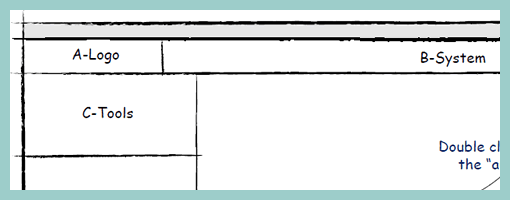
Cutting corners on the level of detail is a popular approach during wireframing which has been noted in the past during exploratory phases. These reference zones (term taken from Wireframes for the Wicked presentation), or content labels, do just that. Block outlines have been drawn out which are then labelled in order to describe what is contained within. Hans here has also introduced a number of arrows which begin to explore rough flows or events within the interface (similarly to Vivi’s In Page Events sample). Perhaps another difference between Hans’ and mine sample is that mine combines these abstract reference zones with more detailed sections, whereas Hans’ sample is fully referenced. Either way, these ways of abstracting the representation is quick and works very well in stirring initial interface ideas.

Credits: Hans Nieuwenburg

Prioritizing Elements with Numbers

Friday, March 20th, 2009


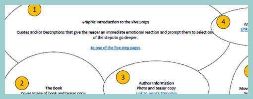
The bubble frame has stirred up some commotion on twitter the other day, and Tyesha reacted with her own variation. Her sample however sheds light on something else – the idea of prioritizing elements. She uses a very simple tactic that relies on numbered circles to denote the importance of an element. The really nice thing about communicating thoughts on priority in such abstract ways, is that it creates more flexibility for a visual designer to interpret the representation. This perhaps gives the designer more room to apply his/her own expertise as well.

I find it really interesting to see information architects thinking of such priorities behind various items on a page. There seem to be quite a few other ways in the realm of visual design which can be used to increase or decrease importance. Some less direct tactics include: the control of element size, emphasis through isolation, variance of depth (foreground, background), and of course a recent example that denotes priority with the use of tone.

Credits: Tyesha Snow

Multiple Element Changes Using Miniframe References

Thursday, February 19th, 2009


Here is a sample revisiting the problem of exploring multiple element changes all over the screen as a result of an interaction. Traditionally a full wireframe would have to be redrawn in order to document such subtle and multiple changes. Here is a quick solution that avoids having to wireframe the full page and thus decreases effort and increases document flexibility. Fabian has achieved this by combining state based wireflows with miniframes which act as references for the elements which do change. Overall, this document reminds us of an important consideration relevant in wireframing richer interactions. This being that one interaction can have multiple element reactions. Just to recap, Bill Scott has used an alternative method of documenting a similar case with a multiple elements & state conditions matrix.

Credits: Fabian Nöthe

Sitemap References

Sunday, February 15th, 2009


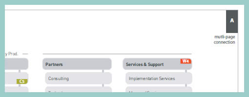
In a way, sitemaps can be thought of as a unifying table of contents of an information architecture project. They provide a way to zoom out and view the whole organization from a bird’s eye point of view. As interesting as things look from the clouds, one can fly around only for so long, and information architects often also allow to come back down to the wireframe or page level. This zooming back in is often done through some form of referencing. Here in this sample I began referencing at least three things: wireframes, content inventories, and additional sitemap pages. Wireframes are referenced with a red “W#” stamp, content inventories with a “C#” stamp, and additional pages with upper corner blocks. Some time ago in the past I also referenced user scenarios at this level. The list of references could possibly be expanded to accommodate other item as well.

Credits: Jakub Linowski

Isolated & Referenced Elements

Monday, January 12th, 2009


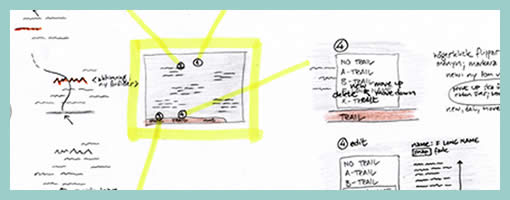
This is an interesting sketching technique provided to me by Jonas Löwgren, which separates individual interface elements from the page. Here, individual elements are taken out from the page view and then referenced back to a mini version of the page which contains a structural representation. More so, the page structure only lives in one area (the centre). Nearby each sketched element there is also some faded hinting of what is around the element. Taken together, this increases the speed in which the sketches can be generated, as there is less need to redraw full pages with all other elements.

Secondly, this technique also has the strength to emphasize particular elements as they speak back at us with a louder voice. The isolation of various items, freed from the page view makes them stand out more. There are also other submitted samples (here and here), which also made use of this technique in a wireframe context.

Credits: Jonas Löwgren