Posts Tagged ‘sketch’

Rough Interface Sketching

Monday, February 23rd, 2009


At least two rough sketching tactics can be identified in this submitted drawing which make it lean very much toward the low end on the fidelity scale. First of all a great deal of the text has been represented using simple squiggly lines as opposed to using real words. Secondly, the interface page boundaries have faded as some elements have been drawn floating independently of any screen edges. Such roughness has definitely a place while designing as it provides ever greater speed of generation. This value does come at a price however as hinted in the previous entry. The lower the fidelity, or the rougher the sketch, the more difficult it may be to understand by others and thus it may require support by explanation.

Credits: Darren Azzopardi

Sketching Alternative and Social Activities

Friday, February 20th, 2009


Recently as I was thinking about an assignment of designing a new playlist system at work, a number of ideas collided all into one and resulted in this design sample. The desire was to explore alternatives, quickly, of high level activities, which would have to support interactions between a number of actors or people. So I jumped back into pencil, paper and marker mode. As simple or obvious as it may seem, what I think might of worked well worth noting is the use of colours to denote different (or same) people. Another thing that perhaps worked out was the use of one activity as a starting point in the center and then branching out toward alternatives.

I think this little sample was influenced by other’s work as well worthy of noting. First of all, here at TU Delft we were exposed to quite a bit of mind mapping exercises which in a way resemble the interface sketches of Jonas Löwgren. Then again, this sample also shares the high level characteristics of a user journey submitted by Steve Johnson. Finally, as I’ve written in my personal blog I’ve also began questioning the sterility of one path user flows wondering about how to explore the diversity of activities.

The sample isn’t perfect, and as is argued in Pencils before Pixels, the lower the fidelity of the sketch the harder it is to use it to communicate with others. However when I showed the sketch to others, and supported the sample verbally, it enriched the conversations.

Credits: Jakub Linowski

High Level Layout Alternatives

Tuesday, February 17th, 2009


Here is a sample exploring the possibilities of various layout approaches in the early stages of a design process. Consecutive lettering has been used to suggest multiple interface alternatives. The variations however only explore very rough structural or navigational alternatives. The level of fidelity is very much devoid of detail. I continue to wonder what other designers do when they want to explore numerous alternatives of more detailed interface elements or screens which are a bit further in the design process. Would you have samples of something like that? If so, please submit.

The source of the file can be found on flickr.

Credits: Bram Pitoyo

Whiteboard Wireframes

Wednesday, February 11th, 2009


Sometimes it’s better to design collaboratively in the open instead of doing it from the safety of the solo oriented computer. If done right, more feedback can be harnessed quicker with higher quality returns. Agile programmers have been doing this with their paired programming approaches which apparently pay off by diminishing bugs and increasing code quality. Here is a sample from Michael drawing up wireframes on a whiteboard for the redesign of Jive Software’s website – visible and affording collaboration.

Credits: Michael Sigler

Generic Content and Section Labels

Friday, February 6th, 2009


While designing, it’s not rare that at times detailing is avoided and more rapid exploration is favoured. This very much applies to wireframing as well and in particular content or section areas. When wanting to document such an area or content reference quickly, I fell into the habit of using the less than and greater than signs to suggest generic labels or variables. Using these signs allows to visually distinguish real content from the labels. In addition, this technique also allows for more granular fidelity in design documentation as some things are more detailed while others are left undefined. In a way then, using such generic labels moves wireframing one step closer toward sketching by allowing for such incompleteness.

A couple of years ago Dan Brown has also written about such different content representation techniques and also created a nice summary poster. It would be interesting however to see some stronger visual language or styling to help distinguish all of Dan’s different content representation types: actual, dummy, labelled, symbolic, and lipsum.

Credits: Jakub Linowski

Little Frames

Wednesday, January 28th, 2009


Sacrificing details for speed can be a very powerful design approach whenever the design space is to be widened and more concepts are to be generated. Creating such small wireframe sketches, as Ash has done here, can truly be a great tactic to get these ideas out on paper rapidly. Such little wireframes ignore detailing anything textual, content oriented or behavioural in nature. These representations perhaps get at the most basic and fundamental characteristics of what makes a wireframe a wireframe. These drawings only represent element positioning and layout. Having so many holes and uncertainties, the power of these drawings is their ability to pose more questions than answers back at the designer. Their lack of detail however makes these documents also weaker as stand alone documents. These little things require hand holding and explanation in order for them to be shared with others. Then again, whatever stirs open discussion and conversation can be very valuable in the first place.

Credits: Ash Berlin

Stickyframes

Tuesday, January 13th, 2009


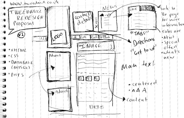
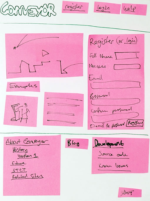
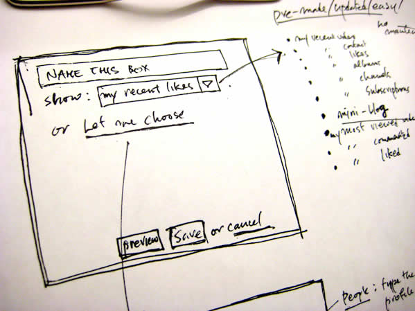
There is a fuzzy line between what constitutes a paper prototype and a wireframe sketch loaded with sticky notes. Although Danny originally tagged them as prototypes (which is perfectly valid in my opinion), I would like to expand the possibility that such design representations may have uses beyond paper prototyping. Instead, sticky paper can also be used in the conceptualization stage in which wireframe generation and sketching fall into. Could this then be called a stickyframe?

Stickyframing, or the idea of using sticky notes combined with sketching can bring great value for a design process. The strength of such a combination is the decreased effort for changes or modifications provided by stickies, while at the same time having the immediacy and flexibility of ideation that sketching allows. Sometimes during paper sketching we’ll draw out an interface element and then we’ll want to reposition it. At other times, we’ll want to redraw an element while the remaining interface parts are perfectly fine. In both of these situations, we’re often forced to redraw the whole page view as we generate more design knowledge. Stickies of course help combat such inefficiencies.

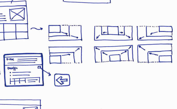
On the same note, an emergent thought comes to mind which further could extend stickyframes – digital photography. Just the same way as Danny Hope took pictures of the various page views and posted them on flickr, the same could be done in a design setting. Photography could not only allow for the various interface states to be frozen as a future reference. More so, photographing sticky wireframes could allow for a reuse of various elements (or their states) across different pages. It’s just a thought, as the fight for increased document agility continues on.

Credits: Danny Hope

Isolated & Referenced Elements

Monday, January 12th, 2009


This is an interesting sketching technique provided to me by Jonas Löwgren, which separates individual interface elements from the page. Here, individual elements are taken out from the page view and then referenced back to a mini version of the page which contains a structural representation. More so, the page structure only lives in one area (the centre). Nearby each sketched element there is also some faded hinting of what is around the element. Taken together, this increases the speed in which the sketches can be generated, as there is less need to redraw full pages with all other elements.

Secondly, this technique also has the strength to emphasize particular elements as they speak back at us with a louder voice. The isolation of various items, freed from the page view makes them stand out more. There are also other submitted samples (here and here), which also made use of this technique in a wireframe context.

Credits: Jonas Löwgren

Pulldown Contents Sketch

Sunday, January 11th, 2009


Need to scribble the contents of a pull down menu quickly? Sockyung uses a pretty straightforward sketching technique of a bulleted list on the side margin and an arrow reference.

Credits: Sockyung Hong

Onion Skinning Animations

Sunday, January 4th, 2009


When an interface element changes position or size over time during an animation, the path it takes can vary. Onion skinning can help indicate the various paths of an animation.

Credits: Michel Vuijlsteke