August 25th, 2009

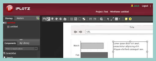
iPlotz is a great web based wireframing application. There is no point in hiding that at first glance the tool resembles to some degree the sketchy feel of Balsamiq Mockups. However, upon further investigation, iPlotz stands out by extending the wireframing process with project management. The hosted application offers the ability for different users to collaborate around a project. For each project, tasks can be assigned and degrees of completion can be measured. More so, iPlotz provides a version history feature for wireframes which is quite unique. The version control feature allows designers to mark wireframes as milestones as well as revert back to older ones.
Being an Adobe AIR application, iPlotz comes with both a hosted and a stand alone format. This wireframing tool also contains interface elements that meet web application as well as iPhone style requirements. IPlotz also has support for masters, libraries, clickable prototypes, and annotation.
Try the demo right here.
Posted in Tools | 6 Comments »
August 20th, 2009

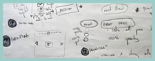
Selfish. That’s right. Sketching for an audience of none other than oneself I’ve noticed to be really elevating and empowering. Ideas are represented as messy chicken scratches along side each other which no one but the original designer understands. Ideas are not bounded with a border and are very close to being without any structure. In this way, ideas are also offloaded onto a piece of paper more rapidly as they are formed in the mind. At least I find, that not having to worry about the communicative value of these infant ideas results in more speedy exploration. For myself, sketching in this manner is also a way of embracing uncertainty which gives more opportunity for questions to rise. Looking back through some of my own work, I’ve noticed that often with these messy selfish sketches I sometimes record such emergent uncertainties. Each time a question pops up in my mind, I draw it as question mark inside of circle right on the page. These new considerations are later tackled in future revisions or more refined sketches such as visible here.
Visible through this example, perhaps the importance of communication in sketching is emphasized. At times, yes, it is important to share and communicate your ideas with others. That’s where structure and clarity comes in to aid. At other times however, it is also important to set proper conditions to allow communication to happen between just you and yourself. That’s where more free form and unstructured representations such as these might be more useful. I’d say that making room in a design process for sketches which can communicate in these two distinct ways, is equally important.
Credits: Jakub Linowski
Tags: annotation, linowski, sketch
Posted in Samples | 2 Comments »
August 18th, 2009

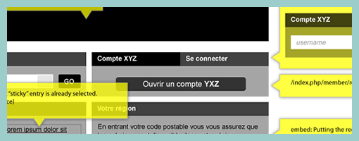
Here is a cool idea by Benoît which combines annotations with interface visuals into one coherent whole. Typically annotation bubbles were reserved for textual information, yet this sample extends it to contain more elaborate visual elements. More so, some of these annotations visible here also contain multiple variations of an interface suggesting some sort of multiple state representation.
Credits: Benoît Meunier
Tags: annotation, colour, referencing, states, wireframe
Posted in Samples | 4 Comments »
August 13th, 2009

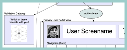
Scott’s sample shares resemblance to the previously shared wireflows posts here and here. One thing it does a bit differently however is that it combines interfaces representation which differ in size or scale. Larger screens are mixed with smaller ones. More so, this example here also represents both interface screens (or what the users see), as well as user activity (or what the user does).
Credits: Scott Dudley
Tags: activity, states, user flow, wireframe
Posted in Samples | Comments Off on Mixed Scale Wireflow
August 11th, 2009

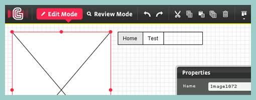
Hot Gloo is another alternative online wireframing application on the rise to keep an eye out for. This flash based tool has been designed by IA’s for IA’s in Germany. Last week they finally opened up and released their first beta version. The interface feels slick, supports a grid, auto alignment, and a some basic drag and drop elements. The tool also has two modes of working, edit and review modes, which support design and annotation activities. An interaction panel is also present which allows designers to specify events and some conditionals. Pretty cool …
Sign up for the beta from here.
Posted in Tools | 3 Comments »
August 5th, 2009

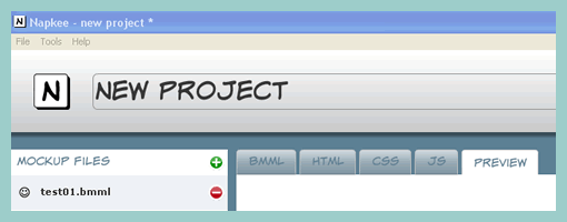
Napkee has just launched their first version this week. Napkee is a nice little application which transforms Balsamiq Mockup files into interactive prototypes. You import your BM files, and export into FLEX or HTML resulting in clickable prototypes. Great idea. The founder, Enrico, sums up Napkee the best:
Well, I think that the idea behind Balsamiq Mockups is absolutely brilliant, so is the founder Peldi and his whole team. I also think that a software that allows you to give life to your mockups is a valuable addition to Balsamiq Mockups and it helps you in your daily job. That’s why I created Napkee. It enables you to create working prototypes of the web application you are designing, and with some adjustments you can add interaction, modify the look’n’feel, and make your prototype ready for a usability session.
Visit the site here.
Posted in Tools | 3 Comments »
August 4th, 2009

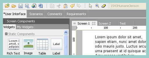
Justinmind Prototyper is a standalone prototyping environment which allows designers to prototype, simulate and collaborate. Currently two products are offered which include the Prototyper and Server. The Prototyper, as the name indicates, is the core tool for creating interfaces representations at a wireframe level of detail. Some of the features include: the ability to drag and drop interface elements, easily change and reuse components with masters, define scenarios and flow, define events and interactions, as well as inject real data into the prototypes. Justinmind Prototyper also supports capturing requirements in text form, exports to HTML, and allows for inserting external native widgets in the form of HTML or Flash objects.
Then comes Justinmind Server. It is a separate product which allows numerous people to join in and collaborate around the created prototypes. Here users can comment and annotate the work. A dashboard overview is also available which shows the latest discussions for each project.
Give it a try right here.
Posted in Tools | 15 Comments »
July 30th, 2009

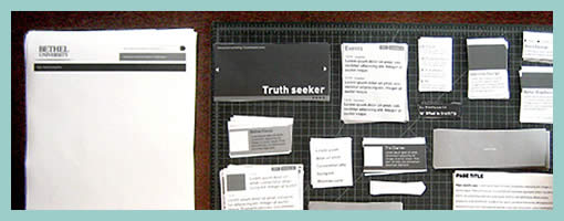
Paper Wireframing is an article by Doug on his process work with an approach which relies very much on paper and scissors. A technique like this has been noted in the past to be engaging and collaborative. Perhaps what sets this method apart from the previous example, is the use of electronically generated content whose copies are then printed numerously for the generative session.
Doug writes:
The idea behind Pwireframing (again, wireframing with paper) was to make the regular wireframing process more modular and collaborative. Instead of having a designer simply follow the instructions of a strategist, we started by discussing all possible contents of pages as a group, including syndicated feeds Bethel is currently maintaining. We also made some decisions about feeds or content Bethel would be likely to bring online in the near future. After this, I drew and printed modular drawings of all of the types of content we talked about, and cut them into sets.
Read the full article.
Credits: Doug Gapinski
Tags: sketch, wireframe
Posted in Samples | 3 Comments »
July 28th, 2009

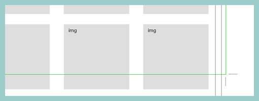
Here is a quick way of setting page boundaries on long scrolling pages. Aluísio has applied and made visible some sort of page crop marks on his wireframe. This approach could be used to give a stronger sense of the relationship between the wireframe and the page screen to show what is visible and what is beyond the fold.
Credits: Aluísio Barcelos
Tags: scrollable, wireframe
Posted in Samples | 3 Comments »
July 23rd, 2009

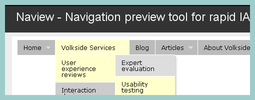
Naview is small web based tool, built by Volkside, for generating prototype like hierarchal navigational structures. The tool allows information architects to specify a tree based hierarchy using tabbing and line breaks, which spits out an interactive prototype of the navigation. Volkside state that with this little piece of software they try to “bridge the gap between card sorting and IA user testing”. Pretty cool!
Posted in Tools | 6 Comments »
