July 21st, 2009

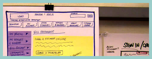
Keith relies on a similar technique to the Stickyframes approach posted earlier. His approach differs in that it mixes a number of techniques together. These hybrid interface representations mix sticky notes with sketching, sketches with flows, and anything else he comes up he just posts up and groups on a wall in a sketchboarding manner. Here is what Keith writes:
I’ve been creating wireframes since the late nineties and in retrospect have always relied on hand sketching and rapid ideation to solve my UI/UX problems.
This example is not unlike the Stickyframes example currently posted on your site. The difference with my approach is that I use color to begin to organize the chuncks of content or functionality. I also attach sticky notes containing mindmaps, flows, or mini sketches of interfaces. The grouping of ideas and sketches stay put until I have sorted out the actual page layouts to be rendered in Visio or AxureRP. The result is a moodboard for ideas which allows me to swap out thoughts until ideas are fully baked. I’ve had success sharing these with clients and collaborative teams early on in the process because they appear to be work in progress.
While I love working at a larger scale on whiteboards, these are a portable alternative for negotiating screens.
Credits: Keith Tatum of Resource
Tags: colour, sketch, sticky notes, wireframe
Posted in Samples | 1 Comment »
July 20th, 2009
Ta da. Three people entered last week’s contest for a chance to win a copy of FlairBuilder. The winner is Keith. I determined the winner by asking participants for a random number between 1 and 10, ordering their first names alphabetically, and counting through the names with the sum of the numbers provided. Congratulations! Here are the people who participated along with the provided numbers.
- Fabian – 7
- Keith – 6 – Winner
- Luis – 7
I plan on posting, Keith’s sample tomorrow, as well as hope to do another one of these sometime in the future. New ideas are more than welcome!
Posted in Announcements | 1 Comment »
July 16th, 2009

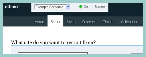
Ethnio is web based user research recruitment tool developed by Bolt Peters – a company which specialized in remote user research. The tool makes it super easy to create user recruitment screeners which can then be attached to any web site. The screener is basically a popup window that asks web site visitors if they would like to participate, followed by a few custom questions. Ethnio also comes with a control panel that allows the recruiter to see an overall status of the recruiting process, as well as the ability to contact the ones which are of most interest. Naturally, Ethnio can be combined with screen sharing software such as UserVue or GoToMeeting, for the actual remote research part. Great little tool!
Also, be sure to see the awesome screencast which explains the product perfectly in a humorous way. Ethnio also offers a trial for the first 20 recruits.
Posted in Tools | Comments Off on Ethnio
July 14th, 2009

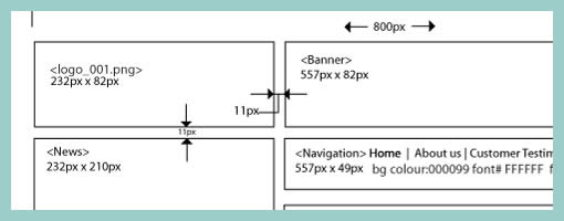
Often while wireframing, we delay considerations for exact sizing till later in the process. However, at other times, the designer may wish to portray some form of pixel dimensions explicitly. Here is one way to accomplish just that and communicate a wireframe’s dimensions, be it margins, widths, heights, or in between spacing. Lukas in his sample did this with the help of a few simple arrows and associated numbering. The nice thing about this approach is that it moves one step closer into putting a wireframe into some form of dimensional perspective.
Credits: Lukas Tomski
Tags: annotation, wireframe
Posted in Samples | 6 Comments »
July 9th, 2009

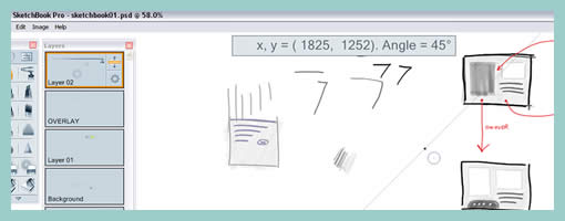
SketchBook Pro is a very nice little application which feels like it sits somewhere in between paper and the digital world. The tool is probably more geared toward people who are equipped with a pen and tablet that makes it a lot easier to draw with than with a mouse. After playing around with it for a few minutes, one advantage became apparent over traditional paper based sketching techniques. Sketching on an electronic canvas along with the power of layers and undos at your disposal, offers the ability to refine and change more flexibly than on paper. Sure, there are those people out there who will argue that all sketches should be kept and not erased so that the process is made visible. Nevertheless, sometimes little corrections still have to be made and software such as this makes it a breeze.
I’ve noticed a couple of other great features with SketchBook Pro. There is a ruler tool that allows you to draw straighter lines when required. Then there is the marker which looks great and has a similar effect to the water colour style of real world makers.
Grab the 15 day free trial here (and click to “software trials” item).
Posted in Tools | 7 Comments »
July 7th, 2009

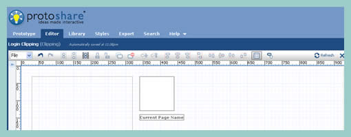
ProtoShare is a fully web based prototyping tool developed by a company called Site9. The third version of this product has been released in early April which brought forth improvements to performance as well as to collaborative aspects. ProtoShare offers such features as page templates, collaborative discussion, interactive prototyping, support for multiple states, drag and drop interface elements, and export functions.
A few features of ProtoShare also make it stand out from other tools on the market. For one, ProtoShare offers increased reusability of interface elements with the help of clippings. Clippings allow to save and store common pieces of an interface onto a flexible clipboard, which can then be pasted and repasted easily wherever required. Another interesting direction in which ProtoShare is moving into is by allowing to attach custom CSS styling to elements, and in turn providing greater flexibility. Being web based, ProtoShare also allows you to save your work online.
A few weeks ago, ProtoShare has also began experimenting with an iPhone prototyping mode that is currently in beta. By allowing users to export their prototypes into HTML, the software makes it easy to preview the resulting work in an actual iPhone. A detailed post on this topic can be found here here.
Signup for a 30 day free trial.
Posted in Tools | 3 Comments »
July 6th, 2009
Craving some new UI design techniques, I decided to do a little call for participation that will end with a software giveaway. In return for some new sample submissions (from you), we’re giving away one full license of FlairBuilder – a cross platform wireframing tool. The winner will be determined randomly. Want to join in? If interested, here is what you need to do:
- Submit your own wireframe, sketch, UI design technique, user flow, persona, time based interactions, or any other UI/UX design documentation or technique, by email to me.
- In the same email, provide a number between 1 and 10 (which will be used to determine a random winner). :)
The draw will take place on July 20, and your sample has to cover a technique or approach previously not seen on Wireframes Magazine. By submitting, you should also be comfortable with me posting your work or approach online. Please send em in …
Posted in Announcements | 1 Comment »
July 2nd, 2009

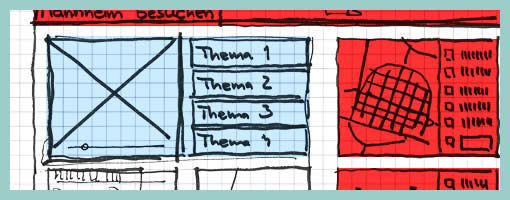
Similar to the recent sample, here is another one also from Uwe showing a more digital approach to colour overlays. I can only speculate that a paper based sketch was imported into the computer in order to colour it with some sort of transparencies. Perhaps what’s interesting about such a mixed media approach is the visibility that colour was an after thought in the process.
Credits: Uwe Thimel for kuehlhaus AG
Tags: colour, sketch, wireframe
Posted in Samples | 7 Comments »
June 30th, 2009

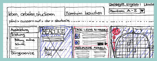
Uwe has recently published his wireframe sketches in which he uses a number of interesting techniques. One of these techniques is the use of rapidly generated hatched colour overlays on top of his sketches. Coloured lines are basically drawn over desired interface sections in a diagonal manner. This fast application of colour has at least two benefits. First attention can be drawn to coloured elements as they stand out more. Secondly, associations between coloured elements spread out over numerous screens can be made more easily when sharing sketches with others.
Credits: Uwe Thimel for kuehlhaus AG
Tags: colour, sketch, wireframe
Posted in Samples | 4 Comments »
June 25th, 2009

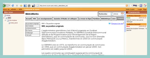
ax_admin is a software product which enables commenting on Axure HTML prototypes. Yes, Axure has collaborative creation features, however these are only supported while working within the software and not after an export. Should you wish to obtain feedback on an exported prototype, ax_admin jumps in to fill this gap by wrapping it with an additional interface. The software is web based and claims to have support for comments by RSS, comment status, and direct URL linking to specific pages.
Have a look at the demo here.
Posted in Tools | 1 Comment »
