December 24th, 2009

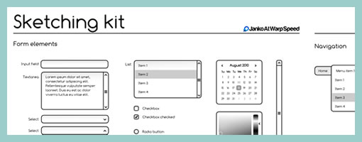
Here is a vector based wireframing template freebie released by Janko:
The Sketching & Wireframing Kit is a free set of elements for sketching and wireframing. It consist of form elements, icons, indicators, feedback messages, tooltips, navigation elements, image placeholders, embedded videos, sliders and common ad banners.
The Kit comes in two vector formats, one for Adobe Illustrator and the other in SVG vector format that can be easily modified. It can also be downloaded in PDF and EPS formats. The kit is completely free, which means that you are allowed to use it for personal and commercial projects. You are not allowed redistribute it.
Credits: Janko Jovanovi
Posted in Templates | 1 Comment »
December 22nd, 2009

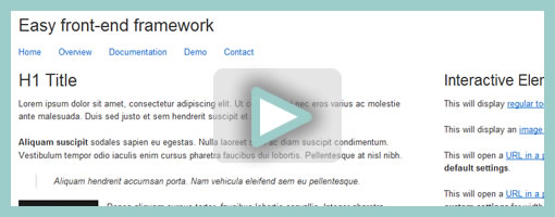
Easy Front-end Framework is another interesting compilation for speeding up the process of building HTML web sites or prototypes. The framework brings together and combines pieces of HTML, CSS and Javascript in order to ease development. For example users can easily set up a simple grid layout by means of equal width percentages or fixed widths. Furthermore, a number of interactive elements are also available which make it possible to inject such common prototype interactions as: popups, tooltips, navigation, jump to scrolling, and standard form validation. These interactions, although heavily based on jQuery, could still be very much useful for HTML based prototyping.
Have a look at the demo page to get a sense of what’s possible.
Credits: Alen Grakalic
Posted in Tools | 1 Comment »
December 17th, 2009

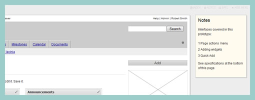
Protokit is an emerging experiment of Michael (konigi.com) targeted at those who like creating HTML prototypes. Protokit is a toolkit composed of existing Javascript libraries which work are combined to together to make the process easier. Hats off to open source prototyping. :) Also be sure to have a look at the working online demo. The toolkit is best described in his own words:
Protokit is a toolkit for creating HTML prototypes. It uses the following open source libraries and plugins: Blueprint, jQuery, jQuery UI, jQuery Templates, and iXEdit. More information about the included libraries and their licensing agreements can be found in the README file.
Credits: Michael Angeles
Tags: opensource
Posted in Tools | 1 Comment »
December 16th, 2009
Here we go. Five people entered the recent contest for a chance to win three accounts to Creately. This time I just used random.org to get the winning numbers. :) The winners are: Juan Jose Vidal (post coming up), Daniel McQuillen and Chris Neale. Congratulations! And thanks for creately.com for providing the accounts.
Posted in Announcements | 2 Comments »
December 16th, 2009

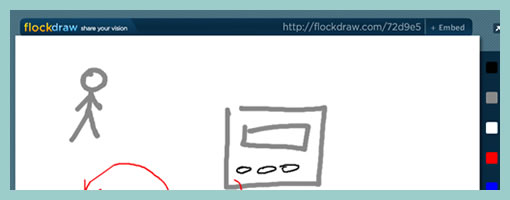
FlockDraw is an online collaborative drawing tool. It looks like it has some interesting potential for those times when you need to sketch something out together in real time and it’s just not possible to meet face to face. This flash based tool allows to create separate rooms for each sketch which are bound to unique and sharable URLs. The software is very light weight with the first version being released just last month and there is still room for improvement. The slight bothersome usability issue lies around the fact that the toolbar does not indicate the selected tool, nor the selected state of each tool (ex: brush size or color). Other than that, I’m looking forward to eyeing this little app into the future.
Try it out here.
Posted in Tools | 3 Comments »
December 10th, 2009

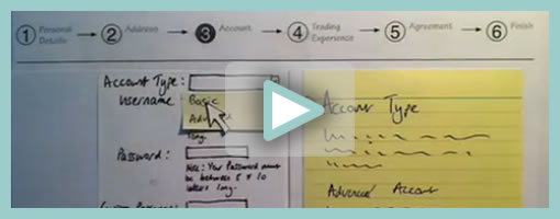
Superb. Very similar to the previous post on Protocasting, here is Chris’ approach to creating quick paper prototype animations which tell stories of rich interaction. This stop-frame animation approach requires a web cam, some video editing software (Quicktime in this case) as well as a desk attached rig to ensure things are visually stable. For showing changing text, Chris uses an erasable pen and overlaid acetate on top of the desk which he calls ‘the stage’. This powerful technique, which portrays interaction seamlessly, is a critical move forward if we are to battle change blindness brought on by shuffling disrupted and disjointed screens. In his own words:
The desk is the stage, and the action is framed inside a print-out of an empty browser to give it context. I wanted it to look so simple and sketchy that nobody could possibly confuse it with a design, so I used paper, card and Post-Its to build up the scene and laid a sheet of acetate on top, which I wrote on with OHP pen. There’s a rather crude cardboard mouse-cursor and a rotating paper ‘in progress’ icon.
There are 8 animations in total, each of which illustrates part of a user journey through the form and highlights complex validation behaviour I’d found tricky to explain. I was a bit worried that the developers might think it was gimmicky, but the novelty wore off quickly and they rapidly moved on to focus on the content. Because the videos illustrated a lot of the main ideas, everyone involved was spared long, tedious meetings talking about display conditions and validation behaviour. This was a big win.
The whole process is really quick and, most importantly, fun – developers and stakeholders engage fully even with dry subject matter. Non-techies can get involved too because the animation software only has about 3 buttons. Unlike with Flex or AJAX, there’s no learning curve.
Animation is famous for taking ages, but doing animations like mine is remarkably quick providing you’re tooled up and organised. It took me about half an hour to set the scene, based on some wireframes we’d already done. Then each animation took about 15 minutes.
Credits: Chris Neale
Tags: activity, prototype, sketch, states, sticky notes, user flow, video
Posted in Samples | 6 Comments »
December 8th, 2009

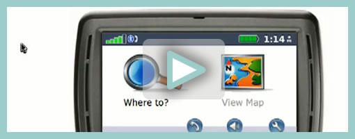
Here is an interesting description of a protocasting technique brought to you by Theresa Neil (which she credits to Todd Zaki Warfel’s book on Prototyping). Basically a bunch of screens are first exported into PDF, then turned into a clickable prototype, and eventually a happy path is recorded as video and annotated with audio. I think it’s great to see an approach to prototype walk throughs which alleviates the pressure on the viewers to discover the interaction by themselves (a problem present in many prototyping tools these days). Instead, the viewer is guided through time and the designer covers the intended flow as a presentation. If prototyping is partially about leading the viewer to believe that the fake product is a real one, then Theresa’s protocasting approach achieves this perfectly.
Credits: Theresa Neil
Tags: activity, prototype, user flow, video
Posted in Samples | 6 Comments »
December 3rd, 2009

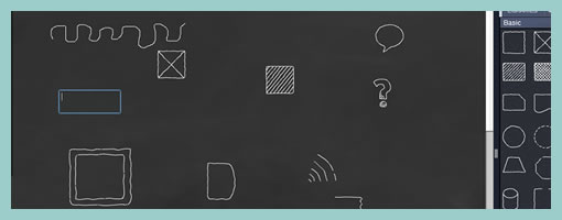
SimpleDiagrams is a very light weight AIR application for creating diagrams which has been just released early last month. This little and simple project has been started by Daniel McQuillen with the intention of describing user experience flows. Speaking to Daniel, he might be willing to incorporate some pieces of the Interactive Sketching Notation in future versions. Look out! :) In his own words, some of the features include:
* Drag, drop and size symbols from libraries
* Add photos and post-notes
* Various background styles (chalkboard, whiteboard, etc.)
* Save diagrams on your computer
* Export your diagram to PNG
Try it out here.
Posted in Tools | 4 Comments »
November 30th, 2009

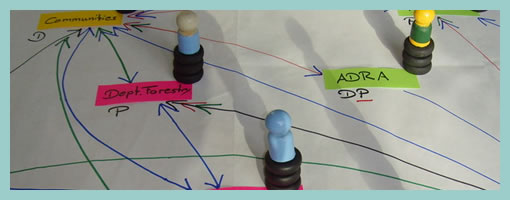
The Net-Map Toolbox is collaborative and physical tool developed by Eva Schiffer with the aim to visualize influencers in a social context. The maps generated with this approach are a snapshot of a social setting with key influencers being emphasized (raised). I found it interesting to see an attempt to capture more complex social situations with multiple people in the equation. In Alan Cooper’s book, The Inmates Are Running the Asylum, the traditional direction given was to design for a single user. Could this rule be breaking down today in light of designing for more complex contexts? Here is a description about the toolbox directly from the Net-Map website:
Net-Map is an interview-based mapping tool that helps people understand, visualize, discuss, and improve situations in which many different actors influence outcomes. By creating Influence Network Maps, individuals and groups can clarify their own view of a situation, foster discussion, and develop a strategic approach to their networking activities. More specifically, Net-Map helps players to determine
* what actors are involved in a given network,
* how they are linked,
* how influential they are, and
* what their goals are.
Credits: Eva Schiffer
Tags: activity, colour, sticky notes
Posted in Samples, Tools | Comments Off on Net-Maps
November 27th, 2009

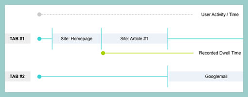
Here is an interesting idea of showing a user’s experience in the context of multiple browser tabs. In the modern browser it’s quite popular that people spend their attention in various modes of activity as they switch back and forth. Nik here tried to capture just that in a diagram which shows the currently selected tab over time. I guess it’s interesting to see a sample which aims to represent multiple potential activities that the a person can engage in, instead of a single over simplified linear one. Even more generally, a diagram such as this perhaps could even step above tabs and represent tasks or activities outside the browser just as well. Nik writes:
I’d like to share a little chart I put together to illustrate the concept of Dwell Time. This has come up more and more recently as clients are asking if the recent trend in tabbed browsers is responsible for an observed upward trend in reported dwell times.
I think one thing we should bear in mind is that a high dwell time can be both good and bad, not just because we may be including time spent on another site (in another tab), but also a high dwell time on an experiential site would be considered a good thing. However similar values on a registration form may suggest usability issues.
Credits: Nik Lazell
Tags: activity, user flow, user journey
Posted in Samples | 5 Comments »
