


Sticky Floating Navigation
June 30th, 2010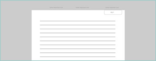
Cross posting from another blog, I thought to share one more little UI / Javascript / CSS experiment. The idea was to come up a few navigation elements which can behave as both floating (fixed positioning) and scrollable at different times. As a user scrolls, these elements feel as they somewhat stick to other parts of the interface (a central container), and hence the name. Please have a look at the quick and dirty prototype and let me know your thoughts.
Whether you call it an emerging UI pattern or an experiment, the main reason why I did this was to get a better feel for the interaction in a real life project. I also wanted to convey the idea of such a navigation to the client, and visual representations such as sketches or wireframes just weren’t adequate.
Beware, the code is ugly. But then again it’s a prototype, so who cares. :)
Credits: Jakub Linowski
12 Responses to “Sticky Floating Navigation”


June 30th, 2010 at 1:36 pm
Nice prototype.
I've seen a fair number of things that act like the help widget, but the footer is intriguing. Do you envision allowing a user to expand it without scrolling to the bottom of the page?
June 30th, 2010 at 1:52 pm
Hey Jeff,
At least in this case, the footer is already expanded so the user probably doesn't need to scroll down. Although an expandable interaction could work as well if there was more content inside.
June 30th, 2010 at 3:03 pm
OK Cupid has been doing this with advertisements at the bottom of their left-hand bar. The ad is typically at the bottom of the bar, but as you scroll past that bottom bar, the ads float down with you.
June 30th, 2010 at 3:42 pm
I am doing a redesign at the moment and I've been looking at options like this. In fact I've been thinking about this a bit too much…
My biggest concern is by having bands/bars locked to the top and/or bottom of the window we're restricting the users potential viewport size. I get annoyed at the diggbar, stumbleupons bar, and other sites with sticky elements.
I've seen sites that ruin the sense of scrolling by having far too much content stay fixed. It makes it feel like the scroll bar is broken. Or that the giant scrollbar on the right of the browser is only affecting one small content area on the page.
Also we've been fighting this war against 'Above the fold mentality'. Are we shooting ourselves in the footer if we start glueing content, that users *will* scroll to, to the fold itself? If content flows past the fold, it's a great visual cue that the user can scroll down. By having the footer at the bottom of the page, it could confuse users into thinking that's all there is.
As for your prototype I think the help button works well, and if there's some navigation elements in the footer that you do want always visible move them to the top like the help button.
Two nice examples: http://www.calicott.com/ http://davidwalsh.name/persistent-header-opacity
(I liked the added reduction of opacity on the second one)
June 30th, 2010 at 7:24 pm
I like the idea of having some information accessible no matter where I'm at on the page, but I prefer to have the largest area possible when viewing the content. For this reason, I don't like the fact that the Help tab hovers above the content. I'd like it better off to the side.
And is there really any content in the Footer that's so important as to cover up that much of your main content? I tend to use my Footers as a site map with a quick link to many areas of my site, but if I've got a link that's that important it probably shouldn't be in the Footer in the first place (or at least not only in the Footer).
June 30th, 2010 at 4:44 pm
I like the concept, but I am a little lost as to why you would want a footer visible all the time. It seems to be counter to what the point of putting something in the footer is in the first place.
Overall a very nice feel and has potential.
July 1st, 2010 at 3:00 am
I like it. I think that this could eliminate the "Back to Top" link. For example a blog with infinite scroll could benefit from having an element which would provide the global navigation. I can also imagine it as an ecommerce cart. If products were drag-n-drop it could provide a unique shopping experience. I agree that the footer seems odd.
July 1st, 2010 at 6:42 am
Hi Jakub, that's an interesting concept!
I recently noticed The Next Web doing something very similar with their "Quick Comment" panel on the left hand side: http://thenextweb.com/eu/2010/07/01/today-finland…
It certainly seems like an emerging design pattern so I reckon we should come up with a descriptive name – anyone? :)
Cheers, Jussi
July 1st, 2010 at 11:48 am
A similar pattern has been used to persist the gadget dock in the viewport on http://www.ziggo.nl. The footer is only revealed when you scroll down to the bottom of the page.
July 2nd, 2010 at 1:29 pm
I saw this and thought of this new trend in web design to have all your content on the home page but then create a navigation that scrolls the browser to the desired content. For example, http://www.blueskyresumes.com/about-us/#our-team. I also thought of those gallery sliders that are like blinds back and forth. (ex. http://www.ohwrite.co.uk/files/slinkySlider/demo…. What if you were to flip that example vertically and each bar would be a link to the content one long page. And if you were to scroll through this long page each bar would be fixed to the header of the content as it scrolled past.
Some interesting stuff.
July 2nd, 2010 at 7:15 pm
Check out the nav for vowsjs – reminded of this article.
http://vowsjs.org/
July 6th, 2010 at 3:34 pm
Some nice examples you all found! Thanks for sharing the links. I've noticed a few superior examples (faded and narrower than the column width) which tackle the issue of mistakenly making the scroll bar "feel as if it's broken".
@Jarrod. I'd say when the need arises for a larger visible screen area, these floating navigation could potentially collapse on mouse out.
@John Beckett. The floating footer could be useful when you have long scrolling pages and a multi step process. In my case I wanted to show very visibly a critical element such as the continue / submit button in a consistent location.