


Multiuser WireFlows
October 6th, 2009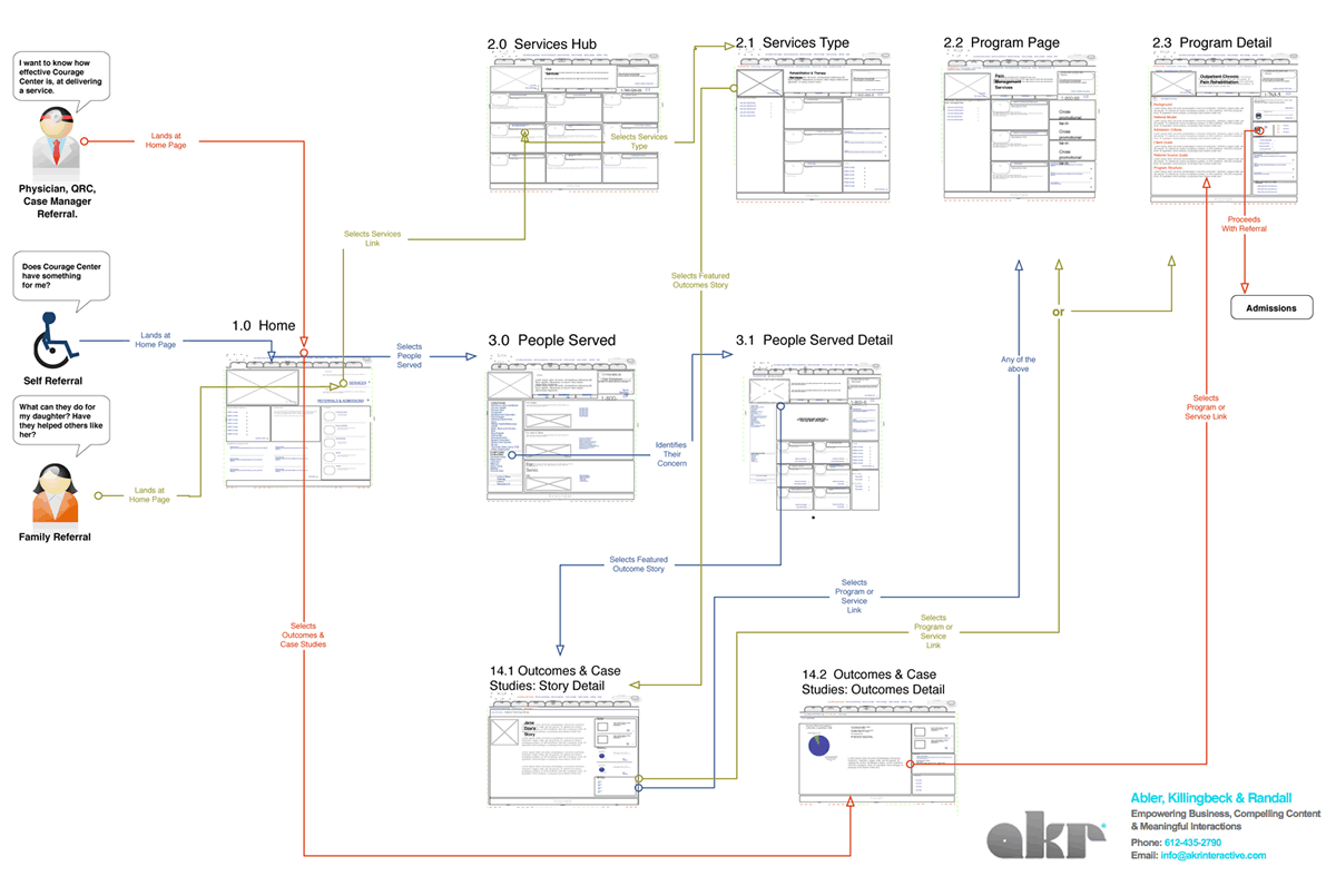
I enjoy seeing flows which try to capture more complex activities. After all, interfaces are under constant strain from various people which use it in a multitude of ways. Carlos has just shared a sample which represents a flow containing at least three different persons attempting to interact with the same interface. The different coloured paths uniquely indicate how the different users take twists and turns over the same screens. Come to think of it, the various users which start off the flow, could just as well be replaced with various use cases belonging to the same person type.
In his own words:
It shows three different persona on a navigational journey through a cross-linking architecture, that takes them through 2-3 different sections of a site — not including the home page, from which they all start. The “Self Referral” persona goes through three sections or the site: Who We Serve, Outcomes & Case Studies, and Services on their path.
The journey starts with the informational intent of the persona. From there you can follow their journey via a line colored for that persona, which describes action-events in brief notes on the line itself. The page thumbnails are the actual wireframes shrunk down. This document is meant to be read along side the wireframes, casting light on them, and vice versa.
Credits: Carlos Abler
6 Responses to “Multiuser WireFlows”


October 6th, 2009 at 3:11 pm
Very nice. I've been edging towards something like this myself but wasn't sure how legible it would be to anybody else. But this is clear and elegant.
October 6th, 2009 at 8:17 pm
Yep. The idea is for the wireframes and the persona driven navigation design flow paths to work side by side. One advantage of having thumbnails of the wireframes/page templates (as opposed to using an abstract section number), is that the lines anchor to the actual areas on the interface where the user clicks the links. This helps to reinforce the learning of the interface for the team and client. So for example where a note on a wireframe might say "Services drill down links send user to tertiary pages in section 2.1"; this is visually reinforced in the information design of the diagram. The native size of the document is 11×17, so while you can't read the type on teh thumbnails, you can pretty clearly see the page region the the lines anchor to.
October 6th, 2009 at 4:25 pm
I guess legibility is questionable. The wireframes can be referenced however when looking at the details becomes more important.
September 8th, 2011 at 9:06 am
Makes loads of sense. Bringing user personas into the basic stage of wire framing is very helpful!