Posts Tagged ‘annotation’

Wireframe Dot Annotation Applescripts for Omnigraffle

Friday, March 25th, 2011


Do you use Omnigraffle and annotate your work with little, round and numbered circles? Meredith just recently created a bunch of scripts which help with these dot annotations. The scripts automatically generate the numbers and thus make it easier to add and remove notes without having to readjust the numbering all the time on all remaining dots. Looks useful. Thanks!

In her own words:

The problem is that it’s not uncommon for me to have 20-30 dots on a single wireframe. What happens if I need a new “1″? Without a script, it means creating a new “1″ dot, then changing the old “1″ to “2″, the old “2″ to “3″, etc. I don’t have time for that!

Credits: Meredith Noble (Usability Matters)

Show/Hide Annotations Omnigraffle Script

Wednesday, March 10th, 2010


Love em or hate em, we still annotate our work be it for ourselves or others during a design process. Jason has just released some quick tips on how to setup annotations in Omnigraffle as to make them optionally disappear when exporting to an interactive prototype. The use case being, at times it makes sense to have annotations visible (documentation), whereas at other times it makes sense to hide them (prototype). The technique involves the creation of a few canvases and layers as well as running of an AppleScript. An example graffle file with the working script is also offered. I haven’t actually tried this one, but I hope it’s useful to some of you knowing that there are quite a few Omnigraffle users out there in the UX community. Thanks Jason! Enjoy.

Credits: Jason Kunesh of Fuzzy Math

Exposure Sheets (X-Sheets)

Friday, January 22nd, 2010


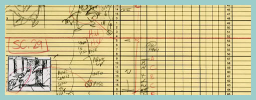
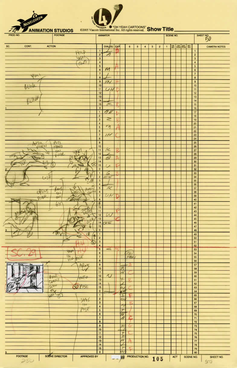
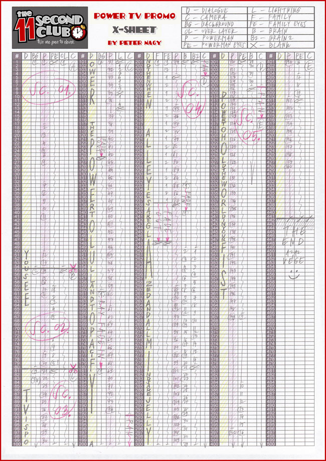
Traditional animators have been relying on sketching techniques of their own which I thought might be inspirational. Animators represent time with exposure sheets (aka. dope sheets) through which a large number of information can be conveyed to others. An x-sheet is pretty much a frame by frame representation of time to which notes can be layered on top. Some of these notes typically include information about: dialogue, camera angles, lighting, background and audio. Since timings of around 30 frames per second are standard, each xsheet is just a snapshot of a few seconds. Nevertheless, animators still find them useful as a communication artifact.

Here is what the people at Michael Sporn Animation studios have to say about these deliverables:

You see, when you get used to reading X-sheets, you see them as time. You don’t see the lines, you see seconds and footage, instantaneously. As an animator, you get an overview immediately of the scene; as a director you read the track, how the animator has constructed the scene, and what camera moves are indicated and why.

Here are a couple extra x-sheet samples.

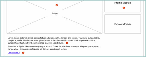
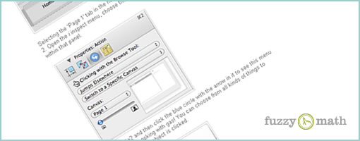
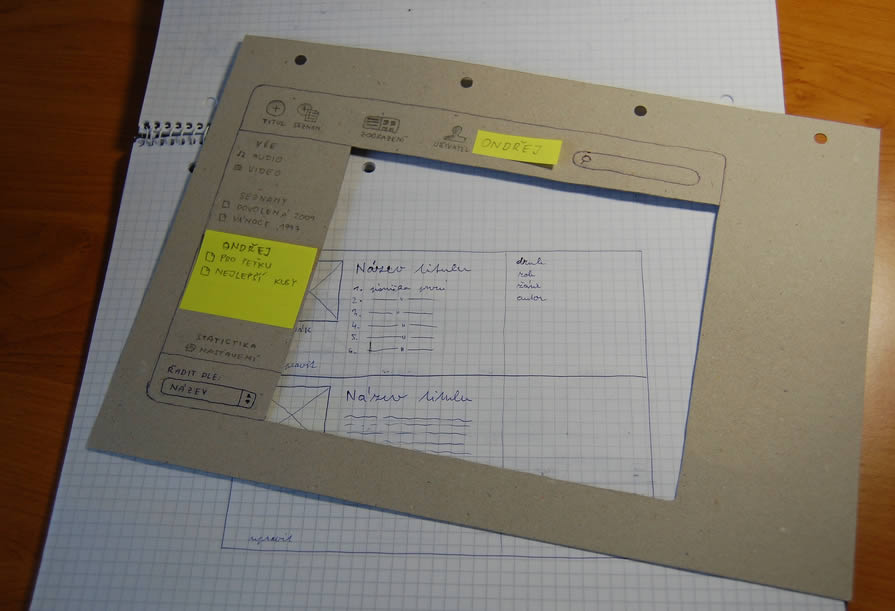
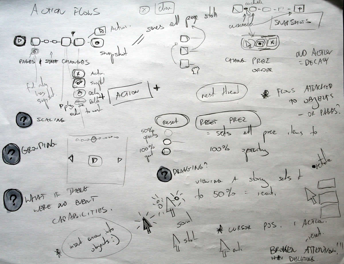
Of course x-sheets work for a passive medium such as film and it’s questionable of how useful they might be for interactive web applications. Nevertheless, I still wonder if some of these ideas can be useful to our field. What other information can experience or interaction designers “layer” on top of the existing deliverables that we are typically accustomed to? Perhaps it would be interesting to combine a user flow representation with a learning curve or effort representation? What ever happened to representing sound in a UI sketch? What about a wireframe referencing an x-sheet sketch for the times when we do use animation? Hey, and what about a user flow with one axis dedicated to representing time consistently? Just thinking out loud.

Credits: Jun Falkenstein

Paper Prototype Cutouts

Wednesday, November 18th, 2009


Here is a cool idea of combining multi layered interfaces in the physical world. Ondřej has created a paper cutout for this sketches that allows him to reuse parts of his interface by means of overlapping screens. Real world masters? :) In his own words:

As a part of a school project of mine I created such prototype. Having considered all the problems I’m going to resolve I’ve made a list of proper goals:

  1. I have to create a paper prototype of an audio/video manager app. I already have the creative brief and the technical brief.
  2. The prototype should contain all the screens and dialogue boxes of the app. It should be compact, easy to store, portable all-in-one solution.
  3. It should provide quick and fancy user testing.

I wanted to have the whole app in a single notebook. Because the app would have a single window interface, the solution had crossed my mind immediately.

The result with all its benefits you can see above.

  1. A page = a screen. Using such solution provides you with a lot of space around every screen. Put down some thoughts, notes and explanations.
  2. The main frame of the app can serve as a stencil when drawing new screens. Speeds ups the drawing process and keeps the notebook full of drawings clean and consistent.
  3. In addition, the space around every screen serves as a place for pop-up windows, dialog boxes and other elements made from post-it papers.
  4. The main frame stencil can hide all the stuff around a screen and turns a set of described wireframes into a testable prototype in a moment.

Take such prototype anywhere, create new screens in a bus or train, test with your mates during a coffee break and finally archive it next to your past prototypes. Worth trying, isn’t it?

Credits: Ondřej Válka

Visible Change History in Sketches

Tuesday, October 13th, 2009


According to Jason, sketches are never complete but only refined. They exist with the intention to pose questions and ask to be scribbled over on top. And that’s exactly how Jason uses them. He will make adjustments and modification straight over them with a red coloured marker. Thus in a way, all on the same drawing, the sketches become a layered representation of the initial idea along with the revisions. Although I personally prefer to use red to represent action items on my sketches, I still find this interesting approach in its power to visualize a history of changes. This makes me wonder though if there would be a systemic way to separate out all future sketch revisions from each other. Could there also be possibly a way to tag which sketched changes belong to which person (should there be multiple authors?) … ahh, just thinking out loud.

Enough of my thoughts. Here is what Jason really thinks:

I was sketching some designs for wireframe templates. The red is my way of calling attention to changes, questions, or comments about the design.

The neat thing about sketches is that what you see there is black and red. The black is my initial guess. The red is the correction to my initial guess. From there, I implement the changes in the live product. So, for instance, I opened my PSD and made the changes in there.

So the sketches are never really “done.” They’re done in the sense that I’m done using them. But they’re not done in the finished sense, they don’t reflect the final changes, other than by what I’ve written in red.

Credits: Jason Robb

Long Page Sketches

Thursday, September 10th, 2009


Quite often user interface pages will have to be long and scroll. As obvious as it sounds, here is a sketch which supports this. Jason has simply decreased the size of his frames and made them taller. On the same note, one of his sketches also makes use of a zigzagged line. I would guess that has been done to suggest a continuation of sorts, allowing him to communicate that there is more to the page without having to go into detail. I also like the heavy emphasis used on the title. Nice!

Credits: Jason Robb

Inpage Requirements

Thursday, August 27th, 2009


Ben just sent me a sketch which uses a number of techniques seen previously. One thing which is a bit unique perhaps are some of the short lists of requirements or goals which he combines with his sketches (seen on page 1 and 3). These seem to guide his thought process at the outset, and are often at the top of a page in the form of a list. Another cool thing he does is break up his ideas into some conceptual chunks with distinct titles that are highlighted. He also emphasizes his sketches similarly to some approaches listed earlier. To draw attention to certain elements, the thickness of borders is varied and some of the screens use colour overlays. Ben’s sketches are also occasionally loaded with question marks – something I’ve noticed to appear in my own drawings as well. Here is how Ben describes his process:

1. I usually lay down a 10% cool grey field where I am going to show “the screen” (or whatever object I am going to sketch)
2. I then draw in the frame of my screen, usually with a Sharpie. I like the effect of the bold border, and it helps me to set up a hierarchy within the sketch with different line weights (Staedtler 0.1, 0.3, 0.5, 0.7 mm black pigment pens)
3. Once I have the screen set up, I just sketch as needed, showing different levels of detail depending on what I need to document
4. I use a wash of blue (very light blue marker) to set off anything that I want to emphasize, red pen for interactions or to call out areas

Sometimes I use a light color pencil to add dimension or texture if I feel it’s important for the design, beyond that, it’s pretty free form.

Credits: Ben Rossi

Selfishly Freeform Sketching

Thursday, August 20th, 2009


Selfish. That’s right. Sketching for an audience of none other than oneself I’ve noticed to be really elevating and empowering. Ideas are represented as messy chicken scratches along side each other which no one but the original designer understands. Ideas are not bounded with a border and are very close to being without any structure. In this way, ideas are also offloaded onto a piece of paper more rapidly as they are formed in the mind. At least I find, that not having to worry about the communicative value of these infant ideas results in more speedy exploration. For myself, sketching in this manner is also a way of embracing uncertainty which gives more opportunity for questions to rise. Looking back through some of my own work, I’ve noticed that often with these messy selfish sketches I sometimes record such emergent uncertainties. Each time a question pops up in my mind, I draw it as question mark inside of circle right on the page. These new considerations are later tackled in future revisions or more refined sketches such as visible here.

Visible through this example, perhaps the importance of communication in sketching is emphasized. At times, yes, it is important to share and communicate your ideas with others. That’s where structure and clarity comes in to aid. At other times however, it is also important to set proper conditions to allow communication to happen between just you and yourself. That’s where more free form and unstructured representations such as these might be more useful. I’d say that making room in a design process for sketches which can communicate in these two distinct ways, is equally important.

Credits: Jakub Linowski

State Annotations

Tuesday, August 18th, 2009


Here is a cool idea by Benoît which combines annotations with interface visuals into one coherent whole. Typically annotation bubbles were reserved for textual information, yet this sample extends it to contain more elaborate visual elements. More so, some of these annotations visible here also contain multiple variations of an interface suggesting some sort of multiple state representation.

Credits: Benoît Meunier

Pixel Dimension Indicators

Tuesday, July 14th, 2009


Often while wireframing, we delay considerations for exact sizing till later in the process. However, at other times, the designer may wish to portray some form of pixel dimensions explicitly. Here is one way to accomplish just that and communicate a wireframe’s dimensions, be it margins, widths, heights, or in between spacing. Lukas in his sample did this with the help of a few simple arrows and associated numbering. The nice thing about this approach is that it moves one step closer into putting a wireframe into some form of dimensional perspective.

Credits: Lukas Tomski