Speech Bubble User Flow
Thursday, March 29th, 2012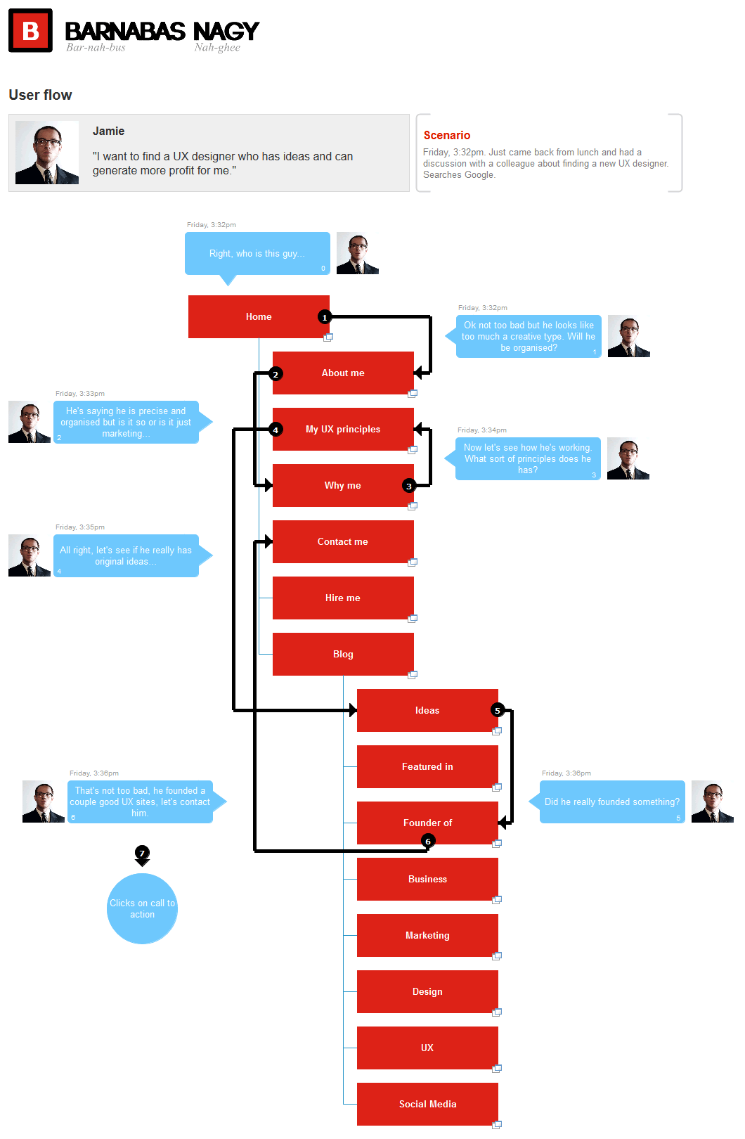
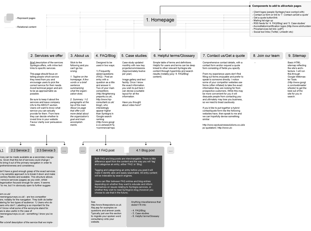
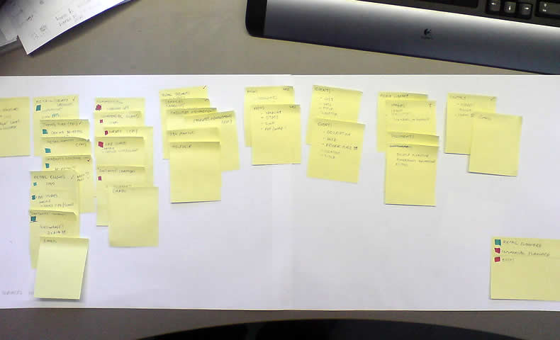
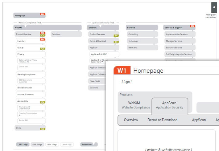
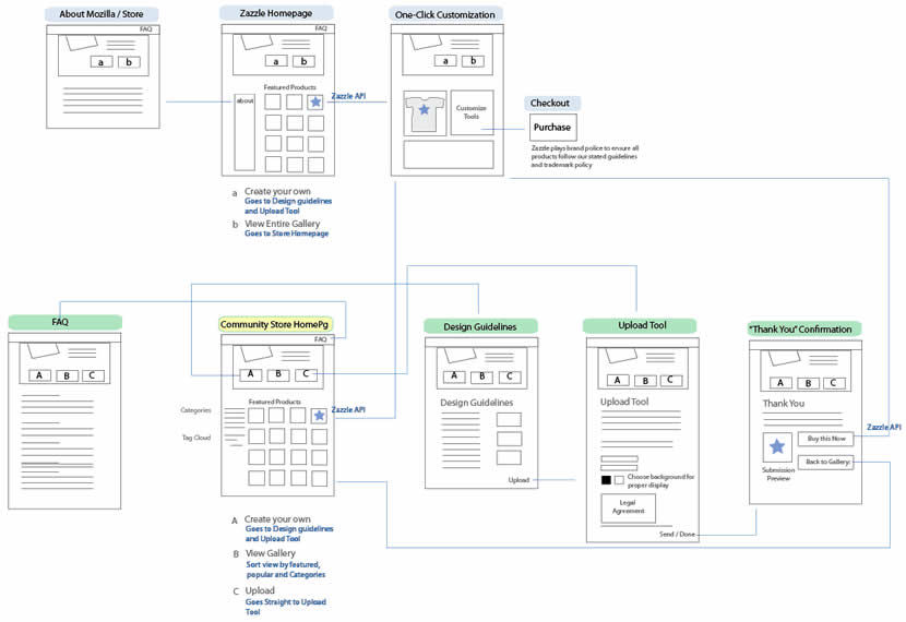
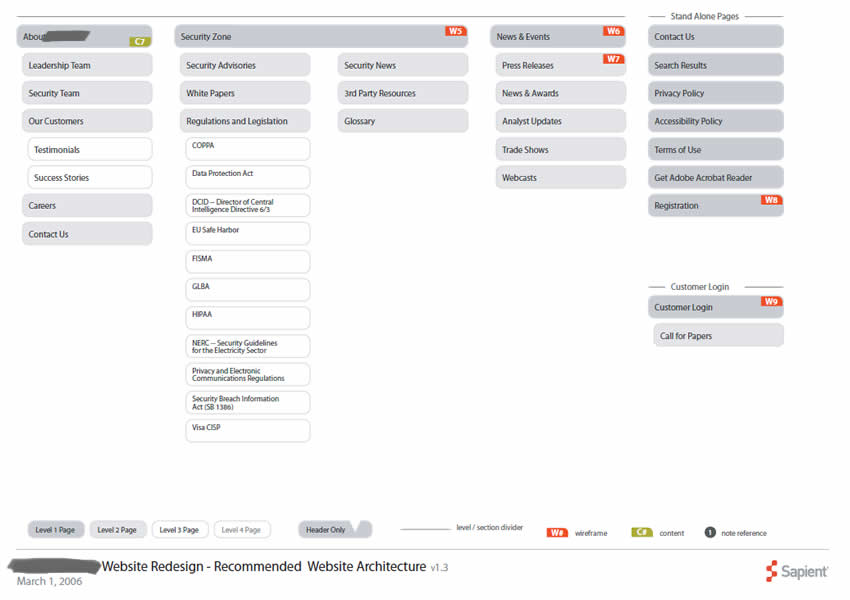
The Speech Bubble User Flow by Barnabas, is a hybrid representation that combines a sitemap, persona and user flow all into one. The idea starts off by overlaying simple and short comments made by a persona in the form speech bubbles on top of a structured sitemap. More so, the speech bubbles are ordered chronologically and so flow through one by one. In the built Axure Demo that has been generated, the sitemap pages are also linked to the wireframes which makes it easier to switch from the generic to the specific. Barnabas has been exploring Personas that “could talk” in a few other forms as well, as the Complex Speech Bubble Persona and the Commented Sitemaps show.
My take on this deliverable would be that Personas can sometimes get lost once a project builds momentum. Possibly what Barnabas is doing is helping the Persona to live a little bit longer and inspire the team a bit more as the Persona’s comments pop up throughout the project. One thing I do wonder about is how this would work though if there was a second or third scenario for the same user type, as sometimes I feel that interactive projects are composed of many little separate user stories and not just one. Either way, good stuff and thanks for sharing!
If you would like to tweak the deliverable, the author has been kind enough to share the actual source Axure file as a downloadable template.
Credits: Barnabas Nagy