


Wireframing Visual Priority with Tone
January 22nd, 2009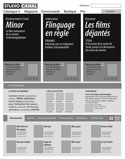
Here is a little challenge: wireframes don’t have to be dull. I’ve seen many wireframes, including my own, represent section areas in very monotone ways by using only single values of grey or just straightforward outlines. In such a case, all elements are perceived equally. Sometimes however as a function or section is being drawn up, thoughts surface about how important or unimportant a particular area really is. Often this thought is shoved aside as information architects by definition are not visual designers and hence it’s best to leave all things related to style alone. But is this really true? Perhaps it’s too early for styling at these phases, but I don’t believe there is anything wrong with documenting (or discussing) visual priority. Matthieu does just that. He varies tones of his sections and it really helps to rapidly visualize which areas are more critical than others. Secondly, in this same sample, font size is also used to denote the importance of text.
Such techniques open up doors for dialogue between information architects and visual designers. If waterfall methods are being challenged by more agile approaches, wireframes can become less hand off documents and more discussion tools. The reality is that traditional wireframes in themselves already steal two core design elements from visual designers. These two elements are positioning and sizing. All wireframes make use of size and position for all text, boxes and content areas. In this light it only makes sense for IA’s to work more closely with visual designers, because visual designers do not just style elements. Visual designers are masters in setting visual priority and controlling element relationships using alignment, positioning, sizing, tone, colour, text size, typography, etc. Talking with them early on could only result in better interfaces.
Quoting Matthieu :
My work is also the result of a method, mostly based on a daily collaboration with Interaction designers, interface designers and marketing strategists. I never work alone, isolated, producing wireframes and then trying to impose them. It is the result of frequent exchanges and documentation on strategy, benchmark, functionalities, and methodology issues. Designing wireframes is the last and (usually) the easiest part of the conception phase.
Designing the information architecture on a page is not only about placing the elements at the right place, it’s also deciding what’s important and what’s not on an editorial perspective. The level of importance of an element is not necessarely related to its size. For instance, an “Add to Cart” button can be highly important but will only cover a very small part of the page. Putting it inside a (visually) strong box can help emphasize it.
Credits: Matthieu Mingasson
11 Responses to “Wireframing Visual Priority with Tone”


January 23rd, 2009 at 2:44 pm
I am a designer first and IA guy second so this method is something I use often in the first stages of a project. It's nice to establish the grid, typography emphasis and navigation structure early , especially for projects where the budget is limited. I actually picked this process up from 31Three. Great post!
January 23rd, 2009 at 11:51 am
After sketching and 'stickyframing', I usually make HTML prototypes.
I'm now thinking it might be a good idea to add classes '1', '2', & '3', allowing elements to be prioritised. A standard style sheet can then be added for applying the kind of shading illustrated here.
Nice and simple.
January 23rd, 2009 at 8:02 pm
Love this idea. I tended to group related content by color in wireframes, but monochrome appears more logical. Enforcing the hierarchy by lightness rather than hue looks effective. Will give this a try.
January 23rd, 2009 at 11:58 pm
I have a design background so it really bothered me to design bland wireframes in the beginning. Now my wireframes are usually in colour. I choose one random color (usually the client's colour), grey and I follow the traffic light system for alerts (yellow), critical info (red), green (confirmation) and blue (information). I also use simple shades ans shadows. Other than that I always used different tones to convey visual priorities and different sized text. In the end I found that clients love them because they're easier to understand. And designers understand better the reasons behind my reasonings.
January 24th, 2009 at 1:12 pm
great! thanks for this post. i use monochrome wireframes after sketching idea to paper. Tone is more useful as colors in wireframing. thats true!
January 26th, 2009 at 7:25 pm
I 100% agree with Matthieu. The wireframe is the visual expression of all the discovery and strategy work. " Designing wireframes is the last and (usually) the easiest part of the conception phase." – This is usually how it goes on my teams too. I often don't even start wireframing until the designer (in partnership with me) has a chance to come up with a visual approach, I then take this basic concept and use it to influence the page layouts I create in the wires.
I think every designer will love you to death if you can give them a system for understanding hierarchy and prioritization of elements on the page. I often literally number elements on the page 1-XX. This method also works good in client discussions to get sign off on priorities.
Beautiful wire by the way:)
January 27th, 2009 at 3:02 pm
Great post. But however, when 'high def' wireframes are presented to our customers, they sometimes make me feel that my wireframes are 'better' than what they could actually see in the early graphical designed screens. I always feel a bit disturbed by these remarks, although 'force' me to explain the overall design methodology, offering clarity to everyone's job in the team. So go go for highly designed and interactive prototypes!