Structure Juxtaposed Wireframe
April 13th, 2009
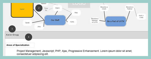
While designing the uxtestkitchen.com site, Dawn has come up with a navigation scheme which displays the site structure along with the current location at the very top of the interface. As we’d expect, these ideas have been naturally placed into the wireframe. What I find interesting however is the juxtaposition between the site structure and the wireframe at a more general level. I mean, this type of view could just as well be used even if the interface did not contain such a navigation. After all, seeing the site structure along side the wireframe in itself provides a richer picture. Similarly to showing needs alongside wireframes, perhaps seeing structure or user flows more closely could enrich the context.
A second thing I find interesting here, is the use of colour to suggest the current location of the user. Here, yellow has been used to hint at the currently selected item. This brings back thoughts about colouring clickables in wireframes. Just as actionable elements in a wireframe could have a reserved colour, perhaps a second standardized colour could be reserved to suggest selected items.
Credits: Dawn Bovasso


April 13th, 2009 at 5:32 pm
I'm a big fan of this (kudos Dawn) but have not done anything like it for years. On one of the very early banking applications we designed (about 1999), for Seniors who were also "Novices," we exposed the navigation and site structure, as modest as it was, to the user. We had made the mistake of going to users with a medium-fidelity prototype (clickable, resident database) but found ourselves showing our Senior users our concept models, flows, and wireframes, to help them succeed in the tasks. Based on their participatory design methods, we then decided to simplify those above-elements and delivered them as part of the design, essentially exposing what was under the hood. The user group loved it, and so did our clients who wanted to reach this latent group. The only downside, we found users relying on it a lot rather then, for example, learning from it and advancing to a more in-head model.