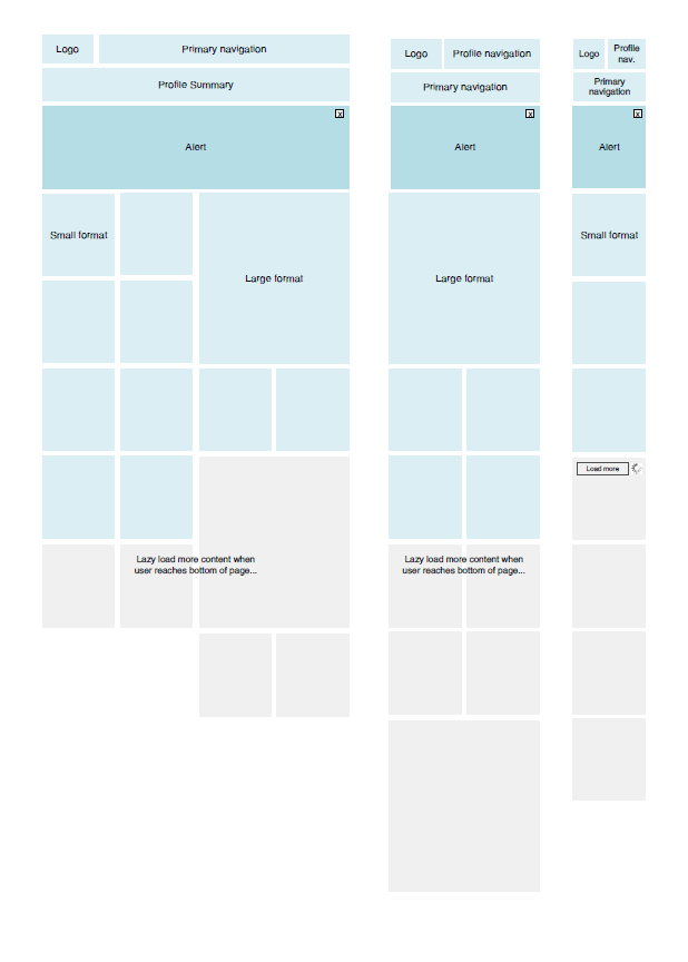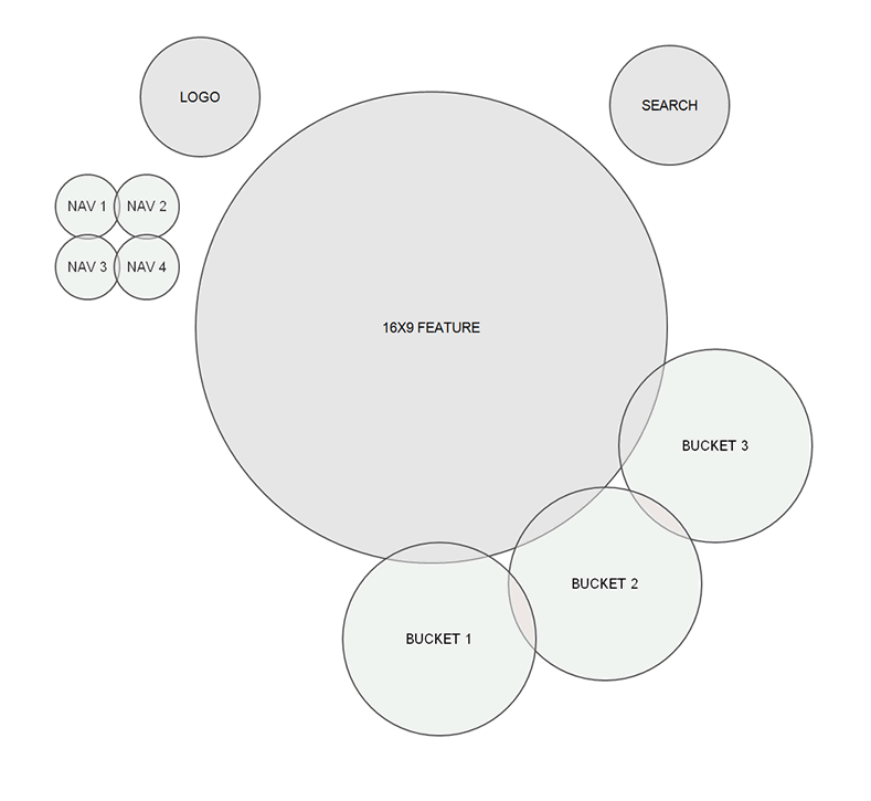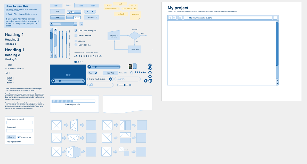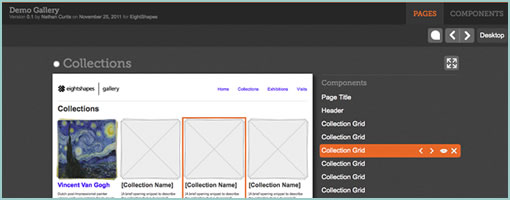
Blocks (github) is a HTML prototyping tool brought to you by EightShapes – the company that’s all about modular components. The JavaScript toolkit allows designers (code literate ones that is) to tag pages or the components within, for purposes of presentation and reuse. Such tagged HTML page prototypes then become listed in a table of contents so to say, along with all of the unique components on the side. Blocks is a presentation layer tool that sits on top of the prototype and can be turned on or off. The other core benefit or idea behind this is that instead of duplicating HTML over and over again, the toolkit instead also allows to reference HTML code and reuse it across multiple pages. Being pure JavaScript, it also looks pretty simple to implement.
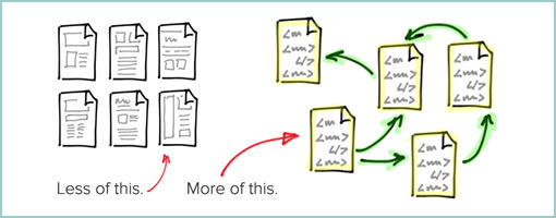
One thing which I don’t see and think would still be nice to have is a way to tell stories across these listed pages and components. Right now, all of these assets are very much fragmented and require the designer to do the magic of tying it all together into a flow or narrative. I wonder how the toolkit would feel if there was a layer of visible use cases, scenarios or non-linear flows that could be attached over on top.
Nathan also shares an interesting article which compares HTML prototyping to other tools like Axure. I’d have to agree with Nathan on this one that working with HTML (and JavaScript) for prototyping has the definite benefit of being closer to the medium as opposed to abstracting it. Even if writing JavaScript functions is too much for a designer (although it can be learned), that also opens up a perfect opportunity to collaborate on the prototype with a developer. For me personally, prototyping is less about setting up clicks between all of the screens, as is more about being able to get to the right richness of interaction, data, or visual representation for a narrower set of screens. With HTML and JavaScript there is simply more potential to get to the highest level of detail possible in order to feel out a risky part of the product. That’s not to say, that more often than not, just the “clicks” are adequate and so many other “abstracting tools” work for a lot of people. Thoughts?
Either way grab and fork it from github. There is also a good video where Nathan describes the approach.
In his own words:
EightShapes Blocks is a toolkit for user experience designers to modularize, communicate, and deliver annotated HTML prototypes.
Credits: Nathan Curtis