


Prioritizing Elements with Numbers
March 20th, 2009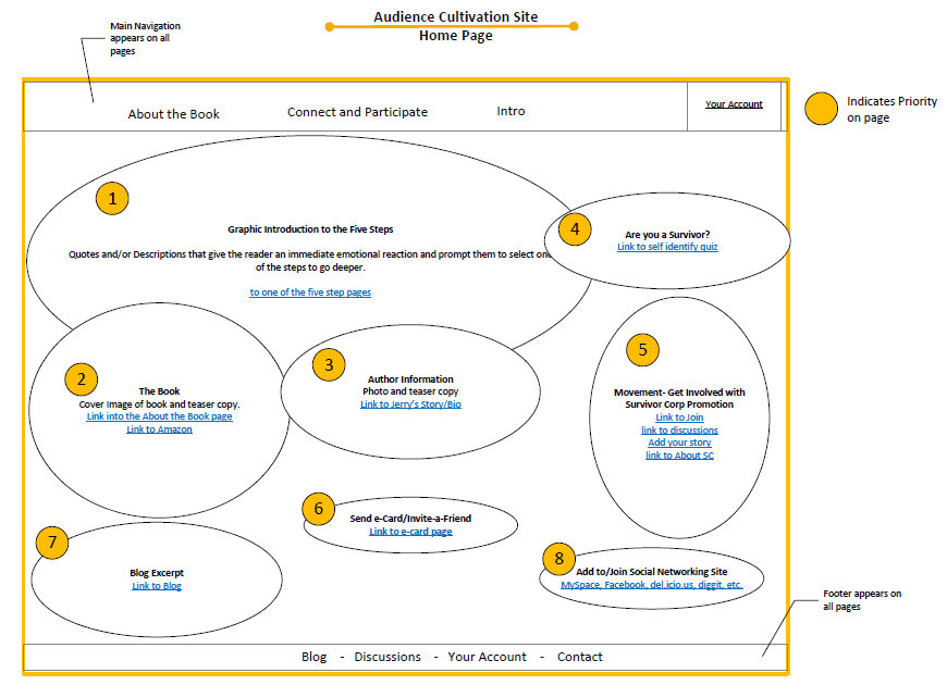
The bubble frame has stirred up some commotion on twitter the other day, and Tyesha reacted with her own variation. Her sample however sheds light on something else – the idea of prioritizing elements. She uses a very simple tactic that relies on numbered circles to denote the importance of an element. The really nice thing about communicating thoughts on priority in such abstract ways, is that it creates more flexibility for a visual designer to interpret the representation. This perhaps gives the designer more room to apply his/her own expertise as well.
I find it really interesting to see information architects thinking of such priorities behind various items on a page. There seem to be quite a few other ways in the realm of visual design which can be used to increase or decrease importance. Some less direct tactics include: the control of element size, emphasis through isolation, variance of depth (foreground, background), and of course a recent example that denotes priority with the use of tone.
Credits: Tyesha Snow
3 Responses to “Prioritizing Elements with Numbers”


March 20th, 2009 at 4:04 pm
Jakub, have you done a post on Page Description Diagrams (PDDs) yet? They also emphasise prioritisation and provide a simple way of visualising early stage concepts.
March 20th, 2009 at 5:37 pm
Harry,
I've done a high bred between PDD's and the Site Map. Showing content elements in the site map in priority order. Same kind of idea but without making two separate docs. Although you can't get as much detail in them. Do you have examples of your PDD's to share?
March 20th, 2009 at 9:22 pm
Harry & Tyesha,
You guys want to send me the samples over? I agree that a PDD would be a nice example.
Jakub