


Tab Order Diagram
March 23rd, 2009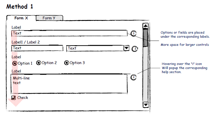
I would guess that not many designers think of specifying or controlling the tabbing order of form elements. It seems that quite often this is the type of interaction which is left alone for the browser to take over and automatically figure out on its own. Most of the time when users press the TAB key, the focus switches between input fields quite well, and if it doesn’t then the mouse is used to correct everything. Hans however, shared with me a user interface sample which clearly makes the tabbing order explicit. He uses a very simple transparent arrow going across form elements in order to indicate the order. It works quite well.
Credits: Hans Nieuwenburg
6 Responses to “Tab Order Diagram”


March 23rd, 2009 at 8:50 am
Mmm… if the tab order is not as straightforward as this one that arrow could end up zigzagging all over the place, and being a bit painful to behold. But perhaps if it is zigzagging, it means that your tab order is messed up!
March 23rd, 2009 at 1:14 pm
what if the order were more complex (if you had more controls and some to the right?)
What if, for example, on a login page you wanted the "remember password" checkbox to be tabbed before the login button that visually came first?
March 23rd, 2009 at 2:05 pm
I think the overall concept still hold Adam. Rather than having a straight arrow going down the page, using a non-invasive visual que to communicate the order would still work. In my head I see zig-zags of arrows, but if done correct they don't have to distract from the rest of the mock up.
March 23rd, 2009 at 3:02 pm
Zigzagging arrows could work, or even less distracting would be flowing curved lines. Perhaps this is also a type of information which could be somehow layered separately and only shown to a certain viewers such as developers (and not clients or users).
March 23rd, 2009 at 6:08 pm
This is particularly important per users with access limitations (visual, auditory, tactile limitations) which our teams saw a lot of in, for example, self-service medical applications. We used lightweight arrows, but if too numerous, we numbered them and them placed them on separate pages. We kept our teams very small, as such, our development colleague(s) very quickly helped us determine what would be easiest for them. – Andrew Schechterman, PhD
March 29th, 2009 at 9:28 pm
Its definitely a good idea and I think that having the client see it (but in context) is not a bad idea. However, I agree that with complex forms a single arrow, whether curved or zigzagging will simply become unmanageable. I am going to start doing this when appropriate but I think I will use some numbered transparent icons. That way they are less intusive and can be adapted for each form regardless of its complexity.