


Usability Test Snapshots
April 7th, 2010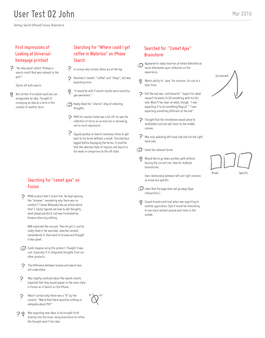
Usability testing is a pretty standard practice and I assume most of us here have done or might do a few of these evaluations in their design careers. Last month, I had the chance to spend some time with end users on a software project and I thought of sharing some of the documentation which resulted from the activity.
Right after doing such a test, we’re often faced with the challenge on how to capture and convey some of the interesting findings to others on the team or even ourselves. Some people try video, while others overlay the identified problems on top of screen captured images. In this round of testing I was aiming for something slightly different. Essentially, I wanted to a capture the core notes per each user on a single piece of 8.5×11 paper (perhaps in a persona like fashion?). Each page would have starting points of what the user has initially done with the use of red text, followed by dark grey notes as the actions unfolded. The findings were then tagged accordingly as: ideas (light bulb symbol), confusions (question mark) or positive remarks (happy face). Further more, the sample also makes use of subtle informal sketches through out the page to help convey the issues somewhat visually.
Perhaps to someone who lacks context of the project or products being tested, a deliverable such as this might not be adequate enough at conveying the issues. On the other hand, for those who have participated in the test as observers, the following usability test snapshot might act as an inspiration piece for the design work ahead.
Please post as a comment (or submit) ideas of your own on how to best convey, remember or prioritize findings from design research.
Credits: Jakub Linowski
3 Responses to “Usability Test Snapshots”


April 8th, 2010 at 9:27 am
Thanks for sharing! This looks like a great way to sum up everything on 1 page.
By the look of it, the session took between 30–45 minutes? I normally print out the script, which has the questions and screenshots. Then as we go along, I'll take notes and scribble on the screenshots where relevant.
The conversation is also recorded. After the session, I dive into the summary report straight away while the memory is still afresh. I'll read the notes and listen to the recording and go through everything.
The deliverable is simply a document that is split into different sections of the site that the user looked at, with some statements of what happened. I'll then write down my notes and suggestions (for the client) wherever relevant. A screenshot is provided below:
http://grab.stilllive.net/89b4340016a0b9af3f51120…
I really like the usage of icons like question mark, smiley face, and light bulb for the different kind of remarks though. It's also a good idea to use 'question marks' as suppose to 'sad faces' because sad faces tend to put clients on their nerves. The truth is, we can't accommodate everyone's needs, and a 'question mark' is much easier to digest and assess without emotional interference compared to using a 'sad face'.
April 8th, 2010 at 4:22 pm
It's a little idiosyncratic. I agree. Will be working on another more high level deliverable some time in the future. Stay tuned. Would you have a sample you'd be willing to share? :)
April 15th, 2010 at 11:43 am
Hi Jakub,
It's really lovely way of presenting results and I can see how it summarises a session really well. As a moderator, I generally have a 'session guide' which I do in an excel spreadsheet, with tasks on the columns and each participant in the lines – and I use it to take notes during the session (touchtyping course coming in handy here). After the test it is easy to analyse different answers for the same task and to compare users, filter and analyse results. Your sheet seems like a natural way of presenting these to clients – so I will definitely get inspired. Thank you so much for sharing!!!!!