Posts Tagged ‘states’
Friday, February 19th, 2010
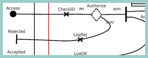
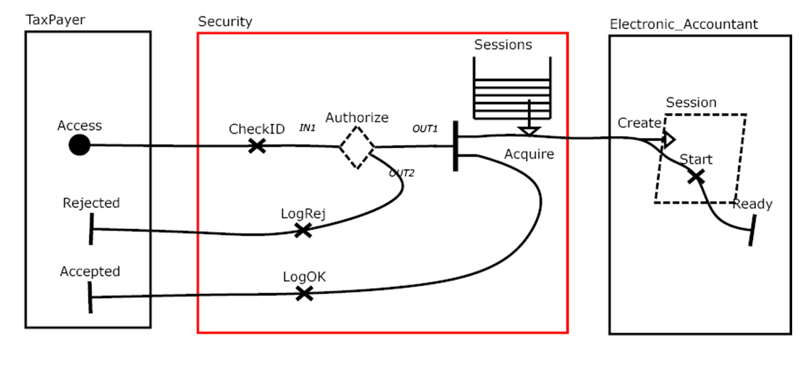
Speaking with Greg the other day I learned about Use Case Maps. This notation which has been initially the work of Raymond Buhr, has its roots in software engineering and perhaps could be an area to draw inspiration from. Use Case Maps intend to convey sequences of events by showing the paths of users over a backdrop of structured system representations. With these flexible scenario-like visualizations, software engineers ensure that the element of time is considered. As part of the notation, Use Case Maps have starting and stopping points and can also branch out. It seems like Daniel Amyot has contributed to this work as well and has published a decent Quick Tutorial with a reference guide at the end. In a nutshell, here is what Daniel writes about the philosophy of UCM:
The Use Case Map notation aims to link behavior and structure in an explicit and visual way. UCM paths are first-class architectural entities that describe causal relationships between responsibilities, which are bound to underlying organizational structures of abstract components. These paths represent scenarios that intend to bridge the gap between requirements (use cases) and detailed design.
Credits: Raymond A. Buhr & Daniel Amyot
Tags: activity, states, user flow
Posted in Inspirations, Samples | 3 Comments »
Thursday, December 10th, 2009
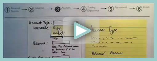
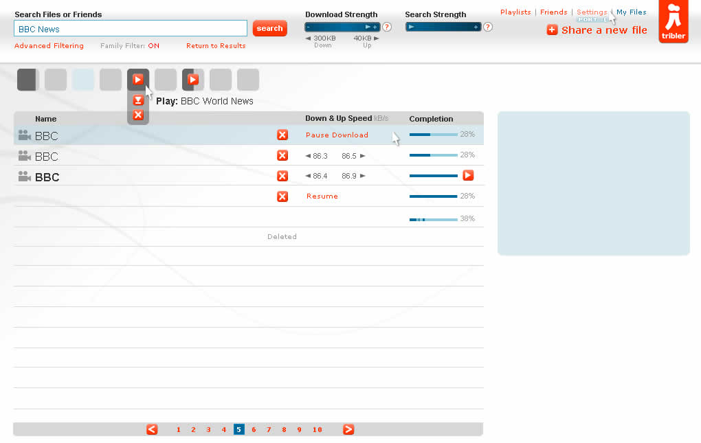
Superb. Very similar to the previous post on Protocasting, here is Chris’ approach to creating quick paper prototype animations which tell stories of rich interaction. This stop-frame animation approach requires a web cam, some video editing software (Quicktime in this case) as well as a desk attached rig to ensure things are visually stable. For showing changing text, Chris uses an erasable pen and overlaid acetate on top of the desk which he calls ‘the stage’. This powerful technique, which portrays interaction seamlessly, is a critical move forward if we are to battle change blindness brought on by shuffling disrupted and disjointed screens. In his own words:
The desk is the stage, and the action is framed inside a print-out of an empty browser to give it context. I wanted it to look so simple and sketchy that nobody could possibly confuse it with a design, so I used paper, card and Post-Its to build up the scene and laid a sheet of acetate on top, which I wrote on with OHP pen. There’s a rather crude cardboard mouse-cursor and a rotating paper ‘in progress’ icon.
There are 8 animations in total, each of which illustrates part of a user journey through the form and highlights complex validation behaviour I’d found tricky to explain. I was a bit worried that the developers might think it was gimmicky, but the novelty wore off quickly and they rapidly moved on to focus on the content. Because the videos illustrated a lot of the main ideas, everyone involved was spared long, tedious meetings talking about display conditions and validation behaviour. This was a big win.
The whole process is really quick and, most importantly, fun – developers and stakeholders engage fully even with dry subject matter. Non-techies can get involved too because the animation software only has about 3 buttons. Unlike with Flex or AJAX, there’s no learning curve.
Animation is famous for taking ages, but doing animations like mine is remarkably quick providing you’re tooled up and organised. It took me about half an hour to set the scene, based on some wireframes we’d already done. Then each animation took about 15 minutes.
Credits: Chris Neale
Tags: activity, prototype, sketch, states, sticky notes, user flow, video
Posted in Samples | 6 Comments »
Tuesday, September 22nd, 2009
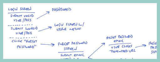
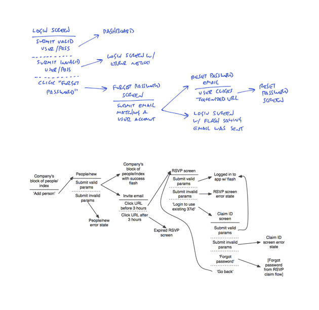
Amongst screens and wireframes, as interaction designers it is always important to consider the time element which binds and glues interface forms with human activity. Ryan Singer of 37signals just wrote an awesome little article about a quick way of noting down one of the common time-based documents we deal with – user interface flows. His shorthand version of a flow relies on making clusters composed of interface states or screens (above a horizontal line) and the actions which users take (below a horizontal line). These interface-action combinations are then transformed into a flow with the help of arrows that show possible sequences.
As basic as the approach sounds, it offers something quite unique in its potential for flexibility. Interestingly, Ryan has figured out a new way of how to represent alternative user actions per each screen (something I haven’t seen done before). These various actions which the users may take, can be separated out using a dotted line. More so, the notation also allows to visualize combined interface results stemming from a single action with the help of forking or branching arrows.
Overall, in an agile fashion, Ryan does not give much weight to these documents. Just like any other light and sketchy work, he hints at these flows being ephemeral and perhaps even a bit self-targeted:
Now don’t forget: all diagrams are destined for the garbage. The meaningful work is work that directly affects our customers as screens they can see or code that functions. But we still need to communicate and manage our work along the way. This shorthand has met a bare minimum for me to get a flow out of my brain in order to move on to other things. I hope it’s useful for you too.
Credits: Ryan Singer
Tags: activity, agility, alternatives, sketch, states, user flow
Posted in Samples | 2 Comments »
Tuesday, August 18th, 2009
Here is a cool idea by Benoît which combines annotations with interface visuals into one coherent whole. Typically annotation bubbles were reserved for textual information, yet this sample extends it to contain more elaborate visual elements. More so, some of these annotations visible here also contain multiple variations of an interface suggesting some sort of multiple state representation.
Credits: Benoît Meunier
Tags: annotation, colour, referencing, states, wireframe
Posted in Samples | 4 Comments »
Thursday, August 13th, 2009
Scott’s sample shares resemblance to the previously shared wireflows posts here and here. One thing it does a bit differently however is that it combines interfaces representation which differ in size or scale. Larger screens are mixed with smaller ones. More so, this example here also represents both interface screens (or what the users see), as well as user activity (or what the user does).
Credits: Scott Dudley
Tags: activity, states, user flow, wireframe
Posted in Samples | Comments Off on Mixed Scale Wireflow
Tuesday, June 9th, 2009
Recently in my sketches I began relying quite heavily on little frames which is one of my favourite techniques. However I also noticed that this approach has a limitation. As a flowing interaction is being sketched out, often I need to zoom in a little bit more on the details to show what I mean more clearly. Little frames are just sometimes too little.
Perhaps influenced by the wonderful isolation and referencing technique of Jonas, I began zooming in on parts of the interface where required. What I have began doing somewhat differently from Jonas’ drawings is an attempt to reference the zoomed in interface pieces more clearly. This is being attempted with the help of thicker black edge lines and corners. Drawing a thicker line around the little frame, and then creating a corner in the same style for the zoomed in piece, I hope helps a bit more in terms of relating the sketch to the edge of the screen. In the end, edge cornering extends the speed of little frames to larger sections of the interface, while still affording to draw only the bits and pieces that are relevant (leaving the obvious out of the picture).
Credits: Jakub Linowski
Tags: linowski, sketch, states
Posted in Samples | 3 Comments »
Tuesday, May 19th, 2009
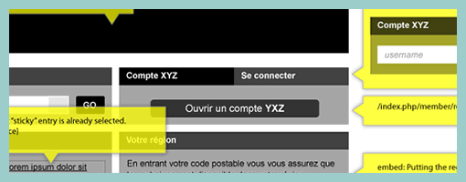
Zef just pointed me to a number of UX templates he published (along with their story), and one particular thing caught my attention. That is, his way of handling display logic based on a few “if” statements in the actual page itself (similarly to a post on in page events). The visual language used is a simple bracket with a conditional statement beside it, which is related to a grey block representing some state. This way of visualizing multiple states compared to an approach where the states are elaborated on a separate page, has the added benefit of being easier and quicker to comprehend as they are contextualized in the page. However, something also tells me that this way of documenting multiple states might work best for simpler conditionals than for more complex ones. The component or object-oriented approaches perhaps still offer more agility and flexibility even if they require more effort to imagine the full picture from elements spread out on numerous pages.
Credits: Zef Fugaz
Tags: alternatives, errors, states, wireframe
Posted in Samples | 2 Comments »
Monday, May 11th, 2009
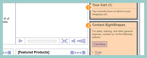
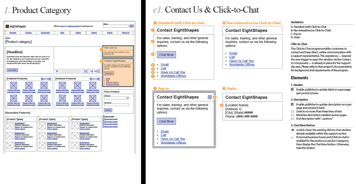
Earlier last month, EightShapes publicly released their Unify templates (for Adobe Indesign). Their systemic approach to wireframing emphasizes very modular ways to reuse elements, styles, pages and user interface components across deliverables. One thing which caught my attention is their interesting documentation technique of the components based approach which shares similarity with an the earlier post on object-oriented wireframing. Compontents are simply covered with a transparent orange overlay, are tagged with a referencing convention (“c#”) and are further elaborated and annotated on a separate page. This particular technique can be also visible in their PDF sample here.
Credits: Nathan Curtis – EightShapes
Tags: agility, annotation, states, wireframe
Posted in Samples | 3 Comments »
Tuesday, April 28th, 2009
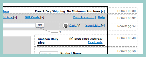
Rich Internet Application wireframes continue to pose a challenge to information architects who try to tame their complexity. Often all it takes is a few multi-state items on a single page and the number of all possible page variations skyrockets. Nick has introduced an object-oriented approach to wireframing which aims to ease the representation of such conditional multi-state interfaces. First, a wireframe is drawn up in the traditional sense. This is then followed by the definition of objects or component areas using dotted lines and a reference code. Each object’s various states and conditions are then explored in detail on a separate page, while still referring to with the same reference code. The approach works well in that it makes the interface components more manageable and easier to change.
Nick continues to evolve his approach, as well as has been presenting his ideas in PPT form over at slideshare.
Credits: Nick Iozzo
Tags: agility, referencing, states, wireframe
Posted in Samples | 8 Comments »
Wednesday, April 15th, 2009
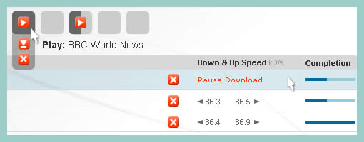
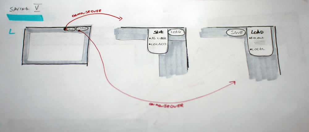
Cursors can be used inside of wireframes, or detailed visual layouts as in this case, to hint at states. Overlaying them on top of existing elements can give the viewer a stronger understanding of the multi state nature of the interface through the visibility of mouse positioning. In its most basic form a cursor can hint at an element’s onMouseOver state. In this sample I’ve used multiple such cursors on one screen to show multiple states all at once. I would assume it would also be possible to help understand other states as well (drags, resizes, etc) using cursors.
Have a look over at Konigi’s Wireframe Icon Set which now also contains cursor icons.
Credits: Jakub Linowski
Tags: activity, linowski, states, wireframe
Posted in Samples | 7 Comments »