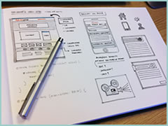
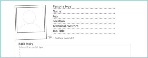
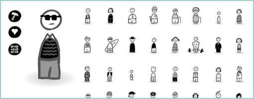
Posts Tagged ‘sketch’

Tablet + Illustrator: the Case for Electronic Sketching

Thursday, February 4th, 2010


It’s probably nothing new that the sketch has been gaining quite some attention lately as a powerful design tool. Some UI designers have began to precede wireframing and prototyping with free-form pen and paper approaches that afford exploration and support a wider diversity of ideas. For over a year now, in my design process I’ve started doing just the same right after I picked up a set of markers and sketch pads. Looking back, sketching has been wonderful at giving rise to design representations that naturally act as conversation starters and therefore make sketching more so compatible with agile philosophies. However, traditional pen and paper has a few limitations which over the last few months became noticeable. As a reaction to this, I grabbed an Intuos 3 from Wacom, installed Adobe Illustrator and began sketching electronically using a pen and tablet. Finding the new approach superior, I have doubts I’ll ever go back to paper and wanted to share some of the reasons why.

Scaling

Like it or not, design ideas need to scale over time and good tools provide room for such growth. One thing that I love about Illustrator (which paper lacks of course) is that the art board or workspace can be stretched as needed whenever concepts need the extra room. The flexibility to resize the canvas is a really great feature especially during early ideation when multiple screens need to be shown together to tell a meaningful story. On the same note, another way Illustrator excels is in terms of a scalable fidelity. Whereas early on in a project the amount of detail might be small, over time however, the fidelity of an electronic sketch has the potential to develop. In a vector environment it is super easy to take a small UI sketch, stretch it to a larger size, and inject more detail inside of it.

Ease of Editing

Yes, in the real world we have pencils, erasers and the ability to redraw or correct our sketches to some degree. We can however only correct our paper sketches somewhat before they becomes unreadable. This isn’t the case with anything electronic or digital where cutting, deleting, undoing, redoing, erasing is second nature. A very common scenario is to draw different screens and only learn eventually that it makes sense for the two or three screens to be placed together – something that is very easily done by reorganizing or repositioning on the computer. Another superb thing about Illustrator is the ability to select a line and just redraw it, causing it the take on the new form. This of course can be done an unlimited amount of times in an electronic tool.

Legibility

Although this might not be the case for everyone out there, I personally find that my hand writing is very hard to read. Unless I spent extra care and time to write legibly, I find that on the computer it is way easier and quicker to type out text that can be read by others.

Carelessness

When I am about to sketch on paper, knowingly that it will be harder to undo, I hold myself back and think twice before the ink or lead leaves a mark. This slow down or inefficiency can be easily overcome in the electronic world with a tablet pen. When I sketch electronically, this worry disappears as I know that I don’t have to generate the right ideas, but instead can easily correct myself if something needs adjusting. This careless quality of electronic sketching brings forth immense value by affording greater exploration to occur more freely.

Reuse

Illustrator allows to create symbols of artwork very easily which in turn speeds up exploration ever more. Let’s say you have the same screen or component which you want to use a number of times across your work. Dragging the selection into the symbols palette allows you to reuse or instantiate that artwork and still have the ability to edit it in one location with it updating throughout. This is simply a superiority that paper cannot compete with.

The above are the reasons why I moved in the direction of electronic sketching. Perhaps the use of paper can still be justified in collaborative sketching sessions when there are more than one designer at the table and the design activity happens simultaneously in real time. For the remaining times, I find that the electronic sketch offers advantages over paper that are just too good to pass.

Credits: Jakub Linowski

Exposure Sheets (X-Sheets)

Friday, January 22nd, 2010


Traditional animators have been relying on sketching techniques of their own which I thought might be inspirational. Animators represent time with exposure sheets (aka. dope sheets) through which a large number of information can be conveyed to others. An x-sheet is pretty much a frame by frame representation of time to which notes can be layered on top. Some of these notes typically include information about: dialogue, camera angles, lighting, background and audio. Since timings of around 30 frames per second are standard, each xsheet is just a snapshot of a few seconds. Nevertheless, animators still find them useful as a communication artifact.

Here is what the people at Michael Sporn Animation studios have to say about these deliverables:

You see, when you get used to reading X-sheets, you see them as time. You don’t see the lines, you see seconds and footage, instantaneously. As an animator, you get an overview immediately of the scene; as a director you read the track, how the animator has constructed the scene, and what camera moves are indicated and why.

Here are a couple extra x-sheet samples.

Of course x-sheets work for a passive medium such as film and it’s questionable of how useful they might be for interactive web applications. Nevertheless, I still wonder if some of these ideas can be useful to our field. What other information can experience or interaction designers “layer” on top of the existing deliverables that we are typically accustomed to? Perhaps it would be interesting to combine a user flow representation with a learning curve or effort representation? What ever happened to representing sound in a UI sketch? What about a wireframe referencing an x-sheet sketch for the times when we do use animation? Hey, and what about a user flow with one axis dedicated to representing time consistently? Just thinking out loud.

Credits: Jun Falkenstein

Present-Future Sketching

Wednesday, December 30th, 2009


I just kicked off a new inspirations category intended for samples and techniques from outside the boundaries of the UI/UX/IA profession. I’m looking forward to seek out some inspiration from within other fields in the new year (please continue to send in samples or ideas). For now, here is a first post in this category.

I’ve noticed that my sister who is in her third year of studying architecture does quite a bit of sketching and model prototyping herself. Looking through her work, one thing which caught my attention was the use of a form of sketching which overlays the envisioned building (or neighbourhood) on top of an existing environment. For me, this seems like a superb and smooth way of transitioning from the present into the future. The present in this case is a black and white photograph of the neighbourhood and acts like a clear reference point. The future state of the intended design clearly stands out by means of a coloured pencil sketch on top of the photograph. Occasionally, I’ve also seen her make use of overlaid tracing paper.

To me this seems really interesting and I wonder if the same approach can be used in UI design. When redesigning existing UIs, why not take screenshots of the current present state, import into Illustrator and sketch the future state on top. Eager to try this one day.

Credits: Dominika Linowska

OmniGraffle Wireflows

Tuesday, December 29th, 2009


Andreas just sent in a sample of a wireflow done in Omnigraffle (here are a few more) which I thought was an interesting show. It contains a sketchy style, conditionals, and groups a set of pages together with a grey background area. Most recently, this way of working is also my personal preferred approach to communicating UI concepts. Not only does a deliverable like this convey activity more clearly, but it also provides a sense of scope in one snapshot. One problem with these wireflows which I’ve seen in the past is when the design proceeds further and more detail is required. Often in this situation I fall back and develop wireframes. This however duplicates the documentation which is undesirable from a maintenance perspective. Come to think of it, perhaps there is a way to reference occasional detailed wires, on demand, from within a wireflow diagram. Anyhow, here is what Andreas has to say:

I’ve got a combination wireframe/sitemap that I thought I’d share with you. Adequately called a WireMap. It’s a tool I started using in an attempt to get an overview of small to mid-sized web projects. (The limit is self-imposed. I like printing my work on paper and hanging it around the office. And there’s only so much information you can fit on Tabloid or A3).

Using the wiremap has been a boon both in talking to the internal team as well as taking to clients. In either case it helps the audience grasp the scope and complexity of the project. I’ve found it very helpful in the formative stage, but I see no reason why it couldn’t also be used later on in the development cycle as well.

My approach to this is the combination of wireframe sketching (for which I use Konigi’s Sketch stencil for OmniGraffle) in combination with J.J.Garrett’s IA templates (another OmniGraffle stencil). The result is very much a WireMap in that sense of the word—a site-wide visualization with some page detail (enough to provide an idea of the page’s purpose) as well as some rudimentary logic.

I’ve attached an example showing a WireMap of a mock website called CoffeeStuff. I’ve tried to keep it simple but could easily elaborate more if you think it worthwhile. Didn’t want to overwhelm the reader, but I’m keen to hear your thoughts as well. The map is by no means bulletproof, but I think it does a good job of introducing the general concept.

Credits: Andreas Holmer

Rigged Stop-Frame Paper Prototype Animations

Thursday, December 10th, 2009


Superb. Very similar to the previous post on Protocasting, here is Chris’ approach to creating quick paper prototype animations which tell stories of rich interaction. This stop-frame animation approach requires a web cam, some video editing software (Quicktime in this case) as well as a desk attached rig to ensure things are visually stable. For showing changing text, Chris uses an erasable pen and overlaid acetate on top of the desk which he calls ‘the stage’. This powerful technique, which portrays interaction seamlessly, is a critical move forward if we are to battle change blindness brought on by shuffling disrupted and disjointed screens. In his own words:

The desk is the stage, and the action is framed inside a print-out of an empty browser to give it context. I wanted it to look so simple and sketchy that nobody could possibly confuse it with a design, so I used paper, card and Post-Its to build up the scene and laid a sheet of acetate on top, which I wrote on with OHP pen. There’s a rather crude cardboard mouse-cursor and a rotating paper ‘in progress’ icon.

There are 8 animations in total, each of which illustrates part of a user journey through the form and highlights complex validation behaviour I’d found tricky to explain. I was a bit worried that the developers might think it was gimmicky, but the novelty wore off quickly and they rapidly moved on to focus on the content. Because the videos illustrated a lot of the main ideas, everyone involved was spared long, tedious meetings talking about display conditions and validation behaviour. This was a big win.

The whole process is really quick and, most importantly, fun – developers and stakeholders engage fully even with dry subject matter. Non-techies can get involved too because the animation software only has about 3 buttons. Unlike with Flex or AJAX, there’s no learning curve.

Animation is famous for taking ages, but doing animations like mine is remarkably quick providing you’re tooled up and organised. It took me about half an hour to set the scene, based on some wireframes we’d already done. Then each animation took about 15 minutes.

Credits: Chris Neale

Paper Prototype Cutouts

Wednesday, November 18th, 2009


Here is a cool idea of combining multi layered interfaces in the physical world. Ondřej has created a paper cutout for this sketches that allows him to reuse parts of his interface by means of overlapping screens. Real world masters? :) In his own words:

As a part of a school project of mine I created such prototype. Having considered all the problems I’m going to resolve I’ve made a list of proper goals:

  1. I have to create a paper prototype of an audio/video manager app. I already have the creative brief and the technical brief.
  2. The prototype should contain all the screens and dialogue boxes of the app. It should be compact, easy to store, portable all-in-one solution.
  3. It should provide quick and fancy user testing.

I wanted to have the whole app in a single notebook. Because the app would have a single window interface, the solution had crossed my mind immediately.

The result with all its benefits you can see above.

  1. A page = a screen. Using such solution provides you with a lot of space around every screen. Put down some thoughts, notes and explanations.
  2. The main frame of the app can serve as a stencil when drawing new screens. Speeds ups the drawing process and keeps the notebook full of drawings clean and consistent.
  3. In addition, the space around every screen serves as a place for pop-up windows, dialog boxes and other elements made from post-it papers.
  4. The main frame stencil can hide all the stuff around a screen and turns a set of described wireframes into a testable prototype in a moment.

Take such prototype anywhere, create new screens in a bus or train, test with your mates during a coffee break and finally archive it next to your past prototypes. Worth trying, isn’t it?

Credits: Ondřej Válka

Interactive Sketching Notation 0.1

Thursday, October 29th, 2009


After being inspired by people’s UI sketches for almost a year now, only naturally, my own approach to drawn user interactions with pen and paper began emerging. This personal compilation of the various techniques which I find relevant, is being published as the so called Interactive Sketching Notation. The general idea behind this notation is the desire to visualize user interface states as well as user actions in a clear and rapid manner. This of course, as the version number implies, is an emerging visual language for sketching interactions which I hope to continue to evolve and improve well into the future. Thanks again to all those who made this possible and please let me know if you find it helpful or have any recommendations. If this inspires your own approach to sketching, I would also love to see some samples of how people use this. .

Download the PDF directly.

Credits: Jakub Linowski

Wiremaps

Thursday, October 15th, 2009


Combine wireframes and sitemaps together and you get something like this following sample from Jason. Wiremaps or siteframes? :) In the man’s own words:

First, the colors aren’t so significant. I just ran out of yellow. :) Underneath each sticky is a few other stickies from previous revisions. As time went on, things changed and so did the stickies on this page.

This document started off as ideas scribbled on a whiteboard. We devised an info architecture that involved controlling the user path by allowing them to drill down (vertically on the sheet) and across ( horizontally) but not diagonally. It’s not super clear, but everyone who needs to know understands the user flow through these pages.

There are 12 new pages that need to be created, as well as revising another half dozen or so. These sticky-frames also act as a site map, or at the least, a site map of templates.

Credits: Jason Robb

Visible Change History in Sketches

Tuesday, October 13th, 2009


According to Jason, sketches are never complete but only refined. They exist with the intention to pose questions and ask to be scribbled over on top. And that’s exactly how Jason uses them. He will make adjustments and modification straight over them with a red coloured marker. Thus in a way, all on the same drawing, the sketches become a layered representation of the initial idea along with the revisions. Although I personally prefer to use red to represent action items on my sketches, I still find this interesting approach in its power to visualize a history of changes. This makes me wonder though if there would be a systemic way to separate out all future sketch revisions from each other. Could there also be possibly a way to tag which sketched changes belong to which person (should there be multiple authors?) … ahh, just thinking out loud.

Enough of my thoughts. Here is what Jason really thinks:

I was sketching some designs for wireframe templates. The red is my way of calling attention to changes, questions, or comments about the design.

The neat thing about sketches is that what you see there is black and red. The black is my initial guess. The red is the correction to my initial guess. From there, I implement the changes in the live product. So, for instance, I opened my PSD and made the changes in there.

So the sketches are never really “done.” They’re done in the sense that I’m done using them. But they’re not done in the finished sense, they don’t reflect the final changes, other than by what I’ve written in red.

Credits: Jason Robb

MBTI Sketching Framework

Thursday, October 8th, 2009


Here is another interesting sketching approach which Henk describes in detail in an article on his blog. Basically, the framework he uses aims to support various personality traits based on the Myers-Briggs Type Indicator, as originated from the psychologist, Carl Jung. In this approach, the designer is forced to generate concepts for these distinct personality types which are segmented into four areas. These types include: competitive, spontaneous, humanistic and methodical. I guess it’s interesting to see designers find inspiration from 100 year old ideas.

Credits: Henk Wijnholds