Posts Tagged ‘sketch’
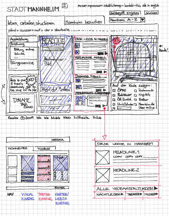
Thursday, July 2nd, 2009
Similar to the recent sample, here is another one also from Uwe showing a more digital approach to colour overlays. I can only speculate that a paper based sketch was imported into the computer in order to colour it with some sort of transparencies. Perhaps what’s interesting about such a mixed media approach is the visibility that colour was an after thought in the process.
Credits: Uwe Thimel for kuehlhaus AG
Tags: colour, sketch, wireframe
Posted in Samples | 7 Comments »
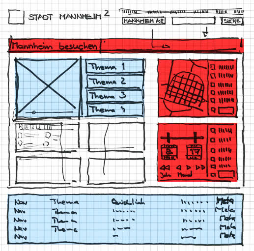
Tuesday, June 30th, 2009
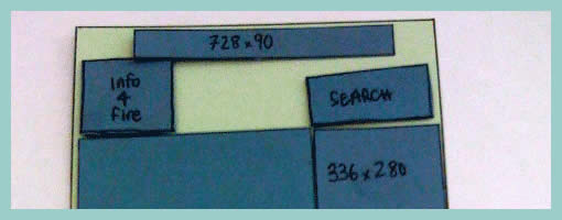
Uwe has recently published his wireframe sketches in which he uses a number of interesting techniques. One of these techniques is the use of rapidly generated hatched colour overlays on top of his sketches. Coloured lines are basically drawn over desired interface sections in a diagonal manner. This fast application of colour has at least two benefits. First attention can be drawn to coloured elements as they stand out more. Secondly, associations between coloured elements spread out over numerous screens can be made more easily when sharing sketches with others.
Credits: Uwe Thimel for kuehlhaus AG
Tags: colour, sketch, wireframe
Posted in Samples | 4 Comments »
Tuesday, June 9th, 2009
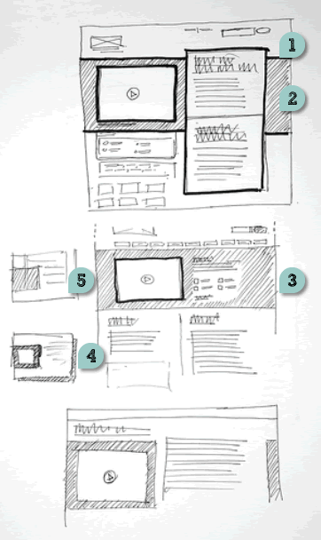
Recently in my sketches I began relying quite heavily on little frames which is one of my favourite techniques. However I also noticed that this approach has a limitation. As a flowing interaction is being sketched out, often I need to zoom in a little bit more on the details to show what I mean more clearly. Little frames are just sometimes too little.
Perhaps influenced by the wonderful isolation and referencing technique of Jonas, I began zooming in on parts of the interface where required. What I have began doing somewhat differently from Jonas’ drawings is an attempt to reference the zoomed in interface pieces more clearly. This is being attempted with the help of thicker black edge lines and corners. Drawing a thicker line around the little frame, and then creating a corner in the same style for the zoomed in piece, I hope helps a bit more in terms of relating the sketch to the edge of the screen. In the end, edge cornering extends the speed of little frames to larger sections of the interface, while still affording to draw only the bits and pieces that are relevant (leaving the obvious out of the picture).
Credits: Jakub Linowski
Tags: linowski, sketch, states
Posted in Samples | 3 Comments »
Tuesday, June 2nd, 2009
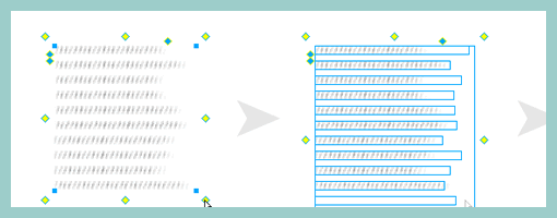
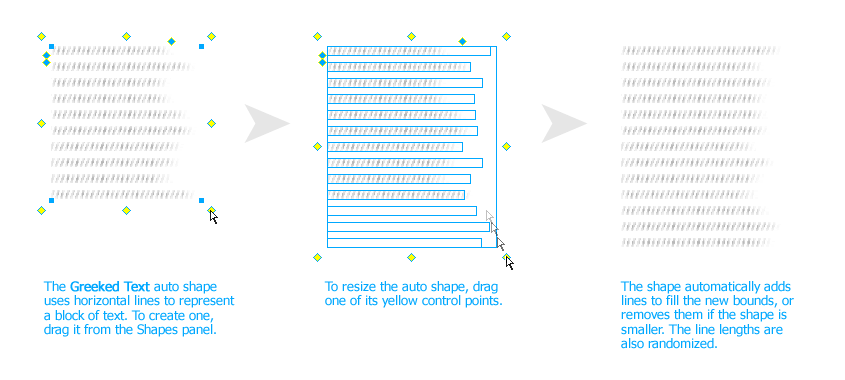
John has recently released publicly a Fireworks extension that allows designers to create a rough looking text placeholder – or “greeked” text. The extension works with the help of auto shapes and generates random line lengths of the text for a particular area. The size of the leading (or line spacing) and line height can be controlled easily as well. When rotating the text block by 90 degrees, it is also possible to use it for a quick graph like looking symbol.
This plugin is a nice addition in the rising popularity of low fidelity representations. It allows anyone to create text quickly which is very undefined and provides a nice alternative to the standard lorem ipsum approach.
Credits: John Dunning
Tags: content, sketch, wireframe
Posted in Samples | 4 Comments »
Tuesday, May 26th, 2009
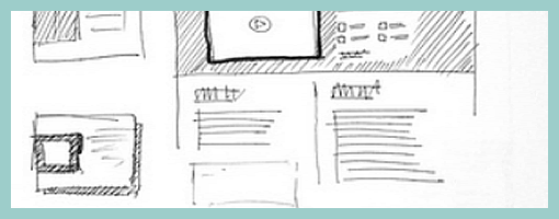
Just found these layouts on flickr belonging to James, which rely on a number of interesting emphasizing techniques. These include:
- Border thickness – thicker lines definitely are a quick way of making an element stand out.
- Tonation – darker backgrounds (in this case with the help of diagonal lines) can be used to emphasize an area (also see Matthieu’s sample).
- Isolation or incompletion – it’s very easy to draw attention to a particular element’s importance if the sketch is incomplete or only partially drawn (the sample by Jonas shows this nicely as well).
- Depth – drop shadows or three dimensional drawings are a quick way of making elements come out.
- Size – smaller sketches of course are less emphasized than bigger ones (see Little Frames).
Although not present in the above example, applying some colour to a sketch can also be a way of underlining desired elements.
Overall, emphasis is quite central to sketching as it sheds light on what is important and varies the visual priority. A sketch can also indicate its importance not only to the people being presented to, but also straight back to the original designer of the sketch. In The Reflective Practitioner, Donald Schön writes that design activity is a form of dialogue between the designer and the material of the situation. In other words, sketches, wireframes and prototypes are all things which in a way talk back to us. In this dialogue like metaphor, once an idea manifests itself in a visible form such as a sketch, it often leads to new ideas and the “conversation” continues on. Visual emphasis in sketching then plays a central role in keeping such cyclical dialogue alive.
Credits: James Bates
Tags: priority, sketch, wireframe
Posted in Samples | 4 Comments »
Friday, May 15th, 2009
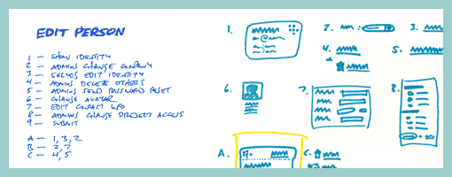
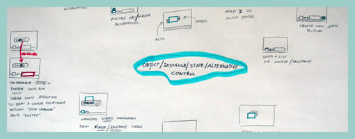
Ryan Singer of 37signals has written about and recently reaffirmed his satisfaction with a sketching technique he uses. The technique is inspired by Christopher Alexander’s book, Notes on the Synthesis of Form, and supports a number of important design qualities. It abstracts the starting point away from the specifics of UI elements, toward requirements or design considerations such as human needs, tasks or behaviours that are to be fulfilled. The technique emphasizes the interaction and forming of relationships between various requirements into manageable chunks or patterns. Prioritization of these patterns is then suggested. Finally, this approach also affords the exploration of multiple alternatives for each pattern or chunk followed by a unifying synthesis. In the end, the central ideas of Alexander are about letting design ideas emerge into unified and contextually fit forms.
Here is how Ryan describes the approach:
1. List all the things a screen should do. What should the customer be able to accomplish? What information are you sure should be displayed? Which affordances are necessary for customers to start a process or reach a goal? Label these things with numbers.
2. Look for any numbered items that relate to each other, conceptually or spatially. Label these groups of numbers with a letter.
3. Sketch a design (or multiple designs) for each number or letter group.
4. Combine the individually sketched blocks into a unified design. Let the pieces fall together into a whole.
Credits: Ryan Singer
Tags: alternatives, priority, sketch
Posted in Samples | 2 Comments »
Tuesday, May 5th, 2009
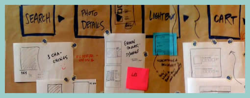
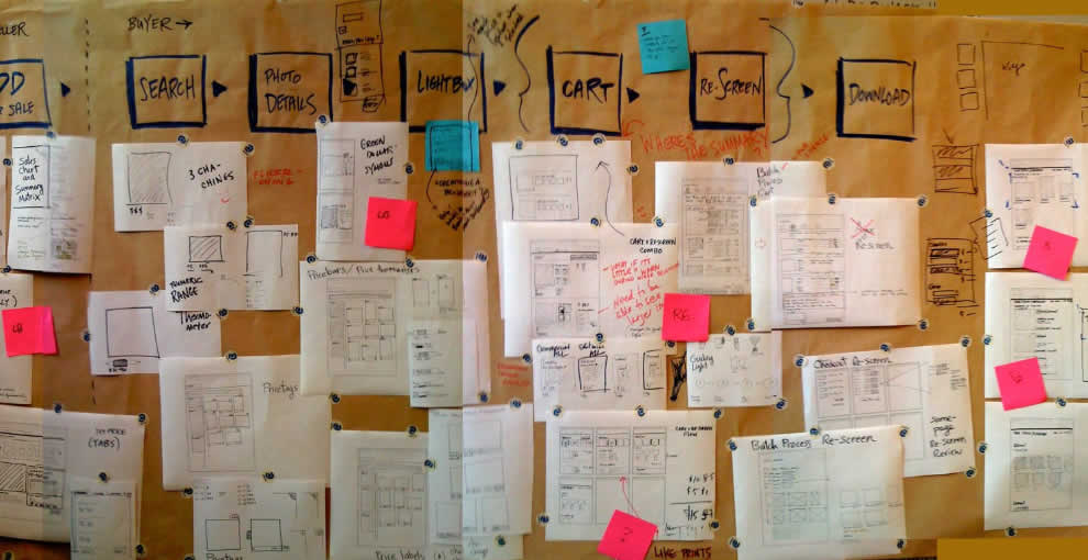
A collaborative sketching technique has been emerging from the people over at Adaptive Path, known as sketchboarding. A large sheet of paper is hung on the wall onto which additional pieces of paper are attached with the help of drafting dots, containing sketched ideas of different levels of fidelity. I find at least two things that stand out with this approach. First of all, inspirational material such as personas or requirements are used as a starting point to drive the conceptualization process. These materials are intentionaly placed on the left hand side of the sketchboard in close proximity to the wireframes. Secondly, the defined space where ideas are to be attached is stretched by design which invites exploration and refinement. Overall, this collaborative sketching technique works nicely as it also provides a bigger picture which can also be taken down and physically relocated if necessary.
Brandon has covered the technique quite in depth along with a video. Dan and Leah have also done a presentation about the approach in PPT format. More recently also, the following samples (along with templates) have been presented at the 2008 CanUX conference.
Credits: Leah Buley, Dan Harrelson & Brandon Schauer
Tags: agility, alternatives, sketch, user flow, wireframe
Posted in Samples | 20 Comments »
Thursday, April 23rd, 2009
Often as noted in the past, there comes a time when the designer craves to invite feedback about a wireframe or any other design documentation. Rob here has taken one step further by creating an interface representation with elements being overlaid as separate pieces of paper. This has the added benefit of having an even more engaging wireframe which invites further collaboration. Here not only can viewers provide verbal feedback, but instead they can explore together different interface variations while freely rearranging elements. In retrospect Rob writes about his experience positively:
I really enjoyed the meeting I had. In the past support for these meetings has been thin. I used this free-flow method to get better participation and stake-holder engagement in this project – and I think it worked (know it worked).
Update: Rob just did a second version of this wireframe, which can be visible over at his flickr site. Looks like putty has also been used to keep all of the paper layers from flying around.
Credits: Rob Enslin
Tags: agility, sketch, wireframe
Posted in Samples | 5 Comments »
Friday, April 10th, 2009
Just made some slight adjustments to the existing alternative sketching technique, aiming to steer more in the direction of brain storming or mind mapping. This resulted in something I’ll call a sketchstorm. Wanting to feel less constrained in the explorative stage of a project, little frames were sketched on a larger paper size (11×17) without any “alternative numbering”. Simply, the interface ideas which were more related to each other were grouped more closely together. As alternative concepts emerged, they were drawn outward away from the center. The center of the page still contains a focal idea which the sketches try to support. Overall, I can say that the larger sheet size combined with small interface representations did feel more free.
Credits: Jakub Linowski
Tags: alternatives, linowski, mindmap, sketch, wireframe
Posted in Samples | Comments Off on Sketchstorming
Wednesday, April 8th, 2009
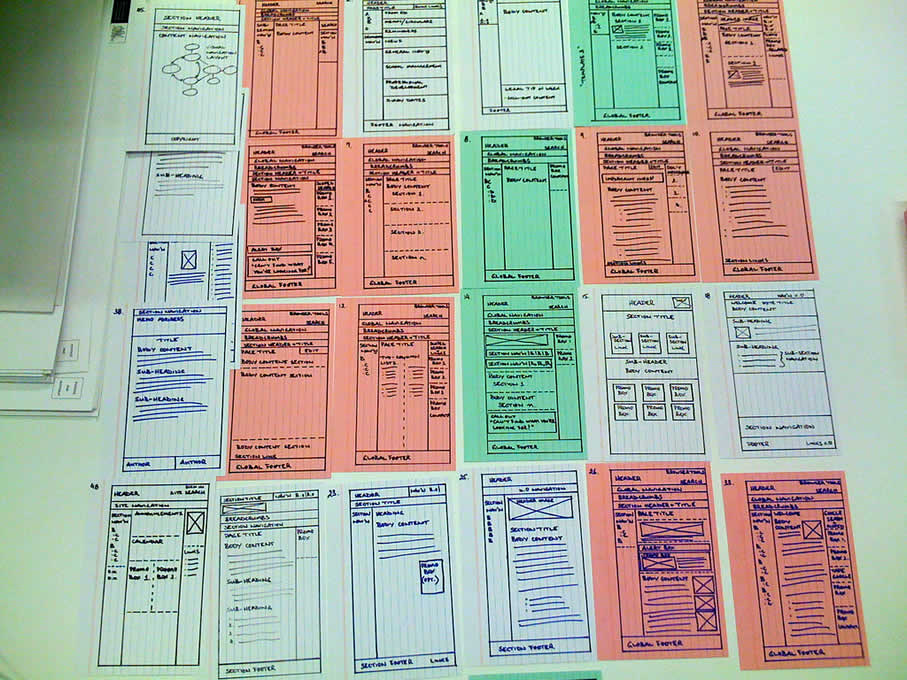
Here is an interesting twist on the wireframe by means of using a different coloured background. When Steve has been drawing up templates of existing content for an intranet site, coloured paper has been used to denote the various templates types. In this case the colour suggests the differences in technologies used. However background colour could be just as well used to denote other things such as: user types, page states, stages in a flow, etc. It seems like an interesting approach, as typically the wireframe usually rests on a white background.
Credits: Steve Baty
Tags: colour, sketch, wireframe
Posted in Samples | 3 Comments »