


Dwell Time Diagram
November 27th, 2009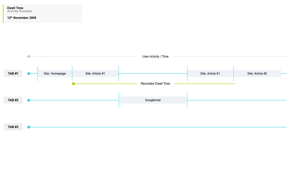
Here is an interesting idea of showing a user’s experience in the context of multiple browser tabs. In the modern browser it’s quite popular that people spend their attention in various modes of activity as they switch back and forth. Nik here tried to capture just that in a diagram which shows the currently selected tab over time. I guess it’s interesting to see a sample which aims to represent multiple potential activities that the a person can engage in, instead of a single over simplified linear one. Even more generally, a diagram such as this perhaps could even step above tabs and represent tasks or activities outside the browser just as well. Nik writes:
I’d like to share a little chart I put together to illustrate the concept of Dwell Time. This has come up more and more recently as clients are asking if the recent trend in tabbed browsers is responsible for an observed upward trend in reported dwell times.
I think one thing we should bear in mind is that a high dwell time can be both good and bad, not just because we may be including time spent on another site (in another tab), but also a high dwell time on an experiential site would be considered a good thing. However similar values on a registration form may suggest usability issues.
Credits: Nik Lazell
5 Responses to “Dwell Time Diagram”


November 27th, 2009 at 5:10 pm
Excellent points made here. Nik makes some good observations and it's interesting to know that many people are discussing dwell time on tabs as this has commonly been brought up.
November 30th, 2009 at 12:22 pm
We call that "Actograms" or "Activity diagrams" in France. It is quite extensively used for displaying some of the results of an activity analysis ( during field observations). Very useful to show the differences between how the "tasks are thought" and how the work is really done. You can also identify some patterns.
I only know one dedicated software for ergonomics but… it is not up to date and work only in windows (Actogram Kronos). So, if someone has links for such tools… I am interested.
November 30th, 2009 at 1:22 pm
Visualized nicely. What software could give that sort of information?
December 10th, 2009 at 5:26 am
I can see how the use of browser tabs would influence Time on Site metrics for websites. But I'm wondering if Google Chrome's multi-process architecture means that Time on Site metrics is more accurate/reliable for Chrome users than for, say, Firefox users.
December 15th, 2009 at 11:23 am
Hi Andreas, Thanks for your comments. With Chrome's multi-process architecture I guess we could generate very detailed stats about each tab and the activity within it. Interesting to see if there are any developments within Analytics to cater for this.