onProximityFade jQuery Plugin
July 26th, 2010
Here is another experiment in the form of an open source jQuery plugin named onProximityFade. What it does is it fades tagged elements (requiring a CSS class of “fadeBox”) depending on their proximity to the mouse cursor. The idea emerged after a subtle irritation with long lists of repeating links which sometimes feel as they receive too much attention on a page. So the intention is twofold. First, to visually deemphasize repeating and predictable elements throughout a page and thus achieve greater simplicity. Secondly, use gradual feedback to invite users to find actionable elements by using ranged values (the closer you get, the greater visibility). Any thoughts? Would love to hear them.
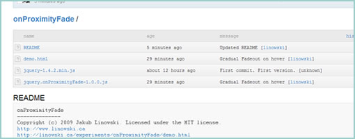
Have a peek at the demo or fork the code at github.
Credits: Jakub Linowski


July 26th, 2010 at 6:54 pm
I think it's a fix for something that shouldn't have been in the first place.
If your page has to much links stacked together, maybe use some whitespace or other styling options to make them more readable.
The demo is to exaggerated, almost invisible -> fully visible. Not a real usage case really.
You would think if someone created this, it was because some page had a problem of to much links. Why not use that, so you know where the real problem comes from.
July 26th, 2010 at 9:14 pm
From the demo, needs a minimum fade so it's still visible, otherwise user loses the ability to scan the page – the demo is like shining a flashlight into a dark room looking for something, not the best.
July 27th, 2010 at 9:56 am
Although I like the effect I wonder whether it complies with accessibility guidelines (WCAG). For instance I'm unable to tab through the different elements on the demo.
August 2nd, 2010 at 4:03 pm
The usability/readability of a list would normally be determined by its visual design and possibly a bit of CSS feedback/highlighting. If you need things like this just to help someone read a list, then you've gone wrong somewhere.
I can't think of an example where this would be useful and the example shown certainly doesn't demonstrate one.
August 5th, 2010 at 11:45 pm
Agreed. This experiment could be a band aid like fix for something that shouldn't happen in the first place, and the accessibility of it is questionable as well. I did want to add that initially I envisioned the list of links actually being composed of the same actions (ex: repeatable and predictable "add" or "edit" links that sometimes appear on each row). This way, the user knows they're there but they don't clutter the space as much. But maybe it's one of those failed experiments :)
August 7th, 2010 at 10:17 am
I think the "show on hover"-method would be better in that case. Like the "reply" and "retweet" on Twitter.
The layout is first designed for viewing purposes, but when a user wants to take action they can by focusing on the item they want to edit, retweet, reply, whatever.
June 27th, 2011 at 3:31 am
I'd imagine this has value for mouse driven hunting and clicking, perhaps in a link heavy UI but less useful for UIs where the user searches by eye as page content will appear missing!