Posts Tagged ‘responsive’

Multi-Device Layout Patterns

Monday, April 30th, 2012

Multi-Device Layout Patterns
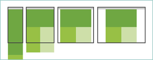
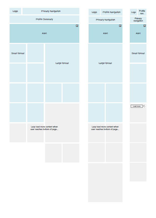
Multi-Device Layout Patterns is a short compilation of a few common layout patterns by Luke Wroblowski after he has gone through the Media Queries site. The article contains 5 high level layout considerations that could work for when dealing with responsive wireframes. A great inspirational read for those who like to respect flexible screen widths.

Credits: Luke Wroblewski

Responsive Layout Wireframe

Friday, September 30th, 2011


As we design for more devices, considerations for more responsive layouts which scale gracefully across varying screen sizes could be gaining in importance. Warren here has shared one such quick wireframe that tries to accommodate just this. It basically shows 3 wires side by side each other with some placeholders as well as how they would all vary across a few predefined screen widths. It’s a pretty straightforward, yet clear way of conveying more flexible layout concepts.

That same week, as I was asking around for a few additional “responsive layout” samples, Martin also pointed me to Media Queries – which is an awesome gallery and collection of layouts that scale beautifully on various screens (it’s actually also a CSS extension recommendation). Have a look.

Credits: Warren Anthony