Posts Tagged ‘wireframe’
Tuesday, June 30th, 2009
Uwe has recently published his wireframe sketches in which he uses a number of interesting techniques. One of these techniques is the use of rapidly generated hatched colour overlays on top of his sketches. Coloured lines are basically drawn over desired interface sections in a diagonal manner. This fast application of colour has at least two benefits. First attention can be drawn to coloured elements as they stand out more. Secondly, associations between coloured elements spread out over numerous screens can be made more easily when sharing sketches with others.
Credits: Uwe Thimel for kuehlhaus AG
Tags: colour, sketch, wireframe
Posted in Samples | 4 Comments »
Tuesday, June 16th, 2009
Page dimming is another visual tactic which can be used to focus attention away from what is less important toward what really matters. Here is one example from Rebecca, of an overlay being used in a wireframe in combination with the background page becoming more grey and faded. I’m not exactly sure how it was technically implemented here, however often all that is required is a drawn rectangle with a see through opacity. The elements which require more attention (such as the overlay in this case) are then brought up above all layers. This approach provides another way of emphasizing certain interface elements for users of the interface, and also for readers of design documentation.
Credits: Rebecca M. Allen
Tags: emphasis, wireframe
Posted in Samples | 6 Comments »
Thursday, June 11th, 2009
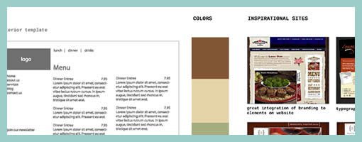
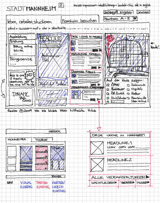
A wireframe alongside a moodboard might stir some controversy for traditional information architects. Fonts, colours, styles have been considered a thing of the later phases of a design process, elevating the flow of activity in importance. Perhaps Chris’ work which combines stylistic exploration with the exploration of interactivity, challenges this traditional waterfall view. Similar thoughts have been surfacing and emerging in earlier posts and samples, as visible here and here. Perhaps this interplay between user experience and emotion is an important one. Perhaps it’s only natural if interaction designers or information architects work in parallel with visual designers opening up more room for dialogue.
TIP: To see the full image you can drag around with the mouse while in the full size mode of the popup.
Chris writes:
I’ll do my Wireframes in illustrator after I have met with the client and they have filled out my website questionnaire (another blog post for that) – after we have hashed out the sitemap on Writemaps (another great product) I will create this over all scheme that includes Fonts, Colors, Inspiration, textures or patterns and takes care of the Wireframing side making sure what will live on each page. For this example I have done a very simple layout – just a homepage template and interior page template. If this was a large site I may have done out 8 template Wireframes in illustrator.
Credits: Chris Gillis & David Perel
Tags: colour, wireframe
Posted in Samples | 14 Comments »
Tuesday, June 2nd, 2009

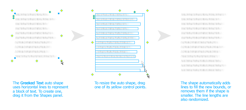
John has recently released publicly a Fireworks extension that allows designers to create a rough looking text placeholder – or “greeked” text. The extension works with the help of auto shapes and generates random line lengths of the text for a particular area. The size of the leading (or line spacing) and line height can be controlled easily as well. When rotating the text block by 90 degrees, it is also possible to use it for a quick graph like looking symbol.
This plugin is a nice addition in the rising popularity of low fidelity representations. It allows anyone to create text quickly which is very undefined and provides a nice alternative to the standard lorem ipsum approach.
Credits: John Dunning
Tags: content, sketch, wireframe
Posted in Samples | 4 Comments »
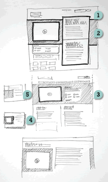
Tuesday, May 26th, 2009
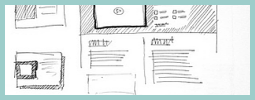
Just found these layouts on flickr belonging to James, which rely on a number of interesting emphasizing techniques. These include:
- Border thickness – thicker lines definitely are a quick way of making an element stand out.
- Tonation – darker backgrounds (in this case with the help of diagonal lines) can be used to emphasize an area (also see Matthieu’s sample).
- Isolation or incompletion – it’s very easy to draw attention to a particular element’s importance if the sketch is incomplete or only partially drawn (the sample by Jonas shows this nicely as well).
- Depth – drop shadows or three dimensional drawings are a quick way of making elements come out.
- Size – smaller sketches of course are less emphasized than bigger ones (see Little Frames).
Although not present in the above example, applying some colour to a sketch can also be a way of underlining desired elements.
Overall, emphasis is quite central to sketching as it sheds light on what is important and varies the visual priority. A sketch can also indicate its importance not only to the people being presented to, but also straight back to the original designer of the sketch. In The Reflective Practitioner, Donald Schön writes that design activity is a form of dialogue between the designer and the material of the situation. In other words, sketches, wireframes and prototypes are all things which in a way talk back to us. In this dialogue like metaphor, once an idea manifests itself in a visible form such as a sketch, it often leads to new ideas and the “conversation” continues on. Visual emphasis in sketching then plays a central role in keeping such cyclical dialogue alive.
Credits: James Bates
Tags: priority, sketch, wireframe
Posted in Samples | 4 Comments »
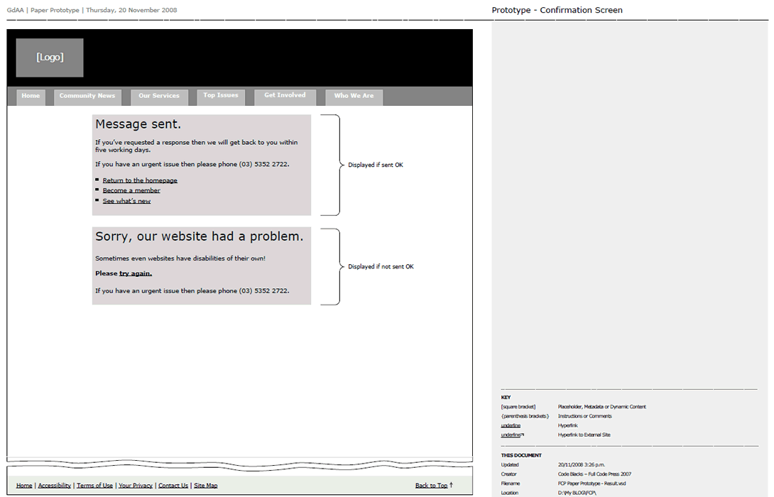
Tuesday, May 19th, 2009
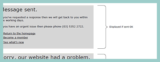
Zef just pointed me to a number of UX templates he published (along with their story), and one particular thing caught my attention. That is, his way of handling display logic based on a few “if” statements in the actual page itself (similarly to a post on in page events). The visual language used is a simple bracket with a conditional statement beside it, which is related to a grey block representing some state. This way of visualizing multiple states compared to an approach where the states are elaborated on a separate page, has the added benefit of being easier and quicker to comprehend as they are contextualized in the page. However, something also tells me that this way of documenting multiple states might work best for simpler conditionals than for more complex ones. The component or object-oriented approaches perhaps still offer more agility and flexibility even if they require more effort to imagine the full picture from elements spread out on numerous pages.
Credits: Zef Fugaz
Tags: alternatives, errors, states, wireframe
Posted in Samples | 2 Comments »
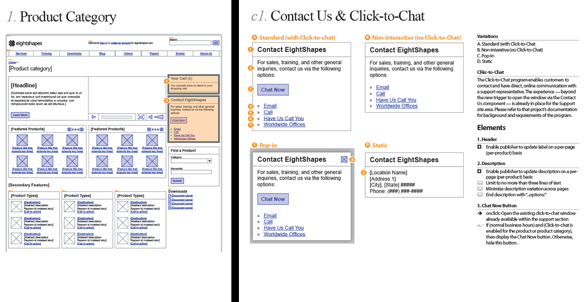
Monday, May 11th, 2009
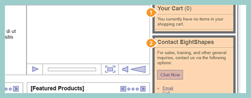
Earlier last month, EightShapes publicly released their Unify templates (for Adobe Indesign). Their systemic approach to wireframing emphasizes very modular ways to reuse elements, styles, pages and user interface components across deliverables. One thing which caught my attention is their interesting documentation technique of the components based approach which shares similarity with an the earlier post on object-oriented wireframing. Compontents are simply covered with a transparent orange overlay, are tagged with a referencing convention (“c#”) and are further elaborated and annotated on a separate page. This particular technique can be also visible in their PDF sample here.
Credits: Nathan Curtis – EightShapes
Tags: agility, annotation, states, wireframe
Posted in Samples | 3 Comments »
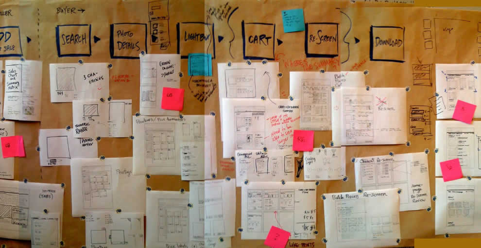
Tuesday, May 5th, 2009
A collaborative sketching technique has been emerging from the people over at Adaptive Path, known as sketchboarding. A large sheet of paper is hung on the wall onto which additional pieces of paper are attached with the help of drafting dots, containing sketched ideas of different levels of fidelity. I find at least two things that stand out with this approach. First of all, inspirational material such as personas or requirements are used as a starting point to drive the conceptualization process. These materials are intentionaly placed on the left hand side of the sketchboard in close proximity to the wireframes. Secondly, the defined space where ideas are to be attached is stretched by design which invites exploration and refinement. Overall, this collaborative sketching technique works nicely as it also provides a bigger picture which can also be taken down and physically relocated if necessary.
Brandon has covered the technique quite in depth along with a video. Dan and Leah have also done a presentation about the approach in PPT format. More recently also, the following samples (along with templates) have been presented at the 2008 CanUX conference.
Credits: Leah Buley, Dan Harrelson & Brandon Schauer
Tags: agility, alternatives, sketch, user flow, wireframe
Posted in Samples | 20 Comments »
Tuesday, April 28th, 2009
Rich Internet Application wireframes continue to pose a challenge to information architects who try to tame their complexity. Often all it takes is a few multi-state items on a single page and the number of all possible page variations skyrockets. Nick has introduced an object-oriented approach to wireframing which aims to ease the representation of such conditional multi-state interfaces. First, a wireframe is drawn up in the traditional sense. This is then followed by the definition of objects or component areas using dotted lines and a reference code. Each object’s various states and conditions are then explored in detail on a separate page, while still referring to with the same reference code. The approach works well in that it makes the interface components more manageable and easier to change.
Nick continues to evolve his approach, as well as has been presenting his ideas in PPT form over at slideshare.
Credits: Nick Iozzo
Tags: agility, referencing, states, wireframe
Posted in Samples | 8 Comments »
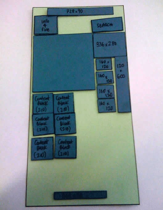
Thursday, April 23rd, 2009
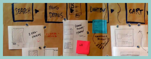
Often as noted in the past, there comes a time when the designer craves to invite feedback about a wireframe or any other design documentation. Rob here has taken one step further by creating an interface representation with elements being overlaid as separate pieces of paper. This has the added benefit of having an even more engaging wireframe which invites further collaboration. Here not only can viewers provide verbal feedback, but instead they can explore together different interface variations while freely rearranging elements. In retrospect Rob writes about his experience positively:
I really enjoyed the meeting I had. In the past support for these meetings has been thin. I used this free-flow method to get better participation and stake-holder engagement in this project – and I think it worked (know it worked).
Update: Rob just did a second version of this wireframe, which can be visible over at his flickr site. Looks like putty has also been used to keep all of the paper layers from flying around.
Credits: Rob Enslin
Tags: agility, sketch, wireframe
Posted in Samples | 5 Comments »