Posts Tagged ‘emphasis’

Wireframe-Mockup Hybrid

Tuesday, January 5th, 2010


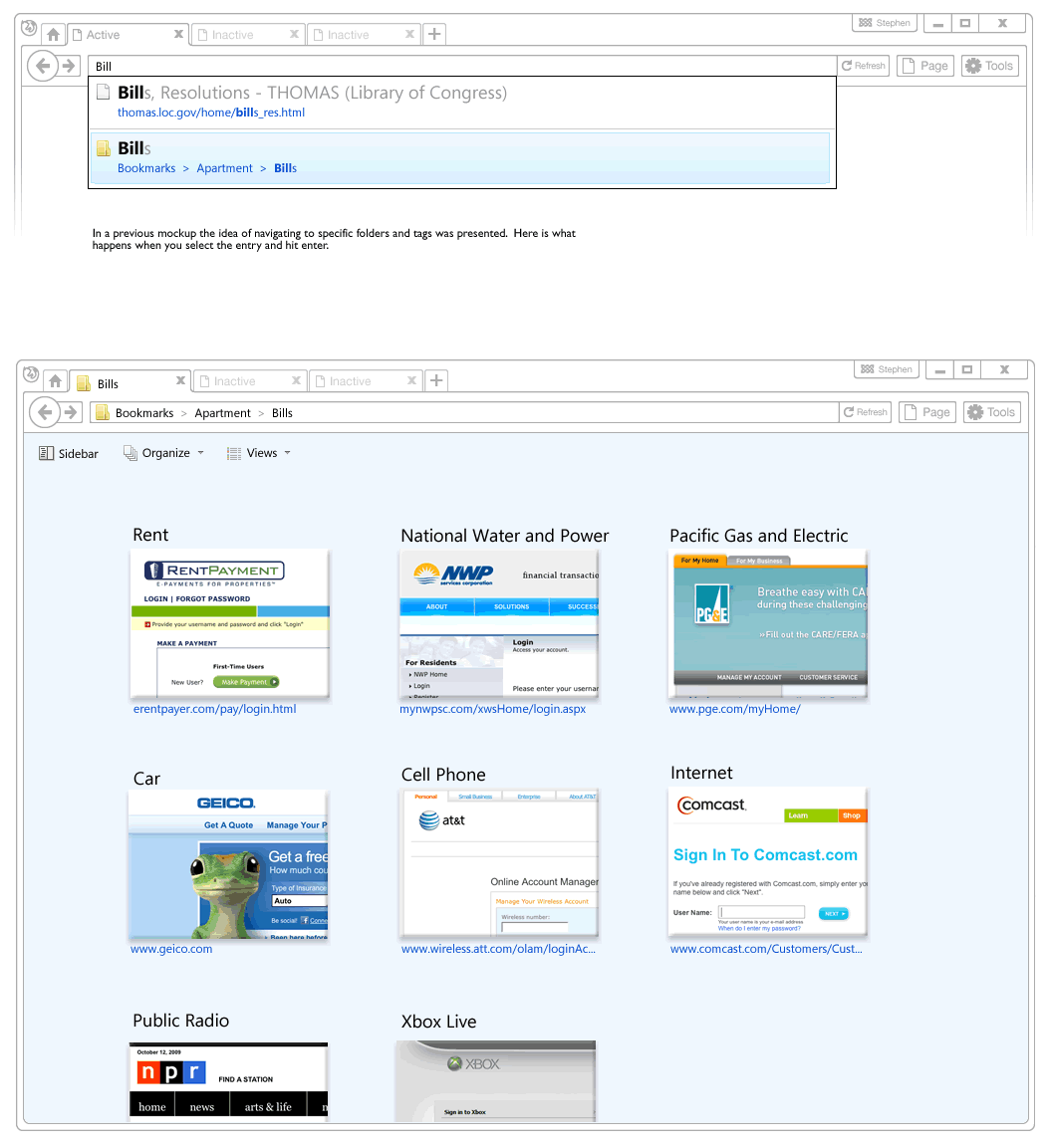
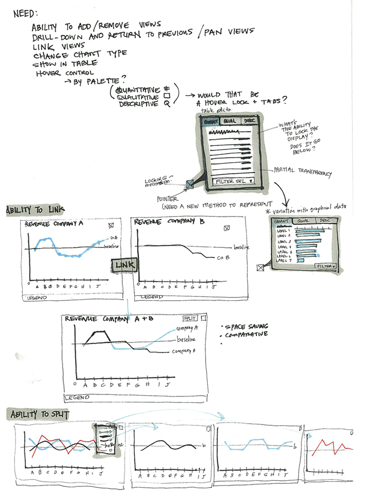
Recently, a visual mockup technique by Alex Faaborg on the Mozilla blog caught my attention. As Alex has been thinking about the merits of searching and browsing through bookmarks and history for the next Firefox version, it seemed like in a way he merged the traditional wireframe with a detailed mockup. While parts of the interface schematics are faded outlines devoid of any colour, other parts are represented in full colour and contain rich depth. Interesting? This effect enables the designer to emphasize the more important parts of an interface and focuses the viewer’s attention on what matters most. These wireframe-mockup hybrids perhaps reaffirm the importance of designing UI parts in the right fidelity and at the same time remind us that it is ok to leave stuff out.

Credits: Alex Faaborg

Inpage Requirements

Thursday, August 27th, 2009


Ben just sent me a sketch which uses a number of techniques seen previously. One thing which is a bit unique perhaps are some of the short lists of requirements or goals which he combines with his sketches (seen on page 1 and 3). These seem to guide his thought process at the outset, and are often at the top of a page in the form of a list. Another cool thing he does is break up his ideas into some conceptual chunks with distinct titles that are highlighted. He also emphasizes his sketches similarly to some approaches listed earlier. To draw attention to certain elements, the thickness of borders is varied and some of the screens use colour overlays. Ben’s sketches are also occasionally loaded with question marks – something I’ve noticed to appear in my own drawings as well. Here is how Ben describes his process:

1. I usually lay down a 10% cool grey field where I am going to show “the screen” (or whatever object I am going to sketch)
2. I then draw in the frame of my screen, usually with a Sharpie. I like the effect of the bold border, and it helps me to set up a hierarchy within the sketch with different line weights (Staedtler 0.1, 0.3, 0.5, 0.7 mm black pigment pens)
3. Once I have the screen set up, I just sketch as needed, showing different levels of detail depending on what I need to document
4. I use a wash of blue (very light blue marker) to set off anything that I want to emphasize, red pen for interactions or to call out areas

Sometimes I use a light color pencil to add dimension or texture if I feel it’s important for the design, beyond that, it’s pretty free form.

Credits: Ben Rossi

Page Dimming

Tuesday, June 16th, 2009


Page dimming is another visual tactic which can be used to focus attention away from what is less important toward what really matters. Here is one example from Rebecca, of an overlay being used in a wireframe in combination with the background page becoming more grey and faded. I’m not exactly sure how it was technically implemented here, however often all that is required is a drawn rectangle with a see through opacity. The elements which require more attention (such as the overlay in this case) are then brought up above all layers. This approach provides another way of emphasizing certain interface elements for users of the interface, and also for readers of design documentation.

Credits: Rebecca M. Allen