Posts Tagged ‘alternatives’

XXL Iteration Views

Wednesday, March 18th, 2009
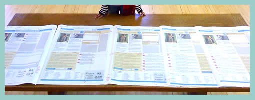

Juhan printed out all historical iterations of a single super sized screen. The awesome thing about this perspective is the quick overview one gains of the exploration performed. One can see very rapidly what has been tried, rejected or accepted, and how the design has evolved through the markings. In comparison to the world of programming, developers also have views such as these and in particular they rely on “diff” tools to highlight changes between code revisions.

Speculating here, another thing which comes out from seeing this (at least to me), is the desire of some designers to communicate a degree of completion. It has been noted in a previous post that it is desirable to control the amount of feedback a presented view affords (ex: by using sketchy styles more comments can be generated). Here perhaps the multiple revisions of a design lined up in such a way can give the feeling of greater completion to the viewer, and thus afford less feedback. If someone was to look at this and see a fifth iteration building on top of the past versions, perhaps they’d think twice before asking to shift the header another 10 pixels. This is not to say that affording less feedback in our deliverables is negative. Contrary, sometimes it is perfectly valid to begin shutting voices out. Otherwise, we’d spin our design wheels and wouldn’t move forward.

Here is the real image on flickr, and Juhan writes:

Rani stands next to the 5 iterations of a single screen we designed (and re-designed) over the last 48 hours. We mark up all the prints and show early adopters for feedback.

We’re close enough to roll to stage… and starting using the damn thing.

Every funky pixel, grid, and design jumps out on big prints.
Print big or get out!

Credits: Juhan Sonin

Sketching Alternative and Social Activities

Friday, February 20th, 2009


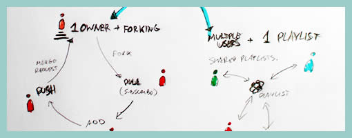
Recently as I was thinking about an assignment of designing a new playlist system at work, a number of ideas collided all into one and resulted in this design sample. The desire was to explore alternatives, quickly, of high level activities, which would have to support interactions between a number of actors or people. So I jumped back into pencil, paper and marker mode. As simple or obvious as it may seem, what I think might of worked well worth noting is the use of colours to denote different (or same) people. Another thing that perhaps worked out was the use of one activity as a starting point in the center and then branching out toward alternatives.

I think this little sample was influenced by other’s work as well worthy of noting. First of all, here at TU Delft we were exposed to quite a bit of mind mapping exercises which in a way resemble the interface sketches of Jonas Löwgren. Then again, this sample also shares the high level characteristics of a user journey submitted by Steve Johnson. Finally, as I’ve written in my personal blog I’ve also began questioning the sterility of one path user flows wondering about how to explore the diversity of activities.

The sample isn’t perfect, and as is argued in Pencils before Pixels, the lower the fidelity of the sketch the harder it is to use it to communicate with others. However when I showed the sketch to others, and supported the sample verbally, it enriched the conversations.

Credits: Jakub Linowski

High Level Layout Alternatives

Tuesday, February 17th, 2009


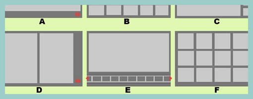
Here is a sample exploring the possibilities of various layout approaches in the early stages of a design process. Consecutive lettering has been used to suggest multiple interface alternatives. The variations however only explore very rough structural or navigational alternatives. The level of fidelity is very much devoid of detail. I continue to wonder what other designers do when they want to explore numerous alternatives of more detailed interface elements or screens which are a bit further in the design process. Would you have samples of something like that? If so, please submit.

The source of the file can be found on flickr.

Credits: Bram Pitoyo

Multivariate Wireframes

Friday, January 9th, 2009


Ben explains it best:

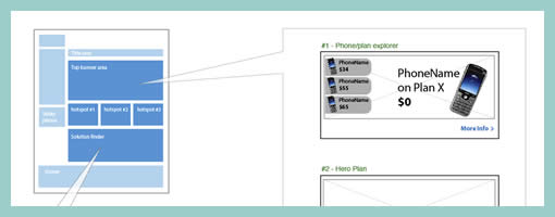
We do a fair but of multivariate testing work, where users get served different combinations of elements to see what works best.

The problem with wireframing this is that you can end up with a lot of repetition. Sure, you get a very impressive, thick wireframe doc – as you’ll have hundreds of wireframes each with small or large variations between them. But they tend not to get read :)

We use a small representation of page on the top left to help explain the type of page we’re describing. Then each element lives inside a call out, which then contains relevant information. This also makes updates much faster, as any element change can be applied to one page rather than 3 or 4.

Credits: Ben Still