February 3rd, 2009
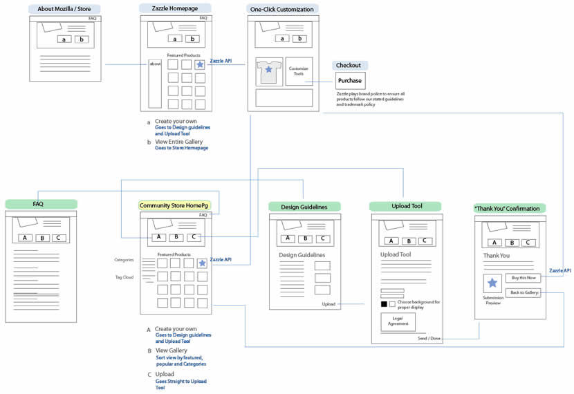
Tara has been designing the Mozilla Community Store and did a couple of wireflows at the page level. Having shrunk down the wireframes to thumbnails, this diagram provides a very nice overview of page-to-page link relationships that the user might take. nform Trading Cards however warn us that these documents could be very labour intensive if the design changes (which I also experienced). Now what if this view was automatically generated with our favourite design tools?
Credits: Tara Shahian
Tags: sitemap, states, user flow, wireframe
Posted in Samples | 7 Comments »
February 1st, 2009
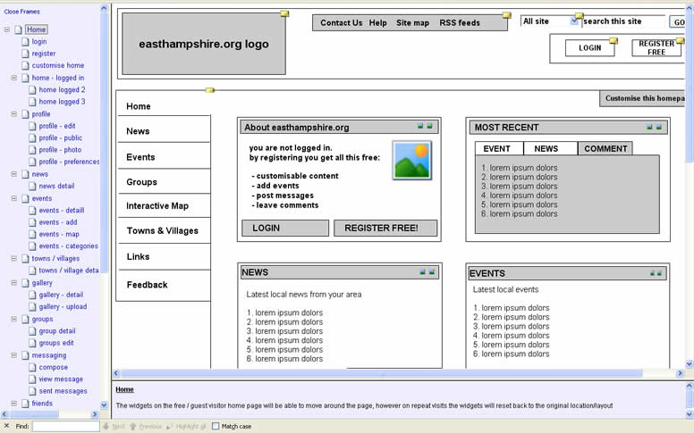
Jim just sent me a very nice and developed sample of an interactive HTML prototype done in Axure. The prototype is clickable and provides a richer understanding of what happens from screen to screen. As a standalone document however, in order for someone to understand this sample they are left alone with exploration as the means to do so. So for user testing and walk through situations this works out nicely, but what about if we wanted to send this to someone else for review and have the sample communicate use on its own without the designer being present? I am now wondering if it would be useful to overlay some sort of scenarios to guide first time viewers of the sample about the most important flows. Just a thought. Jim also sent me a link to a comparison between the prototype and the final product.
He writes:
We used Axure RP for creating these interactive wireframes which we tested volunteers on, to see whether they understood the ‘flow’ of the intended site. Using Axure made it clear for the client to understand what they were getting delivered, and also to see whether we had interpreted the ‘mental model’ correctly from earlier card sorting excercises:
Credits: Jim Callender
Tags: HTML, prototype, wireframe
Posted in Samples | 19 Comments »
January 30th, 2009
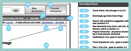
This little design documentation pattern has been with us for a long time and yet it’s still worthy of mentioning. The idea of annotating wireframes using droplets or circles with one pointy edge is a nice visual technique. The coloured circle is what grabs the attention quite well, combined with the pointed edge that allows to reference a very specific area. Will Evans allowed me to post this sample and he also has an interesting write up on his wireframing process. Finally there is also a Konigi Omnigraffle Stencil which uses these droplets as well. I’d also be very much interested to see what others are doing in terms of annotation. If you have interesting visuals, please send those samples over! :)
Credits: Will Evans
Tags: annotation, colour, wireframe
Posted in Samples | 13 Comments »
January 28th, 2009

Sacrificing details for speed can be a very powerful design approach whenever the design space is to be widened and more concepts are to be generated. Creating such small wireframe sketches, as Ash has done here, can truly be a great tactic to get these ideas out on paper rapidly. Such little wireframes ignore detailing anything textual, content oriented or behavioural in nature. These representations perhaps get at the most basic and fundamental characteristics of what makes a wireframe a wireframe. These drawings only represent element positioning and layout. Having so many holes and uncertainties, the power of these drawings is their ability to pose more questions than answers back at the designer. Their lack of detail however makes these documents also weaker as stand alone documents. These little things require hand holding and explanation in order for them to be shared with others. Then again, whatever stirs open discussion and conversation can be very valuable in the first place.
Credits: Ash Berlin
Tags: sketch, wireframe
Posted in Samples | 6 Comments »
January 25th, 2009
Sometime ago I felt a need to represent in wireframes everything that could be clickable or actionable. This came largely from people asking me where one could click on inside a wireframe during presentations. When I just presented black and white screens it was not always easy for them to distinguish standard content areas from clickables and people would ask for confirmation. For this reason I began using one colour, usually red, to denote any interface areas, buttons, or text links that could be acted upon. In this regard, I found that this justified and consistent use of colour worked out pretty well.
Credits: Jakub Linowski
Tags: colour, linowski, wireframe
Posted in Samples | 20 Comments »
January 22nd, 2009

Here is a little challenge: wireframes don’t have to be dull. I’ve seen many wireframes, including my own, represent section areas in very monotone ways by using only single values of grey or just straightforward outlines. In such a case, all elements are perceived equally. Sometimes however as a function or section is being drawn up, thoughts surface about how important or unimportant a particular area really is. Often this thought is shoved aside as information architects by definition are not visual designers and hence it’s best to leave all things related to style alone. But is this really true? Perhaps it’s too early for styling at these phases, but I don’t believe there is anything wrong with documenting (or discussing) visual priority. Matthieu does just that. He varies tones of his sections and it really helps to rapidly visualize which areas are more critical than others. Secondly, in this same sample, font size is also used to denote the importance of text.
Such techniques open up doors for dialogue between information architects and visual designers. If waterfall methods are being challenged by more agile approaches, wireframes can become less hand off documents and more discussion tools. The reality is that traditional wireframes in themselves already steal two core design elements from visual designers. These two elements are positioning and sizing. All wireframes make use of size and position for all text, boxes and content areas. In this light it only makes sense for IA’s to work more closely with visual designers, because visual designers do not just style elements. Visual designers are masters in setting visual priority and controlling element relationships using alignment, positioning, sizing, tone, colour, text size, typography, etc. Talking with them early on could only result in better interfaces.
Quoting Matthieu :
My work is also the result of a method, mostly based on a daily collaboration with Interaction designers, interface designers and marketing strategists. I never work alone, isolated, producing wireframes and then trying to impose them. It is the result of frequent exchanges and documentation on strategy, benchmark, functionalities, and methodology issues. Designing wireframes is the last and (usually) the easiest part of the conception phase.
Designing the information architecture on a page is not only about placing the elements at the right place, it’s also deciding what’s important and what’s not on an editorial perspective. The level of importance of an element is not necessarely related to its size. For instance, an “Add to Cart” button can be highly important but will only cover a very small part of the page. Putting it inside a (visually) strong box can help emphasize it.
Credits: Matthieu Mingasson
Tags: priority, wireframe
Posted in Samples | 11 Comments »
January 21st, 2009
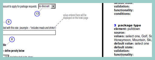
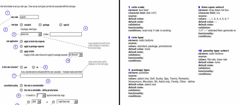
As the design process unfolds on and we begin to tend to the details, form element rules are one area which may be elaborated. From the same designer as in the previous post, comes a sample which specifies form elements in depth. Minoru documents such things as element types, multiple values, default values, character limits, validation rules, etc. Although this is not something that would be typically done in the early phases, such form considerations still can effect the user experience. Thinking about it and putting it down on paper could definitely be worth while.
Credits: Minoru Uchida & Mark Hines
Tags: annotation, forms, wireframe
Posted in Samples | 5 Comments »
January 19th, 2009
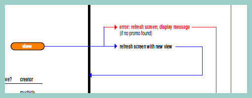
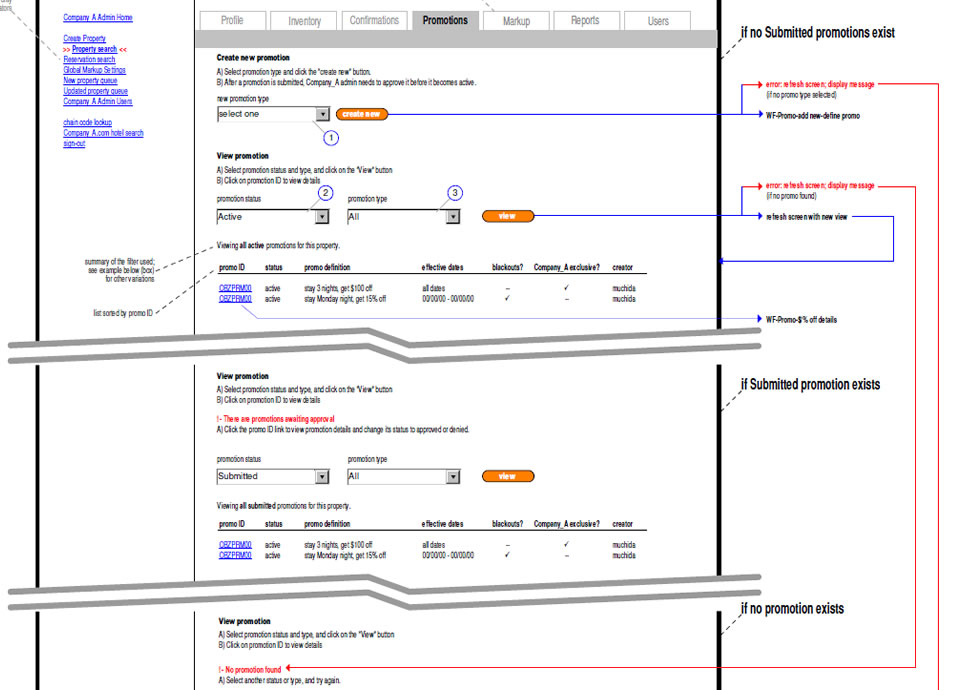
As we begin to think about, sketch and specify multiple interface states, it quickly becomes apparent that error handling is one potential candidate which is rich in state complexity. Looking around for an example of how to document errors I found a very interesting sample of such an error wireframing technique. Minoru Uchida has agreed to showcase and share it here.
The technique is quite simple. Similarly as in the previously described In Page Events example, coloured lines are used to denote user actions. If however there is a conditional error, a red arrow is used to guide the reader to a new page section with the error message in red. The nice thing about this technique is that the page can be further divided horizontally and only a few elements which change are duplicated. The remaining elements such as the header and footer are shared across the full page.
Credits: Minoru Uchida & Mark Hines
Tags: errors, events, states, user flow, wireframe
Posted in Samples | 1 Comment »
January 17th, 2009
Ben pointed me to an interesting set of HTML wireframes which use Polypage. Polypage expands HTML wireframes or mock-ups and allows for the creation of page states. Furthermore, the various states are independent of each other and can be toggled on a small top menu to affect the page view. Say for example you want to show your wireframes to your client in the “logged out” and “first time visit” states. Polypage allows you to click through all your wireframes to demonstrate such a case. Later on when you decide to demonstrate the “logged in” state, all you do is toggle it in the top menu and continue your presentation.
The technique was initially developed at Clearleft, and Richard Rutter explains how to use it better. Here are two more sets of wireframes using this technique which contain more page states to explore.
As a side note, here is also an interesting debate as to whether these things are wireframes or prototypes.
Credits: Ben Sauer
Tags: agility, annotation, HTML, prototype, states, wireframe
Posted in Samples | 5 Comments »
January 15th, 2009
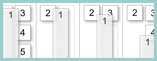
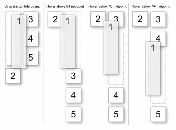
Changing elements on a page can be forceful. Traditionally, the popup or the dialogue box is an example of a rather unforceful behaviour where the overlaying element does not affect the underlying interface. It appears on top and nothing underneath changes other than a drop shadow or a grey out. This does not have to be the case however. One example of such more forceful push and shove behaviours can be seen during dragging operations. Bill documented this nicely in such a diagram. As an item is dragged and its position changes, the surrounding items are affected as they are pushed around. Using key frames, one can imagine the underlying rules during such an operation.
Finally, these push and shove rules do not have to be limited to dragging alone. As RIA elements become more flexible to resizing, dragging, animating or any other positional and size changes, such behaviours could be considered.
I found this example on Bill Scott’s superb companion flickr page for his upcoming
Designing Web Interfaces book.
book.
Credits: Bill Scott
Tags: draggable, events, states
Posted in Samples | 3 Comments »