Archive for the ‘Tools’ Category

InVision Sync (for Mac)

Wednesday, December 5th, 2012


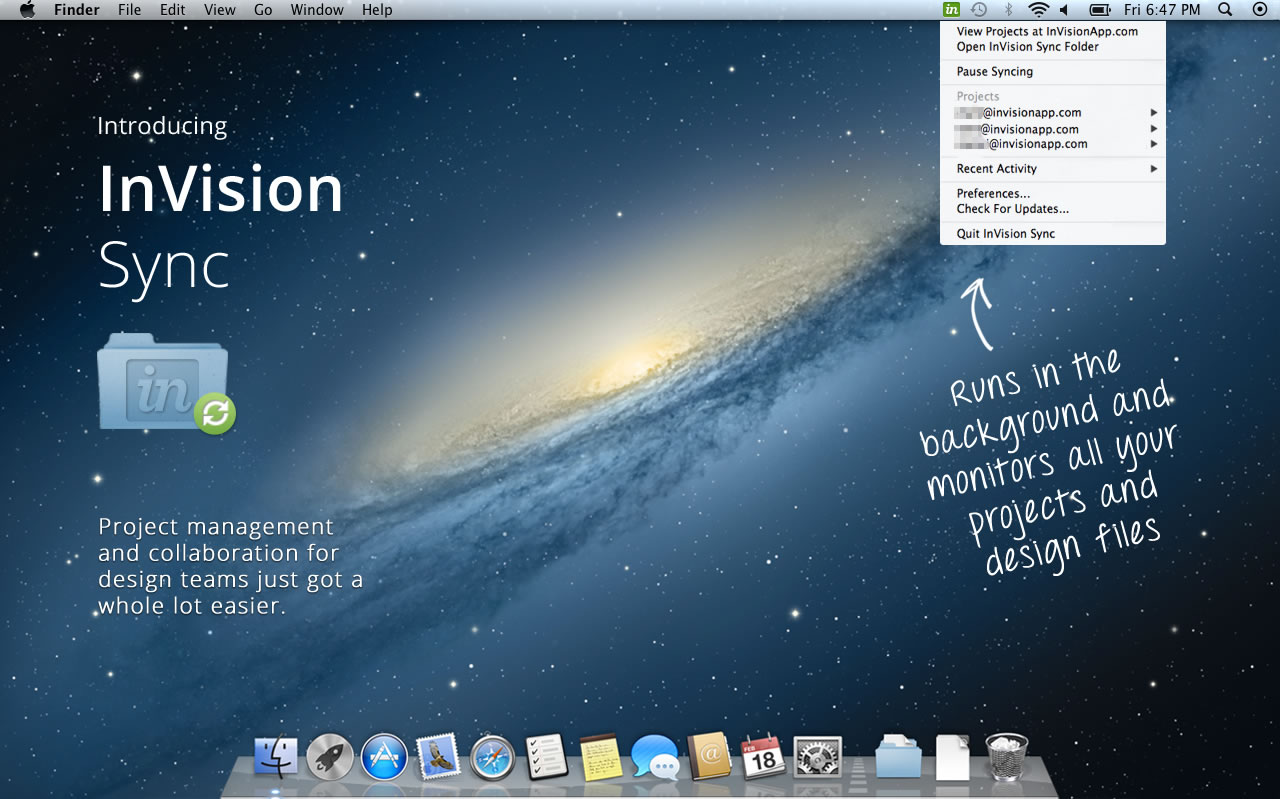
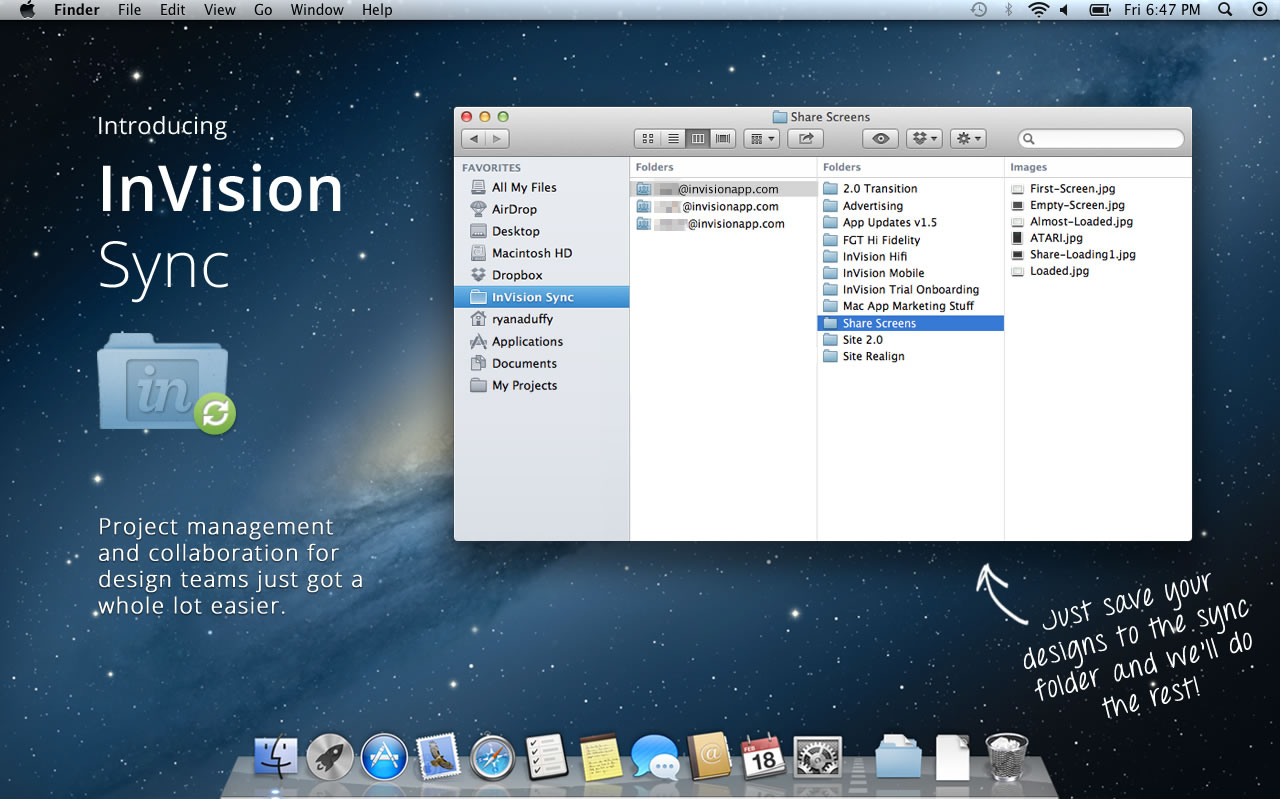
InVision Sync is out (for Mac) and they have removed another hurdle from their online protyping tool – that of having to manually upload screens through the browser. It’s a simple yet powerful improvement which streamlines their prototyping workflow. Designers can now simply set local InVision project folders and then save and manage screens directly to them. InVision Sync will do all the burdensome work of then syncing and uploading the screens to the server so that hotspots can be assigned (hotspots still remain after an existing file has been changed). And yes, if you have a team of designers working on the same project, InVision Sync will upload and download screens accordingly both ways in order to keep things, well, in sync. Way smoother!

InVision Sync runs in the background on the MAC system toolbar and surfaces a few additional quick options to end users. One of these is the ability to quickly grab URL links of projects that can be shared with others. Another feature directly accessible from the toolbar is the ability to see recent comments. Finally, when working with a team, Sync provides system notifications on all files which have been changed. Definitely a move forward in many ways that improves the online prototyping experience.

Ryan Duffy, one of the designers on the project, also released a great Vimeo screencast which explains the full process. Pretty slick!

Ready to try it out? Grab the DMG file.

Interactive Sketching Notation v1.3

Wednesday, November 21st, 2012

ISNv1.3
The next version of the Interactive Sketching Notation is out for those who like to sketch electronically and tell stories with big canvases. The Adobe Illustrator template has been mostly extended to include more icons, device screens, and components amongst a few other minor fixes.

There are now 80 common user interface icons in a sketch based style. Proportionally sized screens now include devices such as: iPhone 4 & 5, two popular Windows 8 phones (Nokia Lumia 920 & HTC Windows Phone 8X), Samsung Galaxy Nexus, Samsung Galaxy S3, iPad, iPad Mini, Nexus 7, and a bunch of browser screens. Newly added components include such things as a: video player, map, chart, two new tooltips, and tabs. Finally, I’m also am trying out a second user story style which is composed of a: user type, scenario title, scenario description, need, and problem – still experimental. If anyone has any symbols, components or feedback to be included in a future release, please let me know. Enjoy. :)

Purchase & Download here.

Credits: Jakub Linowski

FoldTester & Scrolling

Tuesday, November 13th, 2012

FoldTester
FoldTester is a free tool that allows you to enter a URL and see numerous viewable areas as percentages based on world internet users. It’s a simple testing tool for determining viewport areas (minus the tabs, window borders, scroll bars, etc.) as well as determining where the fold might fall. I’m not sure if the tool uses up to date numbers considering the common pattern is that screens are getting bigger.

The fold, beware! Looking at this tool one might quickly fall into the trap of trying to squeeze everything above the fold. It should be noted however, that the fear of users not scrolling is an old fashioned myth. To prove the point, Paddy (the author of FoldTester) also created Life Below 600px, which shows that scrolling should be looked up to as a fundamental UI interaction and basic user behavior. The fold then gives way to scrolling as an immense opportunity for building up a story which leads to a powerful call to action.

One term which I heard being thrown around at work was the notion of a “False Bottom”, that I think is still relevant. The idea is simple. If scrolling is to be relied on, designers should always give the impression that more content is present further. This can be achieved by repetition (showing multiple repeating elements) or continuity (cutting an element in half with the fold). In other words, if there is scrollable content, one should try to avoid showing closure near the fold (ex: lots of white space that suggests completion).

Anyhow, enjoy …

Credits: Paddy Donnelly

PowerMockup v3: Wireframe with PowerPoint

Tuesday, October 30th, 2012


PowerMockup v3 is out. The new version of this awesomely simple PowerPoint plugin comes now loaded with a total of 100 UI stencils and 140 icons. Aside of a nice introductory video screencast which Andreas did, the update allows designers a great deal more of control over their stencil libraries. With custom stencil item creation, export and import options, and categorization, it is now easier to manage and reuse interface assets.

Stencils now can also be searched instantly with a handy keyword search box that limits assets as soon as someone types anything. This search makes use of a synonyms thesaurus of sorts and improves the overall search experience even further. Some stencils and elements are now also made a bit smarter when they are resized. These smarter elements know when and how to keep their proportions, as in stretching a tabbed navigation for example.

Some additional containers have been also expanded to contain such screens as windows, tablets, and iPhones. The plugin works with PowerPoint 2007, 2010 and 2013 and so is ready for the next release of MS Office. Nice!

Try out the 30 Day Free Trial.

Credits: Andreas Wulf

Proto.io V3 – Changes mobile prototyping as we know it

Monday, October 1st, 2012

Proto.io
Proto.io last Thursday just released the next version (V3) of their interactive mobile app prototyping tool. The new version promises to push prototyping to the next level with an even wider range of devices. With custom devices, users can now prototype for pretty much any device with a screen, from SmartTVs to refrigerators. Adding to that, it becomes the first mobile prototyping tool to support full feature animations of UI items within a prototype screen. Its V3 release also includes keyboard events and web fonts, among other improvements.

V3 features in detail from their press release:

Custom device prototyping

Created specifically for mobile, Proto.io identified the growing problem of prototyping for the many different devices and screen resolutions of available mobile devices. Without wanting to restrict users to predetermined mobile devices and factoring in the ever evolving mobile scene, Proto.io took things a step further. It created a prototyping first by giving users the liberty to determine their screen size dimensions and then apply their own skin for the device they are prototyping for, to create a real user experience for the viewer. With this update, prototyping is not restricted to just mobile anymore. It opens up prototyping apps for any device. That includes Smart TVs, PSP and other gaming devices, refrigerator interfaces, airplanes, cars, alarm clocks, medical equipment and pretty much anything with a screen interface. See a custom ‘gaming device’ demo here.

Full feature animations

Since its launch, Proto.io included between screens animations like slide, pop, fade, flip, turn and flow. It now comes to add full feature animations, allowing for simple animations of UI items in the prototype’s screens. That means that users can interact with any item on the screen and make it animate, really bringing prototypes to life. The animations types include move, scale, resize, rotate and fade. Users can set a duration, easing effect and start delay for each animation, and set commands like loop iterations and repeat animation steps. Check out the interactive demos!

Keyboard events and web fonts

Going by the principle that not all devices are created equal, Proto.io wanted to enhance the user’s experience when prototyping for not-only-touchscreen and non-touchscreen devices. For example, a gaming device is accompanied with several hard buttons for navigation and gameplay. Proto.io users can assign keyboard events and map each of these buttons’ functionality. So when a user hits the right arrow key (→) on their keyboard, the corresponding hard button will respond with the action preset by the user. Keyboard events is a useful tool to complement a touch screen interface design that a user would want when prototyping for car radios, remote controlled Smart TVs, handheld gaming devices, etc.

Web fonts are also supported in V3. That includes using any of the 1000+ available fonts, freeing up prototypers to using more suitable fonts for their prototypes. The main benefit of using web fonts is that they show exactly the same in almost any device or browser.

Have a look at more demos and give it a try!

Credits: Alexis Piperides

EightShapes / Blocks

Friday, September 14th, 2012

EightShapes / Blocks
Blocks (github) is a HTML prototyping tool brought to you by EightShapes – the company that’s all about modular components. The JavaScript toolkit allows designers (code literate ones that is) to tag pages or the components within, for purposes of presentation and reuse. Such tagged HTML page prototypes then become listed in a table of contents so to say, along with all of the unique components on the side. Blocks is a presentation layer tool that sits on top of the prototype and can be turned on or off. The other core benefit or idea behind this is that instead of duplicating HTML over and over again, the toolkit instead also allows to reference HTML code and reuse it across multiple pages. Being pure JavaScript, it also looks pretty simple to implement.

One thing which I don’t see and think would still be nice to have is a way to tell stories across these listed pages and components. Right now, all of these assets are very much fragmented and require the designer to do the magic of tying it all together into a flow or narrative. I wonder how the toolkit would feel if there was a layer of visible use cases, scenarios or non-linear flows that could be attached over on top.

Nathan also shares an interesting article which compares HTML prototyping to other tools like Axure. I’d have to agree with Nathan on this one that working with HTML (and JavaScript) for prototyping has the definite benefit of being closer to the medium as opposed to abstracting it. Even if writing JavaScript functions is too much for a designer (although it can be learned), that also opens up a perfect opportunity to collaborate on the prototype with a developer. For me personally, prototyping is less about setting up clicks between all of the screens, as is more about being able to get to the right richness of interaction, data, or visual representation for a narrower set of screens. With HTML and JavaScript there is simply more potential to get to the highest level of detail possible in order to feel out a risky part of the product. That’s not to say, that more often than not, just the “clicks” are adequate and so many other “abstracting tools” work for a lot of people. Thoughts?

Either way grab and fork it from github. There is also a good video where Nathan describes the approach.

In his own words:

EightShapes Blocks is a toolkit for user experience designers to modularize, communicate, and deliver annotated HTML prototypes.

Credits: Nathan Curtis

Fluid UI, Mobile App Prototyping

Tuesday, August 21st, 2012


Fluid UI is a new browser based, HTML5, mobile app prototype tool released the other month by a small and skillful team from Dublin and Berlin. The tool is blazing fast and at the outset allows users to work in two modes. One of which provides an overview of various screens and their links from a bird’s eye view – great for screen flow design. The other more detailed page level view is accessed by clicking on any particular screen, which then brings a close up of it – great for detailing, and actually designing the screens. In the screen design view, users can rearrange standard iPhone, Android and Windows 8 (their newest addition) elements and components by dragging and dropping from a wide wireframing library. A great number of wireframe samples from their libraries can be seen in their extensive flickr stream. The transition between these two views also happen pretty seamlessly as well which adds to the experience.

As users zoom back out to the screen flow design view, all of the links between pages are explicitly made visible as directional arrows – something I’ve come to like and also very much do in my personal style while designing.

Other features also include the ability to incorporate gestures and design for hand-held devices. Out of the box screens are available for a number of mobile platforms, with precanned components for iPhone, iPad, Android, and Windows 8. For those designers that wish to work with their own assets, the tool also allows to upload custom images for use across screens. Mockups can also be previewed and exported as HTML, PNGs or PDF. With the tool being native in the browser, a degree of collaboration and sharing is also possible. More so, the guys have also release an Android App to allow previewing of your work, as well as the ability to setup and scan QR codes related to projects.

Pretty Slick! Give it a try (in Chrome & Safari).

Credits: Dave Kearney & Ian Hannigan

PowerStory

Monday, July 23rd, 2012


PowerStory is a PowerPoint UI requirements tool that Martin has been closely working on and recently released as a plugin for Windows 7, MS Office 2010. The main goal here is to save project time/budget and also improve the accuracy of your requirements and test cases, which is applicable to both small and larger teams.

First of all, it combines written use cases with visual storyboards all within PowerPoint. It does this by associating a PowerPoint slide with each use case step in the main flow and alternate flows defined using PowerStory’s step editor (see the right hand side of the image above).

This more flexible approach enables you to define realistic user interaction behavior, making your requirements more accurate. In addition you will save time because a lot of use case steps and therefor UI mockups will be reused, when compared to traditional linear storyboards.

Secondly, PowerStory also can be used to auto-generate test cases into TFS (Team Foundation Server – Microsoft’s software lifecycle system) directly from the Storyboards. What are test cases? You know, those things which tell you if your big and complex software is on track. The uses cases which are written inside of PowerStory are also tagged as “system” or “user” which then translate into either a UI event or a user action inside of TFS’s as test cases.

PowerStory is a unique approach that can work in both small agile teams and larger enterprise teams, because it combines traditionally separate deliverables into one saving time and increasing agility, but also has the ability to generate test cases for formal testing teams or small agile cross functional ones. And after all it is based on PowerPoint, which is already on most desktops, so it is easy to share your work.

So if you write requirements, wear the Business Analyst or UI/UX hat then give this fresh approach a try.

Here is the five day trial download.

Credits: Martin Crisp

UXToolbox

Thursday, June 14th, 2012


Andrew, an enthusiastic, passionate and friendly developer, asked me the other day to share his excitement and write up a quick mention of his latest accomplishment – UXToolbox. This simple, easy to use product is another alternative wireframing and prototyping tool packed with features and worthwhile of consideration. How is this one any different you might ask? Well, off the top at least two things do stand out which are the Fingertip Emulator and Interaction Cues. The Fingertip Emulator turns the cursor into a larger circular overlay with the size of a typical finger. This becomes an interesting way to evaluate a mobile or touch-based UI quickly and see if the elements are possibly too small (never seen something like that before). The Interaction Cues feature on the other hand is an option that can be enabled and turns any hotspot into a visibly pulsating animation – as seen on the many sample prototypes. This way, viewers of an interactive prototype no longer have to blindly search out where to click.

UXToolbox comes ready to use out of the box, but can be customized when needed. The large number of screen templates (ranging from iPads, Nintendo, Phones, iPods, and other Tablets) packed with a wide range of standard UI widgets and elements, can be used to start generating wireframes straight away. For those that prefer a degree of customization however, new backdrop screens for other devices and different working resolutions can all be added.

Another aspect of the tool I like is its capability to switch between a simple sketchy, more traditional wireframe view and a high resolution, pixel-perfect view which looks just like the real thing. This works great if you want to start refining your screens or to get a feel for the finished design.

For sharing and collaborating, the design tool also has a customizable commenting and annotation system in place. As seen before, comments take the form of post-it like notes, however what’s new is UXToolbox has 6 different color options. Andrew tells me the idea being that different color notes can be used to capture different types of information e.g. User Steps, Questions, Ideas, Assumptions, Requirements, etc. There is also a wide range of exporting options available. Users can export to PNG, Word, HTML, XML or three different types of print out styles. The Word export also boasts the ability to include the coordinates of the UI elements placed on a screen in a nice little layout table.

A good bit of work for such a young startup! Thanks for sharing Andrew. Want to give it a try? There is a 14 day trial download available for the Windows platform (which apparently has also been successfully emulated on MAC with VMware or Parallels). A little bird tells me there may also be a MAC version available later in the year.

Two Thumbs up! :)

Credits: Andrew – SoftandGUI

Living CSS Style Guides & Pattern Libraries

Monday, June 4th, 2012

Living CSS Style Guides & Pattern Libraries
A number of tools have recently sprung up with the aim of generating and maintaining one’s own CSS Pattern Libraries or CSS Style Guides. Living front-end CSS style guides can especially be quite powerful if done right. Guides help to decrease the amount of UI waste that is generated by minimizing the need for detailing similar screens over and over and relying instead on reusable elements. Detailed visual mockups still make sense for a few initial stylistic explorations. However, when teams over rely on detailed screens to communicate UI ideas, things start to duplicate, fragment and slow down. Living CSS guides are tools that could potentially work with wireframes, by placing common emerging UI elements and patterns into one shared place.

Here are a few interesting and emerging tools which I found that might help with starting your own CSS Pattern Library:

  1. Pea.rs by Dan Cederholm (github) – a WordPress theme that basically turns your blog entries into interface pattern pairs of HTML & CSS. It comes with a few default patterns and the UI looks slick. The one disadvantage is that people would still have to transform the pattern library from WordPress into a real workable common.css file that could be used on a real project. So for maintainability, the pattern library and the actual CSS is a bit disconnected.
  2. Knyle Style Sheets by Kyle Neath (github) – a documentation standard for writing more understandable CSS which auto generates a style guide. You start off by writing your CSS and then with some Ruby on Rails help, the CSS file can be automatically turned into a guide.
  3. Pattern Response by Luke Brooker (github) – a PHP script that takes patterns defined from folders and generates a style guide. Each pattern can be composed of HTML, CSS and a potential description.
  4. Pattern-Primer by Jeremy Keith (github) – also a PHP script which automatically generates CSS patterns.
  5. Kalei Style Guide by Thomas Davis (github) – this project aims at making sure your style sheets are fully documented whilst being synchronized with your webpages styles. To do this it actually uses your live stylesheets in so that at anytime you can review how your styleguide looks.

Credits: Dan Cederholm, Kyle Neath, Luke Brooker, Jeremy Keith and Thomas Davis