Archive for the ‘Inspirations’ Category

Lean Sketching Tips: Flexible Fidelity & Cutting Corners

Friday, March 8th, 2013

Lean Mean Sketching 101
Here is some lean UI sketching advice – let the level of detail be a variable in your design process that which you control. Staying conscious of and knowing when to cut a corner or when to spend additional time detailing an interaction, screen or flow is a healthy thing. All sorts of design tools impose certain fidelities on to us the second we pick them up. Take on Axure RP for example and before you know it you’re sucked into aligning stuff at a pixel level whether you like it or not. Load up Adobe Fireworks too quickly and subconsciously you begin writing actual copy, comparing pixels, and choosing RGB color values. The tools which we use, just as Donald Norman said of the artifacts we design, also come with affordances – do stay aware of how much detail they ask of us.

Surely everyone by now knows that sketching tends to be low fidelity in nature as it’s often quick and dirty. However when it comes to its fidelity I think there is more to it. Sketching in particular is a lot more flexible than we think comparatively to other tools out there. I believe that sketching allows designers to work at a wider and therefore more flexible range of detail. On one hand it may be super quick, yet at the same time it also allows us to slow down and elaborate. Here are a couple of examples of what I mean:

Scribbles vs. Real Text

Scribble Text
Consider the text we show and indicate in our work. Sometimes it’s rightfully fine to just ignore detail and save time by showing it as a bunch of scribbled lines. At other times of course we may imbue our concepts with more detail and show the actual text. After all, copy has a clear connection to experience, usability, and understanding. Nevertheless, choose wisely.

Outlines vs. Depth with Contrasts

Outlines
What about outlines – they are a quick way of suggesting an area. These of course can be elaborated with depth or contrast in order to convey element priority. Lighter backgrounds can give way to darker ones when it comes to showing importance.

Partials vs. Full Screens

Partials
I love how useful partial screen sketches can be! They cut through time and effort like a knife through butter (and also save you additional time when you later have to update your working documents). Why design a full screen if all that matters is the top navigation? Sketching in this way allows the designer to emphasize by leaving other elements out, literally. Of course, at other times full screens are the way to go. Be in control!

Placeholders vs. Detailed Components

Placeholders
Placeholders abstract a component by describing what it contains with the byproduct of spare time. It’s a good way of cutting a corner. Alternatively spend additional design time on the same component and turn it into a higher fidelity object.

Approximate vs. Precise Alignment

Approximate
As mentioned previously, aligning elements to the pixel can be a time sink. Sometimes an approximate position is just as fine. Similarly, the same rule applies to how straight or crooked we draw our lines. Decide what works for you and when.

Taken together, being in greater control of a design process does matter with the level of detail being one such variable. When corners are decidedly cut however, some clear benefits do arise. The additional spare time which is brought on can then be allocated to other and more important areas instead. One beneficial use of effort early on in a process is on widening the scope for example and thinking through broader interactions as opposed to just a few screens. Another valuable benefit of cutting corners is for designing alternatives and generating more ideas for the same screen, interaction or user story. Of course as a project unfolds and more knowledge along with deeper consensus is generated, don’t forget to start raising your level of fidelity. After all, the devil is in the details. The important thing here is that you (and not the tool which you use) are in charge when the detailing begins to happen.

Credits: Jakub Linowski

Form Follows Function

Monday, February 25th, 2013

FFF
If you haven’t already heard of the Form Follows Function site, it’s definitely worth a peak at. The site showcases a bunch of interesting CSS and HTML5 experiments by Jongmin Kim, that stretch our understanding of what is possible with modern browsers. As an example, here is a CSS transform Flip Clock. The project has quite a few examples that somewhat remind me of what Joshua Davis was doing back in the early days of Flash. So if you’re tired of those bland boxes and arrows, here is how one individual has pushed HTML to its limits. Definitely inspirational.

Credits: Jongmin Kim

Calling Bull$#!%: The Best Interface Is No Interface

Friday, December 28th, 2012

Calling Your BS
A thoughtful article by Golden Krishna of Cooper came out a few months back which has picked up some steam recently. Its title reads “The best interface is no interface” which I think is one sided, flawed and so here are a few of my thoughts on it out in the open.

Reductionism and minimalism do not guarantee a good interaction. The author seems to advocate a 3 step process for most user tasks. On the other hand however, Zoltán Gócza writing the UX Myths blog has challenged the 3 click rule sometime in the past already, advocating for ease of navigation and a scent of information instead. Then again, I have to admit that I do value simplicity just as Golden Krishna. Lowering unnecessary cognitive workloads must be a good thing as opposed to lengthy and manual labour intensive tasks. I also do believe that a design process often unintentionally fragments the forms we design and it’s very healthy to spend energy and effort to merge or refactor shared functions so that there is less interface duplication. Nevertheless, you can still have a useless or unusable 3 step process and an awesome 7 one. More so, when you take the statement of reductionism and push it to the extreme, you result with a 0 step process and nothing to interact with at all. In that case all that you’re left with is an aware system that knows you inside out. Is that what we want? Is that good design? Perhaps in some cases yes, in others less so I think.

Non-screen based thinking does not guarantee good needs based design. The author writes “When we let go of screen-based thinking, we design purely to the needs of a person.” I’m not sure that letting go of the screen guarantees good design. There are tons of screen-less traditional tangible products which are crap. You can still have needs based user interfaces but that comes more from your values as a designer and your process. Don’t punish screens for poor design.

Interfaces are actually good because they allow us to express intent. Whether you are clicking a button on a screen or turning your keys to open a door (also an interface with two states), you are expressing a very clear intent. Interfaces (screen based or not) enable interaction. Sure, I believe adaptive systems that learn about users are great, but they are not an answer to all situations. Imagine Amazon’s adaptive algorithm being so far stretched that they actually automatically order products for you. Call it the No-Click Ordering Process. Would customers have to spend more time at the post office trying to ship and return unwanted products? Now imagine a purely adaptive nuclear launch facility without all those terrible buttons that require two users to turn the knob simultaneously before a missile is launched. Perhaps sometimes, manual expression of intent is still a good thing – at least until Ray Kurzweil figures out the singularity thing?

Interfaces are also good because they limit the amount of information that is displayed at once. Take a book as an example which is an interface to a story. With it, we can navigate through pages and chapters and focus our limited human attention at words which we combine into sentences over the course of time. If a book did not have an interface however, we would not be able to flip through pages. Instead, we’d have to comprehend the full story in an instant split second with our brains frying from cognitive information overload. A good interface respects our cognition with a proper visual hierarchy and serves us limited amount of content at a time. Let’s not get rid of it completely perhaps?

Screen based interfaces are extremely multifunctional. Actually one thing that traditional screen based interfaces do quite well is that they can shift their functions pretty quickly and flexibly as someone interacts with them. The number of functions a screen can serve is infinite. Sure that comes at the price of learning and possibly confusing some users, but that becomes the designer’s job with the potential at their disposal. A physical product such as a wine opener will be a wine opener and serve a very narrow set of functions by comparison. Yes, the advantage is surely that a wine opener allows us to store the interaction as motor memory with the benefit of physical tactile feedback. Nevertheless I think a designer should choose if the product should be screen based or tactile or both based on some of the qualities and interaction characteristics.

Don’t get me wrong. I think it’s great that Golden is challenging the amount of screens we “slap” everywhere. Those two examples of a car dashboard with a Twitter screen and a fridge with another are perfect in highlighting desperate and thoughtless products. I think it’s also great that the author is thinking about adaptive systems that alleviate unnecessary labour and guess some decisions for us. Finally, I also think it’s great that Golden is taking into account hardware sensors that open up novel ways of interacting. But please don’t shoot yourself in the foot and make sensational statements that the best UI is no user interface at all. If the best UI was truly no UI, then why not put your money where your mouth is and get rid of all links and buttons on the Cooper.com website, and well, actually why not get rid of the screen based website altogether? Sorry if this sounds harsh, but it’s just a devil’s advocate thought experiment to make a counter point. :) I suggest we stay clear of extremist design philosophies and find a more balanced approach where good interfaces live alongside adaptive systems and new interactions. In the end, interfaces are here to stay and so is my pencil.

Credits: Jakub Linowski

Iterations: Concepting Cards

Friday, December 21st, 2012

Iterations
Design inspiration cards have been around for a while in various shapes and sizes with the intention to challenge and help us break out of our routines. Duncan, a product designer in the Netherlands, made a concepting card deck called Iterations which he released under a Creative Commons license. He also describes his process of building them in a blog post.

Iterations is interesting in that it focuses on the early ideation phase when designers are “concept sketching”. The cards have small tactical actions that inject some randomness into a design process, which might say “SHUFFLE Disorder components”, “LOOP Repeat last Iteration”, or “COMPRESS Remove excessive space” as an example. Most cards are clear and understandable, even if some are a bit abstract, such as “POSSESS Imbibe iteration with the spirit of a personal hero.” :)

Either way, a pretty interesting project I think even though it cannot be bought. You can still make it yourself if you read and respect the CC license.

Updated: Duncan informed me that there is also a free online version. :)

Credits: Duncan McKean

Blueprint Wireframe

Wednesday, October 24th, 2012


Here is a something a little different while drawing inspiration from the past – a blueprint wireframe. It definitely looks like a traditional architectural or engineering diagram with a clear conceptual look. Derek has done up the piece in Photoshop (debatable whether the best tool for wireframing or not), but nevertheless the white on blue colors and jagged lines surely make this piece feel like it’s an abstract representation of lower fidelity. I thought it was pretty interesting that someone has found inspiration from 19th century diagramming. Thanks for sharing.

Credits: Derek Clark

How I Sketch: An Introduction

Wednesday, August 15th, 2012


I’ve decided to do a screencast of How I Sketch and the style that came to be known as the Interactive Sketching Notation. It’s around 13 minutes in length going over the basic concepts, some of the key benefits, as well as an example of a real world project. The video is in HD so you might have to expand to full screen in order to experience the real deal. Somewhere at the end you might also find a few minutes of attempted real time UI design. :) Let me know if it’s useful, and if it is, I might do another one of these in the future. I’ve also setup a Vimeo Channel for this just in case. Enjoy. Cheers.

If you need the Adobe Illustrator template, you can purchase it right here for $29.

Credits: Jakub Linowski

Multi-Device Layout Patterns

Monday, April 30th, 2012

Multi-Device Layout Patterns
Multi-Device Layout Patterns is a short compilation of a few common layout patterns by Luke Wroblowski after he has gone through the Media Queries site. The article contains 5 high level layout considerations that could work for when dealing with responsive wireframes. A great inspirational read for those who like to respect flexible screen widths.

Credits: Luke Wroblewski

Interface Origami

Monday, April 16th, 2012

Interface Origami
Juan has been recently playing with paper in order to explore some possibly new interactions. This person is trying to pinch, tear, flip, curl, fold, and peel UI’s in new ways just for kicks without the limitations of pixels. In a way this kind of stuff resembles paper prototyping a bit but probably focuses more on discovering new gestures. Either way, it’s an awesome way to think outside the box in my opinion, as tactile play breads creativity. Thanks for sharing!

In Juan’s own words:

In a previous post, I mentioned a way of thinking about interactions and interface within a framework of depth and space. The ideas were centered around the digital space, but as a designer I find it’s important to remove myself from that space and explore solutions that can originate in physical space.

One of the easiest ways to do this is to break out scissors and paper. With paper you can remove the constraints of working in pixels to fold, tear, flip, curl and manipulate the medium to discover solutions that may have otherwise been missed.

To illustrate this, I created a few examples based on some familiar apps and others based on former concepts I’ve played around with in the past.

Credits: Juan Sanchez

Wireframes Old & New

Friday, March 2nd, 2012

Wireframes Old & New
There is a bunch of articles out there that raise some of the problems, disadvantages and limits behind wireframing. Here are at least four such write ups that I’ve come across lately. Although many of the authors invoke “death” analogies, please don’t be put off as most articles are quite constructive. :) I doubt wireframes will disappear altogether, but instead are probably undergoing a transition of sorts.

Sketch More, Sketch Better: The Buzz at Interaction12

Thursday, March 1st, 2012

Article by:


I am a sketcher. I recently realized quite how much sketching defines what I do when someone pointed out to me that I rarely present any work without a pen in my hand. Whether I’m drawing on a whiteboard or quickly sketching on paper sketching that helps me to illustrate what I’m talking about. So it was an interesting challenge when I was asked to present a workshop at the Interaction12 conference in Dublin, where I would be doing the talking but the participants would be doing the sketching.

Looking at the number of workshops and presentations at the conference that were related in some way to sketching, and the number of people who have viewed my presentation slides on Slideshare (nearly 70k views in just over a week), I think it’s pretty safe to say that the perceived lack of sketching skills in the digital design community is something that has obviously touched a nerve. With all the rhetoric around collaboration with coders and clients through sketching, and the focus on lesser deliverables, this was obviously well timed.

I do believe that by breaking the ‘art’ of sketching down to a set of basic techniques that can be practiced, anyone can create sketches that not only do a good job of communicating but also look good. But before I dived into the practical side of the workshop I spent a bit of time asking people to think about 2 really important aspects that underpin all of the techniques that I was about to share: ‘what is a sketch?’ And ‘why sketch?’

What is a sketch? (and what isn’t?)

Firstly, and possibly most importantly, I like to make a distinction between sketching and drawing.

A sketch is not the same as a drawing in 2 important ways: execution and intent.

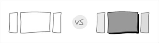
Aside from the obvious wiggly lines vs. straight lines type of differences, it’s easy to look quickly at something and decide whether it’s a sketch or a drawing. Quality and fidelity are easy markers but there’s more to it than that.

Unlike drawings, sketches aren’t precise and often include mistakes or corrections. A drawing is closer to a finalized design or idea. From a drawing you can get a good idea what the whole thing will look like. And that’s often what stops people picking up a pen. Half of the time when people are reluctant to sketch it’s because they are scared that their sketches will be judged by the same standards we use to judge a drawing or a polished design.

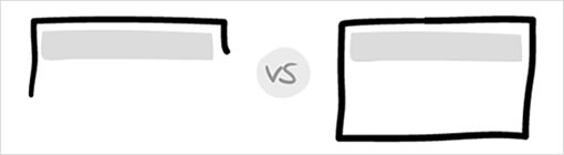
A good sketch doesn’t try to describe everything in detail (the bit that counts is ‘in focus’ and the rest is vaguely described for context), but it gives you enough information to get the point across.

When I sketch I’m not looking to create a beautiful, polished or even finished object (sketches can be beautiful, but they don’t have to be). What I’m trying to do is to capture an idea so that I can communicate it to others and explore whether or not it works. I’m not trying to do visual design on paper. We’ve all been in scenarios where the bottom line is boss and thinking time is seen as a luxury. If I’m spending time articulating all of my ideas in high fidelity on paper, it’s going to take way more time than I have.

The point of sketching is not to produce polished outputs, it’s to explore, challenge and validate ideas. That’s not to say that sketches can’t look good. They can, and with a bit of practice they will. But it’s not so much about what they look like as what they allow you to achieve.

Fast and free

I like to sketch because it’s quick and free (and not just in the financial sense). I can explore ideas on paper much quicker than I can in Illustrator or other tools and I’m not tempted to fall back on libraries of stock elements to solve problems because it’s easy.

Plus, the temptation in doing things digitally is to make things too neat.

When I am about to sketch on paper, knowing that it will be harder to undo, I hold myself back and think twice before the ink or lead leaves a mark … When I sketch electronically, this worry disappears as I know that I don’t have to generate the right ideas, but instead can easily correct myself if something needs adjusting. [Jakub Linowski]

Show your workings

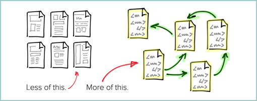
I’m not against sketching digitally. If you can work as quickly as you can on pencil and explore as many ideas in the same way, then the medium isn’t really the issue. My worry is that working digitally encourages us to tidy up and erase mistakes, when often the mistakes are just as important as the final idea. If we are constantly hitting undo, all of those mistake are lost. We end up with a polished final sketch, but no record or evidence of how we got there.

When we’re reluctant to capture our ideas as sketches, often those ideas don’t get captured or aren’t explored as fully as they might be. Sketching is a really useful ideation and communication tool. The ‘art’ of sketching can be learned and practiced, but the real value is in the generating of ideas and the discussions around those ideas that sketches prompt.

Sketching shouldn’t always be solo

Jakub makes a really nice point in his piece on digital sketching:

Looking back, sketching has been wonderful at giving rise to design
representations that naturally act as conversation starters

I agree wholeheartedly with this. When I start to address a design challenge, my sketches are much looser and lower fidelity, but still enough to prompt and aid those conversations.

Sketches do not have to be pretty, beautiful or even immediately understandable by others. However, you should be able to explain your sketches and ideas when anyone asks about them.

– Sketching User Experiences [Saul Greenberg, Sheelagh Carpendale, Nicolai Marquardt & Bill Buxton]

Often the sketch will develop and evolve over the course of the conversation, as per Jakub’s point here:

Perhaps the use of paper can still be justified in collaborative sketching sessions when there‘s more than one designer at the table and the design activity happens simultaneously in real time.

I am a big advocate of this style, with one significant difference. I’ve seen this work successfully (and often) where the collaborators around the table aren’t just designers. Some of my most successful ideation sessions (for generating good design based around insight) have been when there have been designers, clients/stakeholders and developers all contributing and sketching – not just the designers.

Part of the beauty of sketching is that it doesn’t look like the finished product. It’s like creating wireframes with ‘wiggly’ sketch lines to reassure the client that this isn’t what it’s going to end up looking like – except you’re actually sketching rather than making your digital version look sort of like a sketch. The key thing here is that people don’t mind scribbling on a sketch to show you what they mean. And then you’re on your way to collaborative design. Happy days.

Sketching in code

I heard the phrase ‘sketching in code’ mentioned more than a few times at IXD12. In his presentation, Jonas Löwgren talked about (and showed) how really complex interactions can sometimes be best communicated by building them out (show don’t tell).

Although I don’t disagree with this, I don’t think it’s always necessary when we’re dealing with less complex interactions, as many of us are compared to the things Jonas demonstrated.

Committing to building something (as opposed to sketching it) definitely restricts the way that I design. It certainly takes me longer to build it than to sketch it, and as a consequence I find myself exploring less ideas. Plus, if I’ve spent time building something, I’m more inclined to keep elements and re-use them rather than starting from a blank slate. Perhaps this is a symptom of me needing to get more comfortable in code the way I am encouraging people to get more comfortable with a pen or pencil?

Sketch more, sketch better

So, in short: sketching is good, mistakes are ok, neater isn’t necessarily better and when it comes down to brass tacks, good well thought through ideas are what counts.

Like anything, the more you practice, the better you’ll get. There’s more about what is/is not a sketch as well as some basic techniques and exercises in my Sketching Interfaces workshop sides.

Credits: Sam Smith