Archive for the ‘Samples’ Category

Wiremaps

Thursday, October 15th, 2009


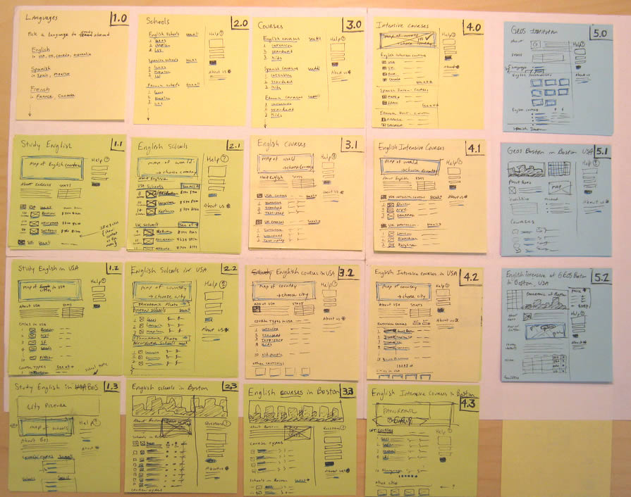
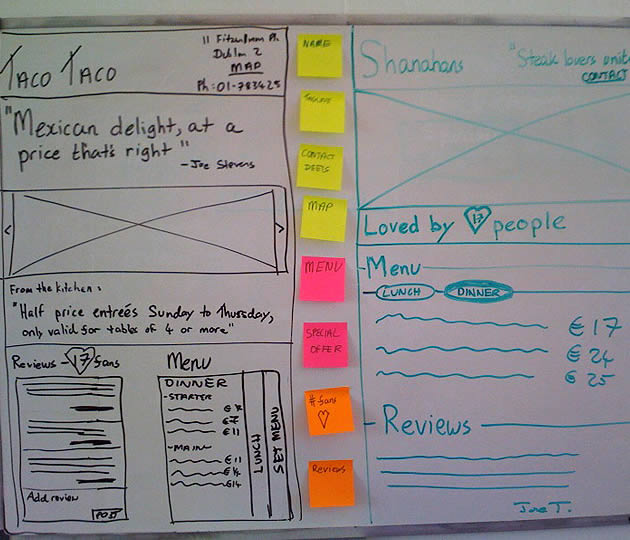
Combine wireframes and sitemaps together and you get something like this following sample from Jason. Wiremaps or siteframes? :) In the man’s own words:

First, the colors aren’t so significant. I just ran out of yellow. :) Underneath each sticky is a few other stickies from previous revisions. As time went on, things changed and so did the stickies on this page.

This document started off as ideas scribbled on a whiteboard. We devised an info architecture that involved controlling the user path by allowing them to drill down (vertically on the sheet) and across ( horizontally) but not diagonally. It’s not super clear, but everyone who needs to know understands the user flow through these pages.

There are 12 new pages that need to be created, as well as revising another half dozen or so. These sticky-frames also act as a site map, or at the least, a site map of templates.

Credits: Jason Robb

Visible Change History in Sketches

Tuesday, October 13th, 2009


According to Jason, sketches are never complete but only refined. They exist with the intention to pose questions and ask to be scribbled over on top. And that’s exactly how Jason uses them. He will make adjustments and modification straight over them with a red coloured marker. Thus in a way, all on the same drawing, the sketches become a layered representation of the initial idea along with the revisions. Although I personally prefer to use red to represent action items on my sketches, I still find this interesting approach in its power to visualize a history of changes. This makes me wonder though if there would be a systemic way to separate out all future sketch revisions from each other. Could there also be possibly a way to tag which sketched changes belong to which person (should there be multiple authors?) … ahh, just thinking out loud.

Enough of my thoughts. Here is what Jason really thinks:

I was sketching some designs for wireframe templates. The red is my way of calling attention to changes, questions, or comments about the design.

The neat thing about sketches is that what you see there is black and red. The black is my initial guess. The red is the correction to my initial guess. From there, I implement the changes in the live product. So, for instance, I opened my PSD and made the changes in there.

So the sketches are never really “done.” They’re done in the sense that I’m done using them. But they’re not done in the finished sense, they don’t reflect the final changes, other than by what I’ve written in red.

Credits: Jason Robb

MBTI Sketching Framework

Thursday, October 8th, 2009


Here is another interesting sketching approach which Henk describes in detail in an article on his blog. Basically, the framework he uses aims to support various personality traits based on the Myers-Briggs Type Indicator, as originated from the psychologist, Carl Jung. In this approach, the designer is forced to generate concepts for these distinct personality types which are segmented into four areas. These types include: competitive, spontaneous, humanistic and methodical. I guess it’s interesting to see designers find inspiration from 100 year old ideas.

Credits: Henk Wijnholds

Multiuser WireFlows

Tuesday, October 6th, 2009


I enjoy seeing flows which try to capture more complex activities. After all, interfaces are under constant strain from various people which use it in a multitude of ways. Carlos has just shared a sample which represents a flow containing at least three different persons attempting to interact with the same interface. The different coloured paths uniquely indicate how the different users take twists and turns over the same screens. Come to think of it, the various users which start off the flow, could just as well be replaced with various use cases belonging to the same person type.

In his own words:

It shows three different persona on a navigational journey through a cross-linking architecture, that takes them through 2-3 different sections of a site — not including the home page, from which they all start. The “Self Referral” persona goes through three sections or the site: Who We Serve, Outcomes & Case Studies, and Services on their path.

The journey starts with the informational intent of the persona. From there you can follow their journey via a line colored for that persona, which describes action-events in brief notes on the line itself. The page thumbnails are the actual wireframes shrunk down. This document is meant to be read along side the wireframes, casting light on them, and vice versa.

Credits: Carlos Abler

UI Flow Shorthand Notation

Tuesday, September 22nd, 2009


Amongst screens and wireframes, as interaction designers it is always important to consider the time element which binds and glues interface forms with human activity. Ryan Singer of 37signals just wrote an awesome little article about a quick way of noting down one of the common time-based documents we deal with – user interface flows. His shorthand version of a flow relies on making clusters composed of interface states or screens (above a horizontal line) and the actions which users take (below a horizontal line). These interface-action combinations are then transformed into a flow with the help of arrows that show possible sequences.

As basic as the approach sounds, it offers something quite unique in its potential for flexibility. Interestingly, Ryan has figured out a new way of how to represent alternative user actions per each screen (something I haven’t seen done before). These various actions which the users may take, can be separated out using a dotted line. More so, the notation also allows to visualize combined interface results stemming from a single action with the help of forking or branching arrows.

Overall, in an agile fashion, Ryan does not give much weight to these documents. Just like any other light and sketchy work, he hints at these flows being ephemeral and perhaps even a bit self-targeted:

Now don’t forget: all diagrams are destined for the garbage. The meaningful work is work that directly affects our customers as screens they can see or code that functions. But we still need to communicate and manage our work along the way. This shorthand has met a bare minimum for me to get a flow out of my brain in order to move on to other things. I hope it’s useful for you too.

Credits: Ryan Singer

Prioritized Stickynote Requirements

Thursday, September 17th, 2009


Des just sent me a link to where he describes his early design process with a few whiteboard wireframes. One thing he does is create some sort of inpage requirements with the help of sticky notes which are placed alongside the UI work for inspiration. These rough and abstract textual ideas or requirements guide his thinking during the wireframing process. More so, he goes even further and uses colour coded stickies to denote priority.

In his own words:

They’re colored by importance. For this project it was:
Yellow = super important, site is useless without
Pink = nice to have, but requires restaurant owners to do some work
Orange = social features, relies heavily on people using the site (might not be there at all).

At the same time, I also found it very interesting that Des explores variations or alternatives as not to fall into the pattern trap. There is another interesting article related to this which he wrote about, Thinking in Patterns, on his company blog.

Credits: Des Traynor

Long Page Sketches

Thursday, September 10th, 2009


Quite often user interface pages will have to be long and scroll. As obvious as it sounds, here is a sketch which supports this. Jason has simply decreased the size of his frames and made them taller. On the same note, one of his sketches also makes use of a zigzagged line. I would guess that has been done to suggest a continuation of sorts, allowing him to communicate that there is more to the page without having to go into detail. I also like the heavy emphasis used on the title. Nice!

Credits: Jason Robb

Functional Mindmaps

Tuesday, September 1st, 2009


Abstracting away from the way the interface looks, we begin to face higher level goals, functions or activities that the design ought to support. Eugenio here has done just that by using Mindmeister software to generate a high level mind map of the activities users will be able to accomplish. Thinking about functional requirements such as these before jumping into wireframing is a divergent design tactic as it allows more flexibility in interpretation. In other words, by being more ambiguous these functional mindmaps can generate a greater variety of new ideas. Comparatively, wireframes or sketches which are more concrete, are a convergent tactic which steer us in a single direction with the aim of getting us all “on the same page”. In my opinion, a design process that makes room for both divergent and convergent tactics, generates the best results. I guess, Eugenio’s sample here is a nice reminder to think a little bit bigger beyond the boundaries of the wireframe.

Credits: Eugenio Grigolon

Inpage Requirements

Thursday, August 27th, 2009


Ben just sent me a sketch which uses a number of techniques seen previously. One thing which is a bit unique perhaps are some of the short lists of requirements or goals which he combines with his sketches (seen on page 1 and 3). These seem to guide his thought process at the outset, and are often at the top of a page in the form of a list. Another cool thing he does is break up his ideas into some conceptual chunks with distinct titles that are highlighted. He also emphasizes his sketches similarly to some approaches listed earlier. To draw attention to certain elements, the thickness of borders is varied and some of the screens use colour overlays. Ben’s sketches are also occasionally loaded with question marks – something I’ve noticed to appear in my own drawings as well. Here is how Ben describes his process:

1. I usually lay down a 10% cool grey field where I am going to show “the screen” (or whatever object I am going to sketch)
2. I then draw in the frame of my screen, usually with a Sharpie. I like the effect of the bold border, and it helps me to set up a hierarchy within the sketch with different line weights (Staedtler 0.1, 0.3, 0.5, 0.7 mm black pigment pens)
3. Once I have the screen set up, I just sketch as needed, showing different levels of detail depending on what I need to document
4. I use a wash of blue (very light blue marker) to set off anything that I want to emphasize, red pen for interactions or to call out areas

Sometimes I use a light color pencil to add dimension or texture if I feel it’s important for the design, beyond that, it’s pretty free form.

Credits: Ben Rossi

Selfishly Freeform Sketching

Thursday, August 20th, 2009


Selfish. That’s right. Sketching for an audience of none other than oneself I’ve noticed to be really elevating and empowering. Ideas are represented as messy chicken scratches along side each other which no one but the original designer understands. Ideas are not bounded with a border and are very close to being without any structure. In this way, ideas are also offloaded onto a piece of paper more rapidly as they are formed in the mind. At least I find, that not having to worry about the communicative value of these infant ideas results in more speedy exploration. For myself, sketching in this manner is also a way of embracing uncertainty which gives more opportunity for questions to rise. Looking back through some of my own work, I’ve noticed that often with these messy selfish sketches I sometimes record such emergent uncertainties. Each time a question pops up in my mind, I draw it as question mark inside of circle right on the page. These new considerations are later tackled in future revisions or more refined sketches such as visible here.

Visible through this example, perhaps the importance of communication in sketching is emphasized. At times, yes, it is important to share and communicate your ideas with others. That’s where structure and clarity comes in to aid. At other times however, it is also important to set proper conditions to allow communication to happen between just you and yourself. That’s where more free form and unstructured representations such as these might be more useful. I’d say that making room in a design process for sketches which can communicate in these two distinct ways, is equally important.

Credits: Jakub Linowski