Archive for the ‘Samples’ Category

Big Transparent Thumbs

Tuesday, January 26th, 2010


Vincent, a friend of mine, has been tinkering with some new ways of portraying simple touch screen interactions on his Get Around application. He uses a big overlaid thumb with a set transparency to indicate the touch. For indicating a dragging action, the thumb also contains an arrow with a direction. Just thought to share this as I found it interesting. To refresh quickly, Elaine has also approached the same problem previously in a slightly different way.

Credits: Vincent Steurs

Wireframe-Mockup Hybrid

Tuesday, January 5th, 2010


Recently, a visual mockup technique by Alex Faaborg on the Mozilla blog caught my attention. As Alex has been thinking about the merits of searching and browsing through bookmarks and history for the next Firefox version, it seemed like in a way he merged the traditional wireframe with a detailed mockup. While parts of the interface schematics are faded outlines devoid of any colour, other parts are represented in full colour and contain rich depth. Interesting? This effect enables the designer to emphasize the more important parts of an interface and focuses the viewer’s attention on what matters most. These wireframe-mockup hybrids perhaps reaffirm the importance of designing UI parts in the right fidelity and at the same time remind us that it is ok to leave stuff out.

Credits: Alex Faaborg

OmniGraffle Wireflows

Tuesday, December 29th, 2009


Andreas just sent in a sample of a wireflow done in Omnigraffle (here are a few more) which I thought was an interesting show. It contains a sketchy style, conditionals, and groups a set of pages together with a grey background area. Most recently, this way of working is also my personal preferred approach to communicating UI concepts. Not only does a deliverable like this convey activity more clearly, but it also provides a sense of scope in one snapshot. One problem with these wireflows which I’ve seen in the past is when the design proceeds further and more detail is required. Often in this situation I fall back and develop wireframes. This however duplicates the documentation which is undesirable from a maintenance perspective. Come to think of it, perhaps there is a way to reference occasional detailed wires, on demand, from within a wireflow diagram. Anyhow, here is what Andreas has to say:

I’ve got a combination wireframe/sitemap that I thought I’d share with you. Adequately called a WireMap. It’s a tool I started using in an attempt to get an overview of small to mid-sized web projects. (The limit is self-imposed. I like printing my work on paper and hanging it around the office. And there’s only so much information you can fit on Tabloid or A3).

Using the wiremap has been a boon both in talking to the internal team as well as taking to clients. In either case it helps the audience grasp the scope and complexity of the project. I’ve found it very helpful in the formative stage, but I see no reason why it couldn’t also be used later on in the development cycle as well.

My approach to this is the combination of wireframe sketching (for which I use Konigi’s Sketch stencil for OmniGraffle) in combination with J.J.Garrett’s IA templates (another OmniGraffle stencil). The result is very much a WireMap in that sense of the word—a site-wide visualization with some page detail (enough to provide an idea of the page’s purpose) as well as some rudimentary logic.

I’ve attached an example showing a WireMap of a mock website called CoffeeStuff. I’ve tried to keep it simple but could easily elaborate more if you think it worthwhile. Didn’t want to overwhelm the reader, but I’m keen to hear your thoughts as well. The map is by no means bulletproof, but I think it does a good job of introducing the general concept.

Credits: Andreas Holmer

Rigged Stop-Frame Paper Prototype Animations

Thursday, December 10th, 2009


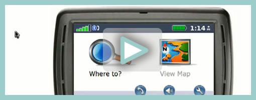
Superb. Very similar to the previous post on Protocasting, here is Chris’ approach to creating quick paper prototype animations which tell stories of rich interaction. This stop-frame animation approach requires a web cam, some video editing software (Quicktime in this case) as well as a desk attached rig to ensure things are visually stable. For showing changing text, Chris uses an erasable pen and overlaid acetate on top of the desk which he calls ‘the stage’. This powerful technique, which portrays interaction seamlessly, is a critical move forward if we are to battle change blindness brought on by shuffling disrupted and disjointed screens. In his own words:

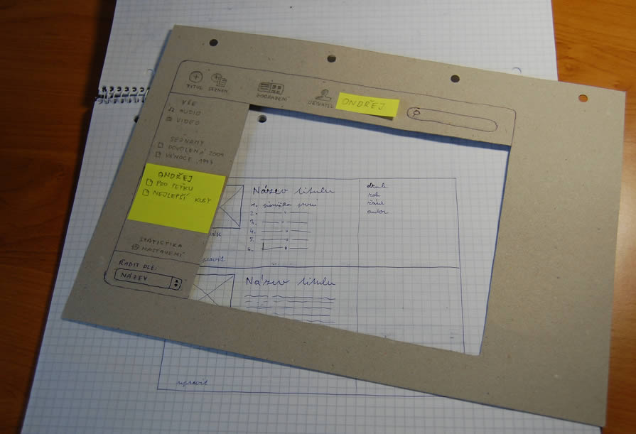
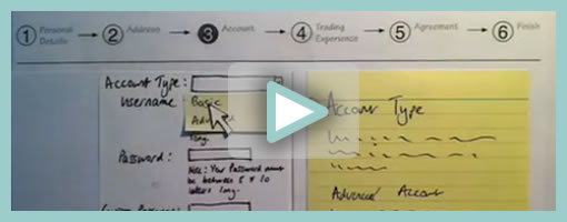
The desk is the stage, and the action is framed inside a print-out of an empty browser to give it context. I wanted it to look so simple and sketchy that nobody could possibly confuse it with a design, so I used paper, card and Post-Its to build up the scene and laid a sheet of acetate on top, which I wrote on with OHP pen. There’s a rather crude cardboard mouse-cursor and a rotating paper ‘in progress’ icon.

There are 8 animations in total, each of which illustrates part of a user journey through the form and highlights complex validation behaviour I’d found tricky to explain. I was a bit worried that the developers might think it was gimmicky, but the novelty wore off quickly and they rapidly moved on to focus on the content. Because the videos illustrated a lot of the main ideas, everyone involved was spared long, tedious meetings talking about display conditions and validation behaviour. This was a big win.

The whole process is really quick and, most importantly, fun – developers and stakeholders engage fully even with dry subject matter. Non-techies can get involved too because the animation software only has about 3 buttons. Unlike with Flex or AJAX, there’s no learning curve.

Animation is famous for taking ages, but doing animations like mine is remarkably quick providing you’re tooled up and organised. It took me about half an hour to set the scene, based on some wireframes we’d already done. Then each animation took about 15 minutes.

Credits: Chris Neale

Protocasting

Tuesday, December 8th, 2009


Here is an interesting description of a protocasting technique brought to you by Theresa Neil (which she credits to Todd Zaki Warfel’s book on Prototyping). Basically a bunch of screens are first exported into PDF, then turned into a clickable prototype, and eventually a happy path is recorded as video and annotated with audio. I think it’s great to see an approach to prototype walk throughs which alleviates the pressure on the viewers to discover the interaction by themselves (a problem present in many prototyping tools these days). Instead, the viewer is guided through time and the designer covers the intended flow as a presentation. If prototyping is partially about leading the viewer to believe that the fake product is a real one, then Theresa’s protocasting approach achieves this perfectly.

Credits: Theresa Neil

Net-Maps

Monday, November 30th, 2009


The Net-Map Toolbox is collaborative and physical tool developed by Eva Schiffer with the aim to visualize influencers in a social context. The maps generated with this approach are a snapshot of a social setting with key influencers being emphasized (raised). I found it interesting to see an attempt to capture more complex social situations with multiple people in the equation. In Alan Cooper’s book, The Inmates Are Running the Asylum, the traditional direction given was to design for a single user. Could this rule be breaking down today in light of designing for more complex contexts? Here is a description about the toolbox directly from the Net-Map website:

Net-Map is an interview-based mapping tool that helps people understand, visualize, discuss, and improve situations in which many different actors influence outcomes. By creating Influence Network Maps, individuals and groups can clarify their own view of a situation, foster discussion, and develop a strategic approach to their networking activities. More specifically, Net-Map helps players to determine

* what actors are involved in a given network,
* how they are linked,
* how influential they are, and
* what their goals are.

Credits: Eva Schiffer

Dwell Time Diagram

Friday, November 27th, 2009


Here is an interesting idea of showing a user’s experience in the context of multiple browser tabs. In the modern browser it’s quite popular that people spend their attention in various modes of activity as they switch back and forth. Nik here tried to capture just that in a diagram which shows the currently selected tab over time. I guess it’s interesting to see a sample which aims to represent multiple potential activities that the a person can engage in, instead of a single over simplified linear one. Even more generally, a diagram such as this perhaps could even step above tabs and represent tasks or activities outside the browser just as well. Nik writes:

I’d like to share a little chart I put together to illustrate the concept of Dwell Time. This has come up more and more recently as clients are asking if the recent trend in tabbed browsers is responsible for an observed upward trend in reported dwell times.

I think one thing we should bear in mind is that a high dwell time can be both good and bad, not just because we may be including time spent on another site (in another tab), but also a high dwell time on an experiential site would be considered a good thing. However similar values on a registration form may suggest usability issues.

Credits: Nik Lazell

Paper Prototype Cutouts

Wednesday, November 18th, 2009


Here is a cool idea of combining multi layered interfaces in the physical world. Ondřej has created a paper cutout for this sketches that allows him to reuse parts of his interface by means of overlapping screens. Real world masters? :) In his own words:

As a part of a school project of mine I created such prototype. Having considered all the problems I’m going to resolve I’ve made a list of proper goals:

  1. I have to create a paper prototype of an audio/video manager app. I already have the creative brief and the technical brief.
  2. The prototype should contain all the screens and dialogue boxes of the app. It should be compact, easy to store, portable all-in-one solution.
  3. It should provide quick and fancy user testing.

I wanted to have the whole app in a single notebook. Because the app would have a single window interface, the solution had crossed my mind immediately.

The result with all its benefits you can see above.

  1. A page = a screen. Using such solution provides you with a lot of space around every screen. Put down some thoughts, notes and explanations.
  2. The main frame of the app can serve as a stencil when drawing new screens. Speeds ups the drawing process and keeps the notebook full of drawings clean and consistent.
  3. In addition, the space around every screen serves as a place for pop-up windows, dialog boxes and other elements made from post-it papers.
  4. The main frame stencil can hide all the stuff around a screen and turns a set of described wireframes into a testable prototype in a moment.

Take such prototype anywhere, create new screens in a bus or train, test with your mates during a coffee break and finally archive it next to your past prototypes. Worth trying, isn’t it?

Credits: Ondřej Válka

Interactive Sketching Notation 0.1

Thursday, October 29th, 2009


After being inspired by people’s UI sketches for almost a year now, only naturally, my own approach to drawn user interactions with pen and paper began emerging. This personal compilation of the various techniques which I find relevant, is being published as the so called Interactive Sketching Notation. The general idea behind this notation is the desire to visualize user interface states as well as user actions in a clear and rapid manner. This of course, as the version number implies, is an emerging visual language for sketching interactions which I hope to continue to evolve and improve well into the future. Thanks again to all those who made this possible and please let me know if you find it helpful or have any recommendations. If this inspires your own approach to sketching, I would also love to see some samples of how people use this. .

Download the PDF directly.

Credits: Jakub Linowski

Clickpaths

Tuesday, October 20th, 2009


Here is an idea for representing narrative or user actions inside a wireframe. As an alternative to flows I wanted to showcase what the user is doing right in the context of the interface. For this, a simple clickable hand symbol was used with a wireframe reference inside of it. This was meant as to suggest that a click causes a new wireframe to appear. The value of such an approach to flows, can be that the readers of this documentation do not have to flip through pages to refer to flows to understand what the user is doing. Flows can be said to diverge away from the concreteness of a wireframe into abstraction. Here, instead, the flow of user activity is coming closer in on the interface.

Credits: Jakub Linowski