Archive for the ‘Samples’ Category
Tuesday, August 18th, 2009
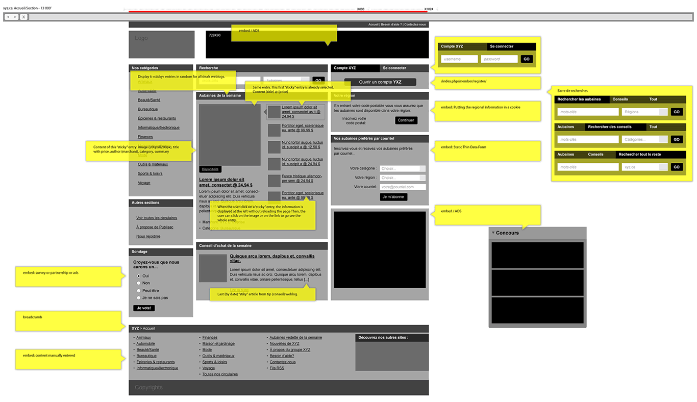
Here is a cool idea by Benoît which combines annotations with interface visuals into one coherent whole. Typically annotation bubbles were reserved for textual information, yet this sample extends it to contain more elaborate visual elements. More so, some of these annotations visible here also contain multiple variations of an interface suggesting some sort of multiple state representation.
Credits: Benoît Meunier
Tags: annotation, colour, referencing, states, wireframe
Posted in Samples | 4 Comments »
Thursday, August 13th, 2009
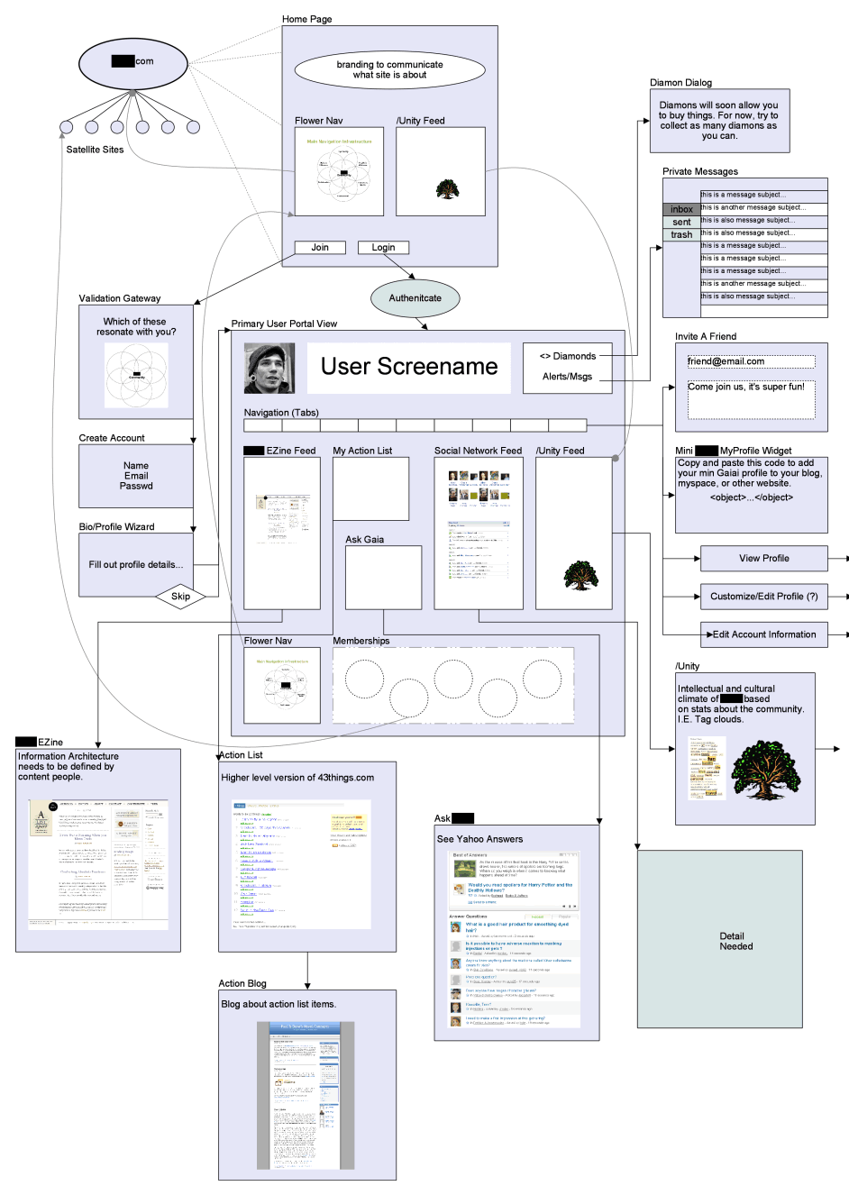
Scott’s sample shares resemblance to the previously shared wireflows posts here and here. One thing it does a bit differently however is that it combines interfaces representation which differ in size or scale. Larger screens are mixed with smaller ones. More so, this example here also represents both interface screens (or what the users see), as well as user activity (or what the user does).
Credits: Scott Dudley
Tags: activity, states, user flow, wireframe
Posted in Samples | Comments Off on Mixed Scale Wireflow
Thursday, July 30th, 2009
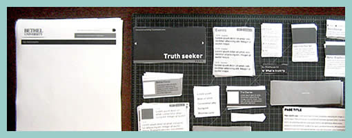
Paper Wireframing is an article by Doug on his process work with an approach which relies very much on paper and scissors. A technique like this has been noted in the past to be engaging and collaborative. Perhaps what sets this method apart from the previous example, is the use of electronically generated content whose copies are then printed numerously for the generative session.
Doug writes:
The idea behind Pwireframing (again, wireframing with paper) was to make the regular wireframing process more modular and collaborative. Instead of having a designer simply follow the instructions of a strategist, we started by discussing all possible contents of pages as a group, including syndicated feeds Bethel is currently maintaining. We also made some decisions about feeds or content Bethel would be likely to bring online in the near future. After this, I drew and printed modular drawings of all of the types of content we talked about, and cut them into sets.
Read the full article.
Credits: Doug Gapinski
Tags: sketch, wireframe
Posted in Samples | 3 Comments »
Tuesday, July 28th, 2009
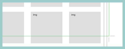
Here is a quick way of setting page boundaries on long scrolling pages. Aluísio has applied and made visible some sort of page crop marks on his wireframe. This approach could be used to give a stronger sense of the relationship between the wireframe and the page screen to show what is visible and what is beyond the fold.
Credits: Aluísio Barcelos
Tags: scrollable, wireframe
Posted in Samples | 3 Comments »
Tuesday, July 21st, 2009
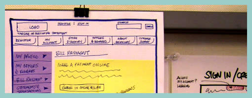
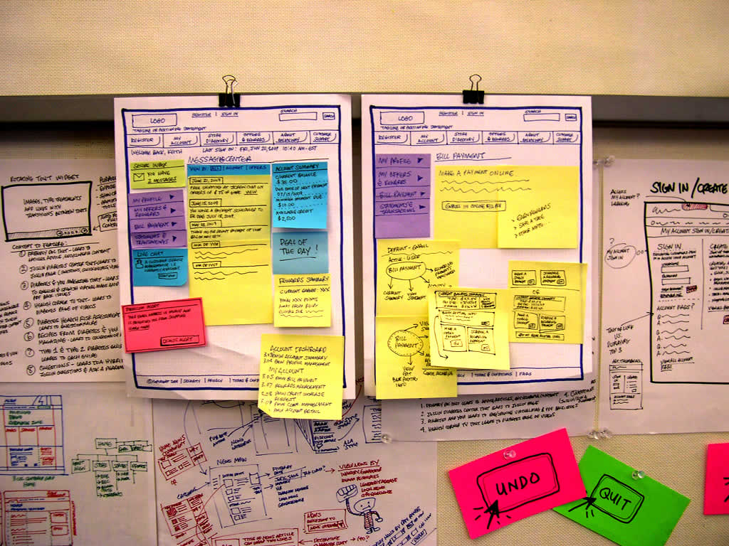
Keith relies on a similar technique to the Stickyframes approach posted earlier. His approach differs in that it mixes a number of techniques together. These hybrid interface representations mix sticky notes with sketching, sketches with flows, and anything else he comes up he just posts up and groups on a wall in a sketchboarding manner. Here is what Keith writes:
I’ve been creating wireframes since the late nineties and in retrospect have always relied on hand sketching and rapid ideation to solve my UI/UX problems.
This example is not unlike the Stickyframes example currently posted on your site. The difference with my approach is that I use color to begin to organize the chuncks of content or functionality. I also attach sticky notes containing mindmaps, flows, or mini sketches of interfaces. The grouping of ideas and sketches stay put until I have sorted out the actual page layouts to be rendered in Visio or AxureRP. The result is a moodboard for ideas which allows me to swap out thoughts until ideas are fully baked. I’ve had success sharing these with clients and collaborative teams early on in the process because they appear to be work in progress.
While I love working at a larger scale on whiteboards, these are a portable alternative for negotiating screens.
Credits: Keith Tatum of Resource
Tags: colour, sketch, sticky notes, wireframe
Posted in Samples | 1 Comment »
Tuesday, July 14th, 2009
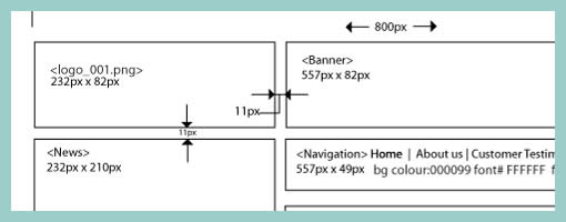
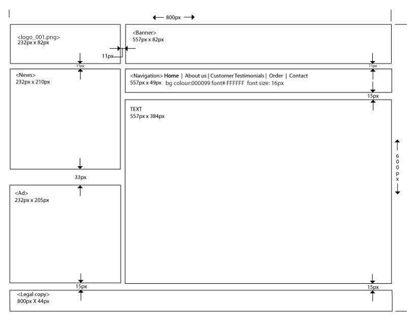
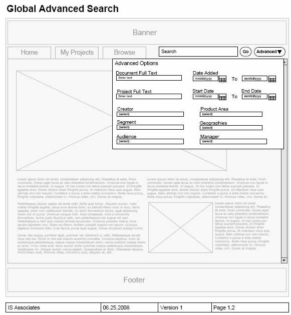
Often while wireframing, we delay considerations for exact sizing till later in the process. However, at other times, the designer may wish to portray some form of pixel dimensions explicitly. Here is one way to accomplish just that and communicate a wireframe’s dimensions, be it margins, widths, heights, or in between spacing. Lukas in his sample did this with the help of a few simple arrows and associated numbering. The nice thing about this approach is that it moves one step closer into putting a wireframe into some form of dimensional perspective.
Credits: Lukas Tomski
Tags: annotation, wireframe
Posted in Samples | 6 Comments »
Thursday, July 2nd, 2009
Similar to the recent sample, here is another one also from Uwe showing a more digital approach to colour overlays. I can only speculate that a paper based sketch was imported into the computer in order to colour it with some sort of transparencies. Perhaps what’s interesting about such a mixed media approach is the visibility that colour was an after thought in the process.
Credits: Uwe Thimel for kuehlhaus AG
Tags: colour, sketch, wireframe
Posted in Samples | 7 Comments »
Tuesday, June 30th, 2009
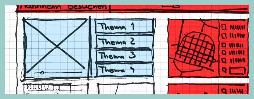
Uwe has recently published his wireframe sketches in which he uses a number of interesting techniques. One of these techniques is the use of rapidly generated hatched colour overlays on top of his sketches. Coloured lines are basically drawn over desired interface sections in a diagonal manner. This fast application of colour has at least two benefits. First attention can be drawn to coloured elements as they stand out more. Secondly, associations between coloured elements spread out over numerous screens can be made more easily when sharing sketches with others.
Credits: Uwe Thimel for kuehlhaus AG
Tags: colour, sketch, wireframe
Posted in Samples | 4 Comments »
Tuesday, June 23rd, 2009
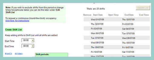
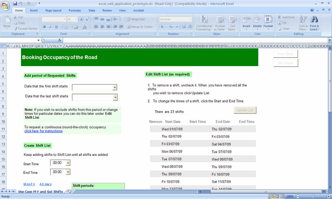
Petra has been exploring the idea of using Microsoft Excel for prototyping purposes. Introductory documentation on how to create such a prototype along with the real sample has also been posted online. At first glance, it appears like such a prototype is more suitable for complex data transformations than for GUI design which can be more easily achieved with stronger drawing applications. However, personally I have very little experience with such an approach and it would be interesting to see what others think.
Petra writes:
I created a paper prototype guided by Carolyn Snyder’s excellent book, Paper Prototyping: The Fast and Easy Way to Design and Refine User Interfaces, for a web application used to book occupancy of the road to do maintenance work, etc. It was a lot of fun testing it on my colleagues and a couple of genuine local users but when it got to testing remote users I thought perhaps I’d try to create an online prototype. I started with PowerPoint but found the macros deficient and a couple of things I wanted to do I couldn’t. I then ordered Effective Prototyping with Excel by Bergen et al, expecting that their prototypes would involve some basic coding but was disappointed to find they didn’t. A programming colleague showed me a couple of very basic code statements in Excel and I realised that with the Control Toolbox widgets, .Visible = True and .Visible = False statements, a couple of If statements, a little googling and a little recording of macros to figure out some code, I could create a pretty workable prototype, albeit only able to handle very specific use cases.
Credits: Petra Liverani
Tags: forms, prototype
Posted in Samples | 1 Comment »
Tuesday, June 16th, 2009
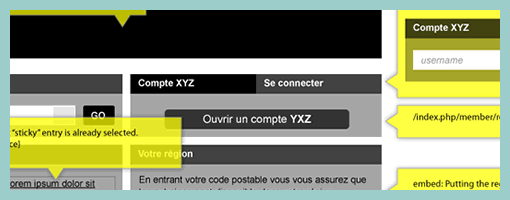
Page dimming is another visual tactic which can be used to focus attention away from what is less important toward what really matters. Here is one example from Rebecca, of an overlay being used in a wireframe in combination with the background page becoming more grey and faded. I’m not exactly sure how it was technically implemented here, however often all that is required is a drawn rectangle with a see through opacity. The elements which require more attention (such as the overlay in this case) are then brought up above all layers. This approach provides another way of emphasizing certain interface elements for users of the interface, and also for readers of design documentation.
Credits: Rebecca M. Allen
Tags: emphasis, wireframe
Posted in Samples | 6 Comments »